Day out in Nashville
A day in the park looking for fall colors was on our agenda. While we were out, I was able to get a few portrait shots of my friend. We have two versions, color and monochrome.


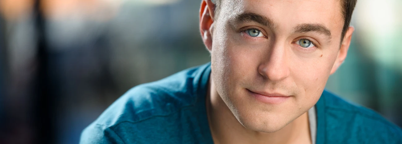
A day in the park looking for fall colors was on our agenda. While we were out, I was able to get a few portrait shots of my friend. We have two versions, color and monochrome.


I must admit I have been lax in both my shooting and posting recently, perhaps due to the fact my wife has now retired, and we are spending a LOT more time together doing various activities.

It was mid September late in the afternoon, a group of sailboats were out on the water enjoying the weather, there was a soft breeze blowing, pushing on the sails.


... a 'grab' just after I changed lens and model was not posing

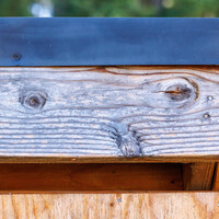
"Pareidolia is the tendency for perception to impose a meaningful interpretation on a nebulous stimulus, usually visual, so that one detects an object, pattern, or meaning where there is none.*"


7 Comments
Nice photo, I like the BW version as her face is framed by the dark tones. The color version IMO is too much color, maybe I'd tone down the saturation a bit?
We did like the amount of saturation there but I find the bw version to be dramatically compelling. Thank you for the nice words and critical thoughts.
IMO - The color is way way too saturated/vibrant. The monochrome is definitely easier on the eyes. Maybe this is just me, but this seems more like a close up portrait than it does an actual "headshot." Nit picky - I know, but headshots usually feature a subject engaging with the camera. Maybe that's just me, though, and I'm not trying to be rude - just wanted to add my two cents.
I hadn't considered the difference between headshots and portraits, interesting point.
The colour version is quite rich but I think of the two it is worth working on. The key reason is the striking red hair of the model and its direct opposite in the green of the ivy. So for me it has legs but could do with alternate poses and a different approach in post prod. If I were to go with the b&w I would work more to up the contrast as it appears a little flat.
Not a fan of that monochrome treatment. Looks too crunchy. Hard to explain. It's just not a good look. I think you're better off with just a normal black/white treatment.
And, yeah, I agree with everyone else on the colored version. :)
I like both of them. Her red hair against the green foliage, and her pale skin against the dark foliage--both work equally well. That doesn't happen very often. I like the saturation of the color and the contrast of the monochrome--in both cases, more is more. I agree with the comment that this is a portrait, not a "headshot."