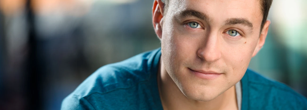
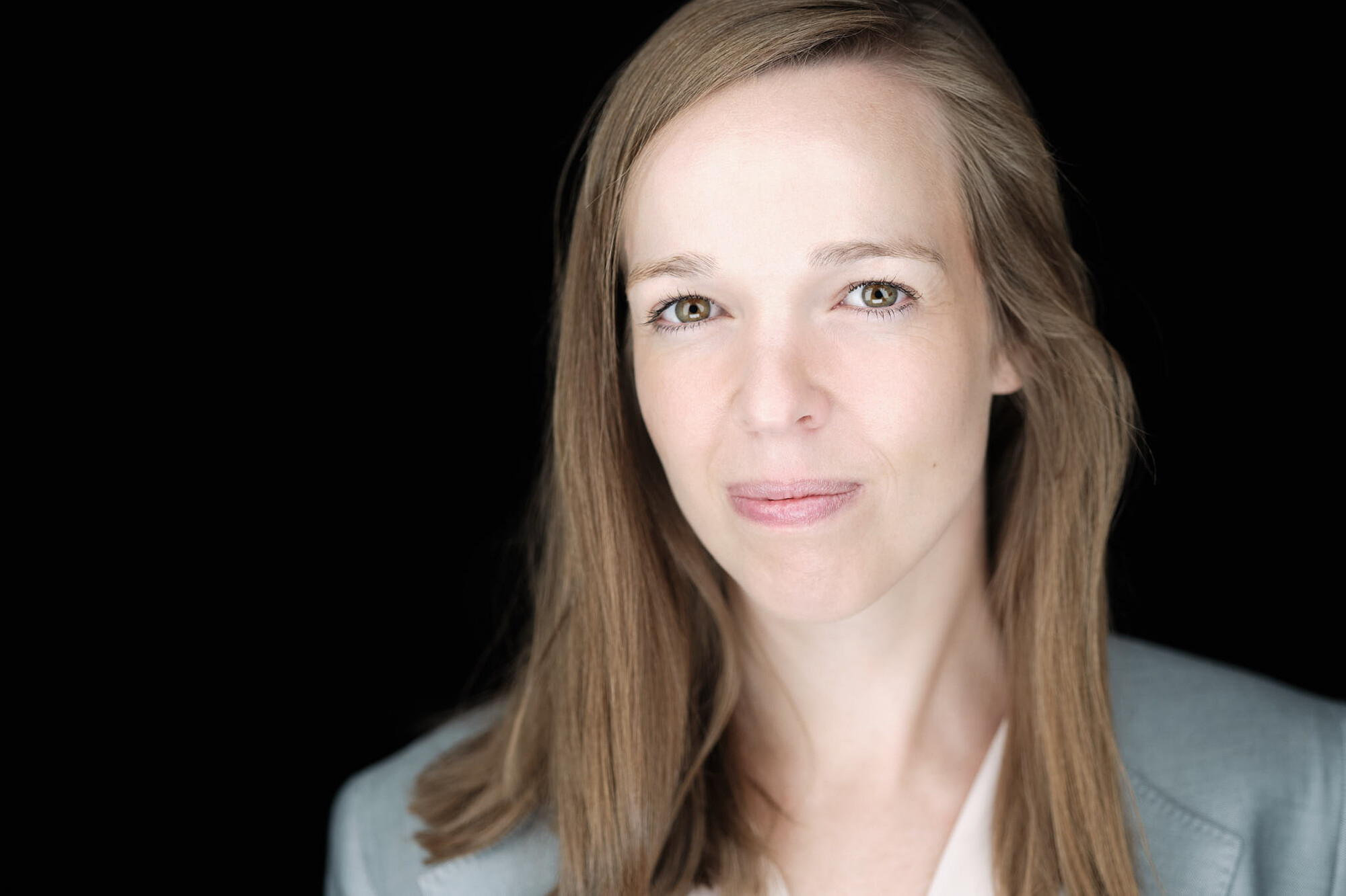
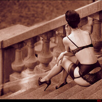
skin tones "the struggle"
is this a good tone? I think it is, but I must tell you that skin tone is the last and the first thing I struggle the most with. before this last shot, I used different light setups. but this portrait I started with led-light panels and the plan is to use them form now for all my portrait work. on witch photo, the skin tone is better? the first or the last? please help me out a little. :)


4 Comments
I think the first looks better of the two.
The last one looks too bright and flat. Almost like it was shot with on-camera flash.
I agree with Eddie. The second image has a cold feel to it, like a combination of incorrect white balance and over exposure/bright light that has washed out the warmth and any defining shadow. The first is closer but TBH is still quite flat. Maybe do some research on YouTube etc and look at lighting setup natural or otherwise, play with the light to get shadows that give structure.
Hey Robin - if you have a calibration system, like Xrite Color checker, or something like that, Hurley has one he recommends, then that's what you need. We can't tell what you're seeing on your monitor. Obviously you're struggling. So the thing to do is to shoot a calibration target/gray card, have the subject hold it to their nose, and at a minimum white balance to the gray. But if your monitor isn't calibrated it won't matter. So use that same system to calibrate your monitor. That will take all the guess work out.
It also looks like you're using a 35mm or a 50mm a little too close. Great if you're going for that look! That sort of Platon thing with some barrel distortion. But for a straight up business headshot, you'll probably get some complaints because it distorts the face and if too close can pull the nose out making it look bigger.