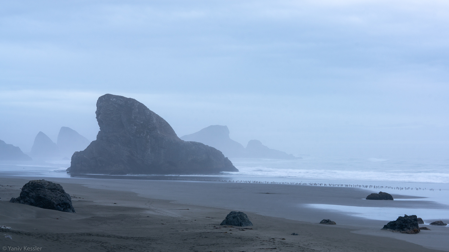
Stormy Oregon coast
Hi Folks, would love to get some feedback on this frame. What would you do the same? what would you do different? Thanks, Yaniv
Hi Folks, would love to get some feedback on this frame. What would you do the same? what would you do different? Thanks, Yaniv
I am interested in learning Macro/Closeup photography and understanding that Focus Bracketing is a good part of the process, I thought I would give focus stacking a try.


Another visit to our garden using a vintage lens (Canon FD 50mm f/1.4) on my Canon R5. NOTE: With this lens the minimum focusing distance is 18" at which point you have 1/4" depth of field.
Was down in Austin for a bit on a work trip. I've always heard how beautiful the skyline is from the river.
Was a little let down by the clouds, but what can I do!
My two favourite images from my recent night time adventure in Tenerife. Foregrounds and skies were shot separately and blended in PS.
Hi all, I was looking for such a group but see that although there are many members there hasn’t been a single post. Is there interest out there in getting this group going?


13 Comments
Very interesting light and look to the atmosphere. They look like birds on the shoreline. I would perhaps tried to get a bit closer to them an feature in the foreground.Reminds me of the opening lines to the highway man poem. "The moon was a ghostly galleon tossed on a stormy sea". The ghost like look made me thing of that. Or could be a setting for "Pirates of the Carribean" Well done!
I like the symmetrical use of the rule of odds in the foreground with those rocks. I think what this image is lacking is interest in the sky. If you framed this the same way in a fire-like sunset sky, it would help the shot a lot in my opinion.
I agree with Trevor. I also think that there are too many "subjects". The large rock in the background, the three rocks in the front and the line of birds or whatever that is. I would like it better if you chose one and made it stand out more.
Thank you very much for your feedback! I very much appreciate it.
I like the atmosphere, and the use of layers.
I think I would prefer it with a slightly tighter crop. I think the foreground is a little too busy. I think you could afford to lose two of the rocks on the right, and just have three rocks in the foreground.
I might even go as far as to say I might prefer an even tighter crop crop only using two of the rocks (almost a square crop). I think this could help with the balance, and it will a be a little more centered. As it is now, my eyes scan left and right in the foreground, the when they move up, they are greeting with an empty right side, and an interesting left side. Negative space can be very powerful, but only when used perfectly.
Overall, a wonderful shot, I think a few crop adjustments, and it's a keeper. But that's just my opinion.
Jordan McChesney something like this?
For me, that helps center the focus of the photo a little more. I'm curious to know what other people think.
I think there's too much going on in the foreground without any cohesion or reference to whats happening in the background. It's the larger stacks and the layering in the fog that I'm drawn to and the smaller rocks up front are distracting from that. I'd re compose to eliminate all but maybe a single foreground rock and bring the distant rocks in a bit more (maybe telephoto to compress the scene). I might try a pano or letterbox crop as well, and finally, without much color or sky, this scene might look better in BW, lots of nice texture in that large center rock. Also maybe an ND filter to add some smoothing blur to the ocean.
I had to disconnect from the image for a little while to understand how good this edit of yours is. Thank you very much for it!
And I didn't really do anything other than crop and de saturate. If you are working with RAW files there's probably a lot you can do here. It's a good image, just needs more ficus I think. I'd kill to be closer to that coast!
As with most of the other comments, I think the image is too busy. I love the separation of the large rocks in the background and, I like the line of the tide across the image. The birds are distracting too me and I feel like the rocks in the foreground throw the image off balance. So as the others have said, I would have limited the foreground and focused on the background more. Also I think the upper left third feels empty.
Return to this spot on a better day as the fog/clouds are too thick. The composition is there.. just need the light to work with you. Do not crop this image as the original is balanced enough. Cropping then centering is a bad idea.
This is a wonderful discussion, thank you so much!