I am put together my first portfolio. I have been shooting for about two years and feel that I should have something more complete than an Instagram. Any feedback is appreciated. Here are the first three images that I have picked out.
I am put together my first portfolio. I have been shooting for about two years and feel that I should have something more complete than an Instagram. Any feedback is appreciated. Here are the first three images that I have picked out.


first 2 i like very much not the third as far as having cohesion in the portfolio a portfolio should look similar across the board otherwise for professional reasons it looks like you don't know what your style is and you are still searching, to an editor i don't believe this is what they would want to see. on the second did you try a square crop i feel like you might get a stronger result.
Thank you for your feedback. Can you help me understand why you dont think the third one belongs? I would agree that Im still trying to find my style and understanding why the third one doesn't belong might help me get there
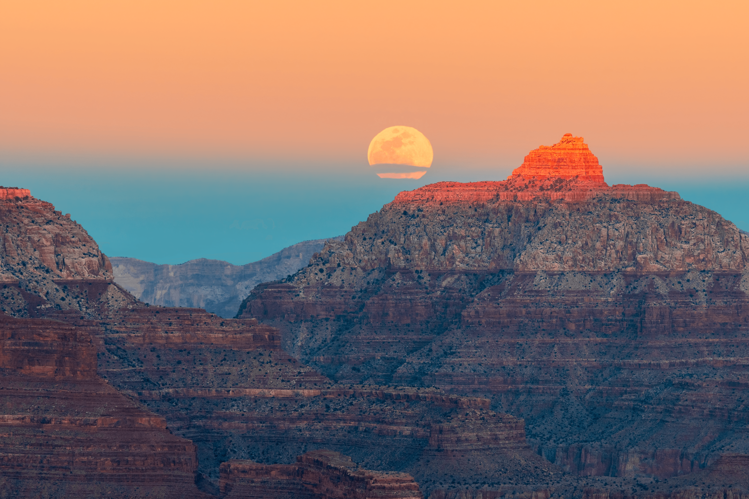
Hi Gregory - I think these are really nicely done. The colors in the first are fantastic. love the sky and how the orange and turquoise are picked up in the rocks. The second is also nice. For this one though, I would crop a little more off the top as the layer of dark clouds so thick that it almost becomes confusing about where this cloud bank/the sun break/second cloud break are in relationship to each other. And, the cloud cover is too dominant compared to the mountains. I think the third is fabulous and don't see the problem of including it in your portfolio. While it is different, it is also a well done landscape and shows diversity.
Thank you for your feedback. I will try a cropped version and compare the two.
I like all of these, Gregory. While the third is different - mono, high-contrast - to the others, I agree with Ruth that diversity in a portfolio can be advantageous.
Ideally, the moon would be further left in the first, but that would mean a vantage point a hundred or more metres further left, which I realise was probably impossible.
I note Ruth's point about the top of the second image, but to me the darkness adds drama, almost a sense of foreboding, and the paler cloud at the very top adds some interest there. It's a fine image and well processed, to my eye.
The third is so like Ansel Adams' famous version that it invites dangerous comparison with a great master! One thing I wonder is whether you've added the moon. The lighting on it suggests that the sun is still quite a bit above the horizon, yet the sky is black.
Thank you for your feedback. I agree with the moon, but if I moved another two feet to the left I would have fallen down the grand canyon!
I too liked the paler clouds.
The dark sky is done using a red filter which turns the sky black and is not a composite. I was messing around and loved how it made the moon stand out. And since it's in black and white the granite still looks good.
PS - if you post these in your portfolio here you would get some stars. It is another way to judge how they work.
I agree with Ruth, Gregory - start your portfolio with these. Putting it crudely, posting here invites criticism, posting in your portfolio invites praise and stars - ideally, lots of both!
The first image is quite neat, but I think it could use a touch of contrast in the rocks, the haze is making them look a little flat. But over the composition is nice a layered.
I like the second image a lot, the light is super strong. I think you could crop it a bit, to lose of some of the negative space, but at the same time, it kind of works. Either way, it's a keeper.
I'm not super big on the third image. The composition isn't super strong, so my eyes are just kind of floating around, but mostly they are resting on the moon, which is coming across distracting to me.
Overall, some pretty good stuff.
I keep coming back to the first one and I think it is for the reason Jordan mentions about the flatness. You could take a brush tool and swipe a tiny bit of decrease exposure above each ridgeline to pop it away from the one behind it. I think this 1 minute edit would give you a really push to the top.
This screen capture is just a quicky to show what I mean. And - not meant to be a criticism as this is just to go from a 4 stars to a 5 stars in my opinion.
Thanks! I will try this. I hadn't thought of doing this, but it should definitely help
Think your first image is the strongest, and most unique. Really striking colors and love the moon position. I'd be tempted to clean up the noise and smooth out the gradient in the sky with a blur mask.
The 2nd image is pretty interesting, I would like to see more detail in the mountain shadows.
Joseph makes a good point, you really have to decide if you want to have a signature style in your portfolio or if you are just going to go for demonstrating diversity. I'm also putting together a portfolio and this is something thats already been crossing my mind.