Dappled Forest
Learning to create and apply luminosity masks. First attempt. The second is a 3 shop pano. C&C appreciated.
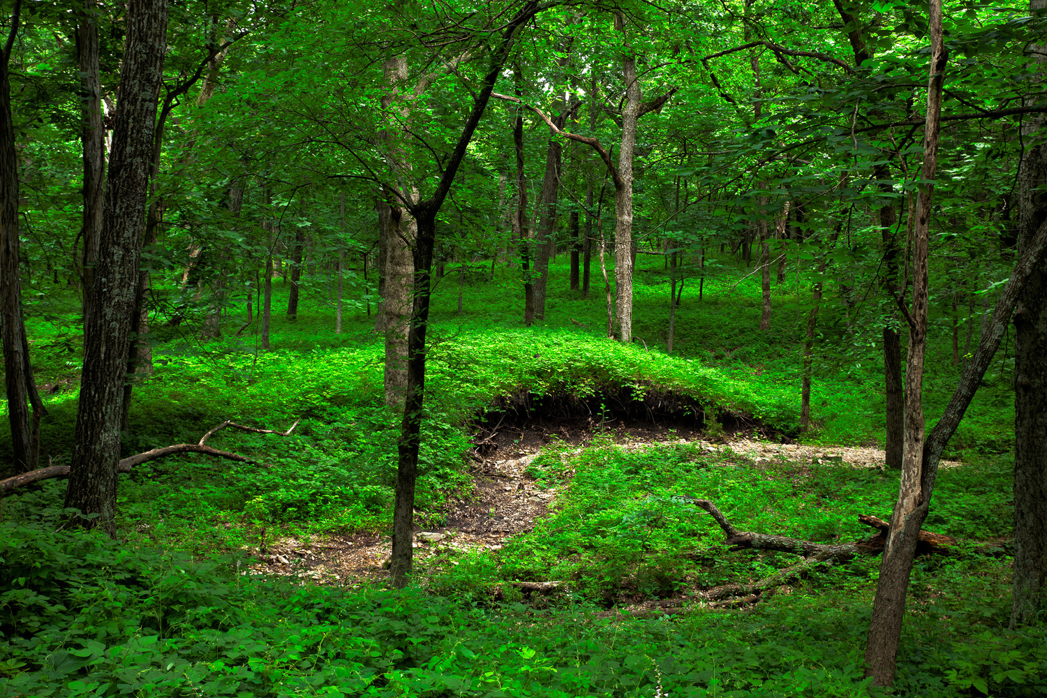
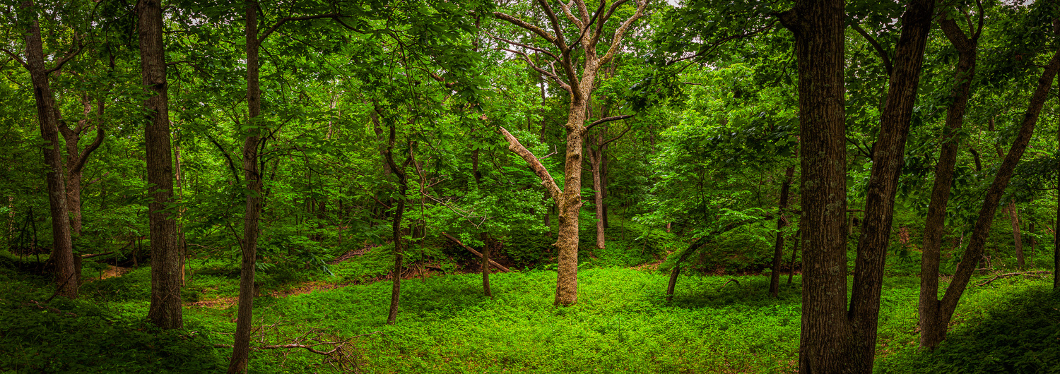
Learning to create and apply luminosity masks. First attempt. The second is a 3 shop pano. C&C appreciated.
Latex paint takes about 1-2 hours to dry and it was faster than taking this image!


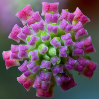
I picked up an RF100 f/2.8 L Macro lens and thought I would practice and see what I could come up with.
All photos are multiple image focus stacked.

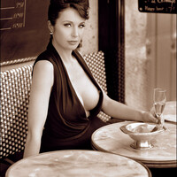
That haunting mental image of a woman you glanced at while walking past a Paris cafe...
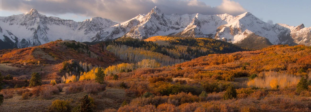
Just a few interesting details walking around a couple of towns in Germany. In the second one, I was just captured by the setting sunlight in an alley.
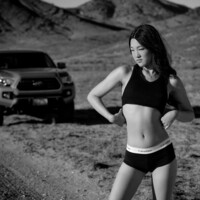
Part of my series, Backroads and Boots.
Model: Tiffany Chen.
5 Comments
Luminosity masks are fun to play with just make sure you keep an eye on the histogram and color levels as to not go too crazy I really like that pano nice work
Thanks for that! I am still a little mystified with the color histograms. I understand the farther right the more saturation. That being said, here is the color histogram for the top image. It seems fairly balanced to me. How do I use that to analyze color levels? Is it saying I want to increase the blue saturation a little on the color curve?
I’m not an expert on it I just try and make sure they stay within a pleasant range so they aren’t so harsh
Hi Brian,
'the farther right the more saturation' isn't exactly right, the saturation is rather about relative positions of the R, G, B curves and how they're stretched. If they're all pushed to the right, you get just a brighter image, not more saturated. To put it simply, you'll probably find it very hard to get colours right by just looking at the colour histogram.
Your histogram alone shows there's more bright green than blue, and when we look at the image - yes, it's all green.
I'd suggest to calibrate the monitor and use your own perception and sense of colour.
To my eyes and on my recently calibrated monitor :), the second image looks just right, very well balanced, and the first one seems to be oversaturated with acid green.
Thank you Michael for that thorough response! Acidy is a great description. I pulled back the green Hue and think it balanced it out nicely. I included the new histogram for educational comparison. Looks like it brought the reds down to even out with the greens. Interesting. I was just curious how to use the color histogram.