More Posts in: Landscape and Nature Photography
High above the clouds on the summit of Haleakalā, Piko o Ka Lani — meaning “The Center of Heaven” — captures a moment where earth and sky seem to touch.
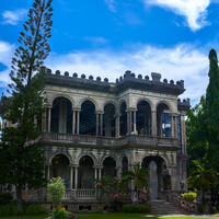
Pag-ibig na Gawa sa Bato — Love Made of Stone
They burned it. And it refused to fall.
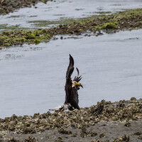
While taking photos of the Eagles out at Big Beef Creek out in Seabeck WA on Sunday morning, this one eagle tried to get away with the fish.
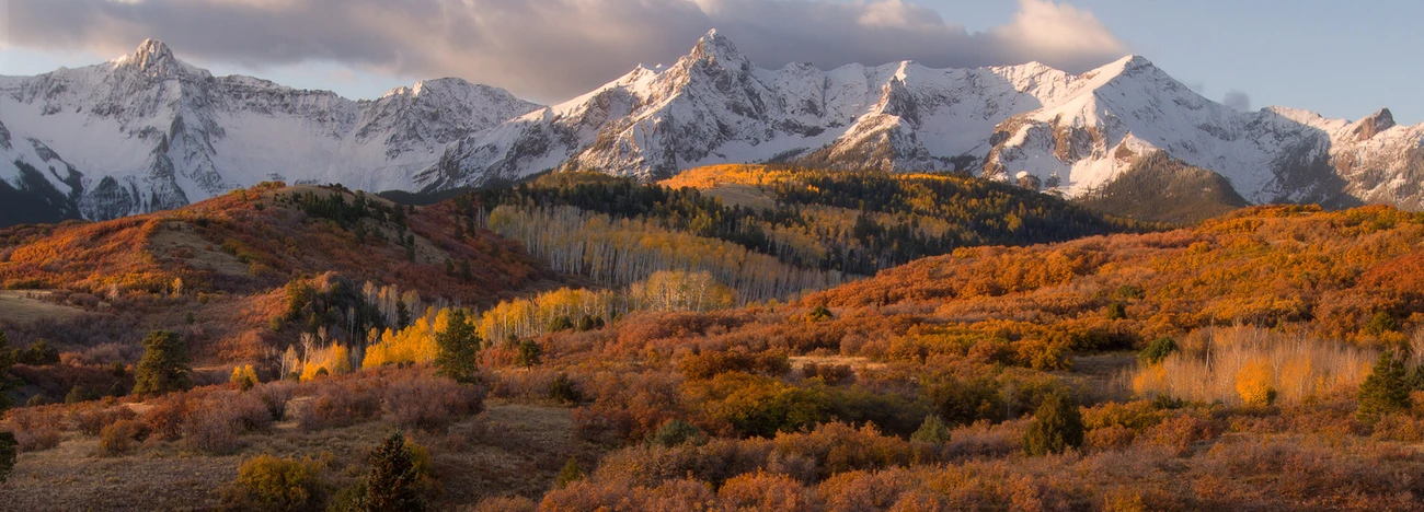
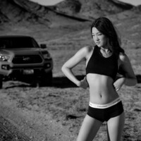
Part of my series, Backroads and Boots.
Model: Tiffany Chen.
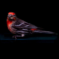
I like playing with these photos of Purple Finches where I make their reddish/purple color stand out.


14 Comments
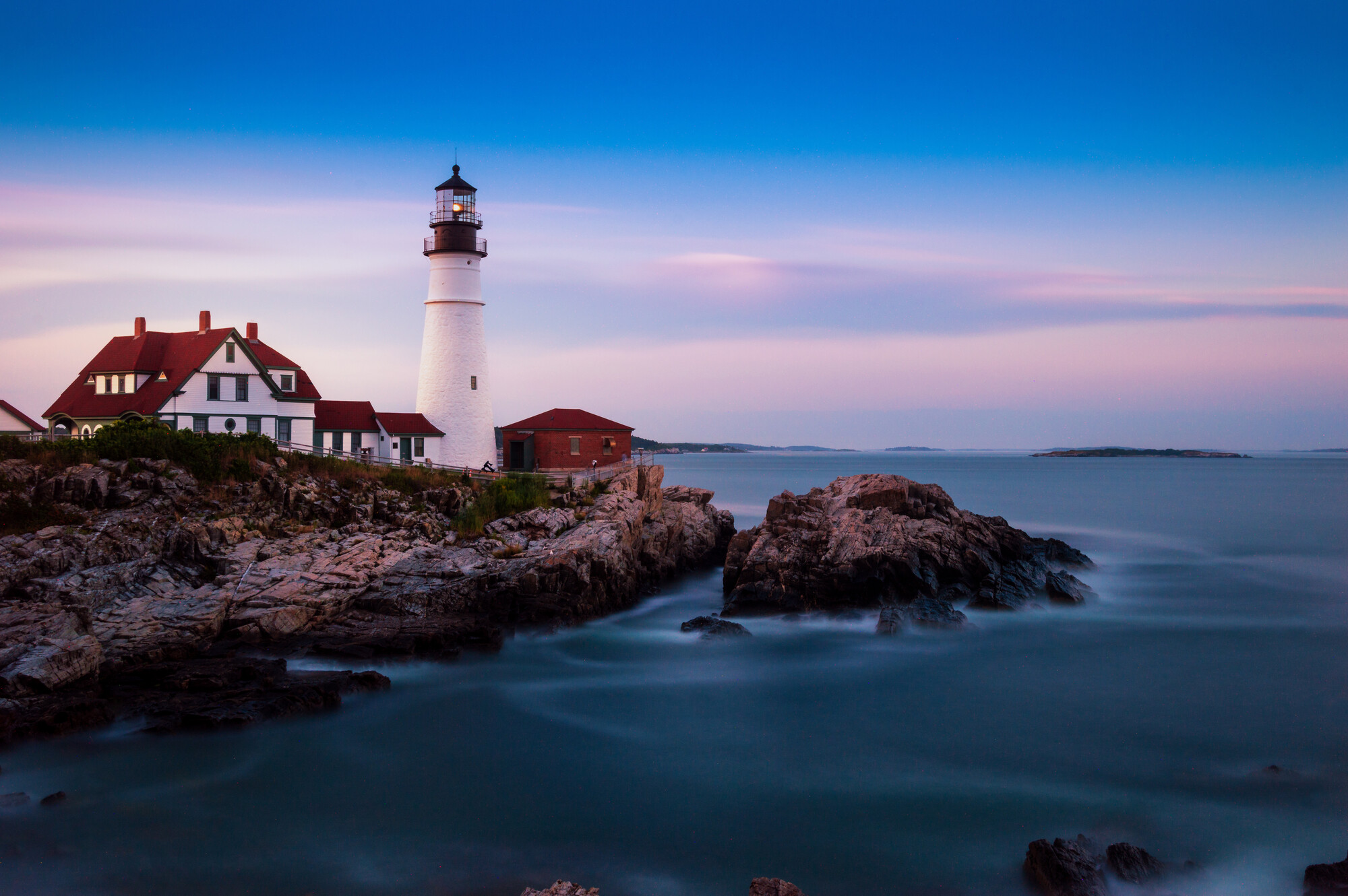
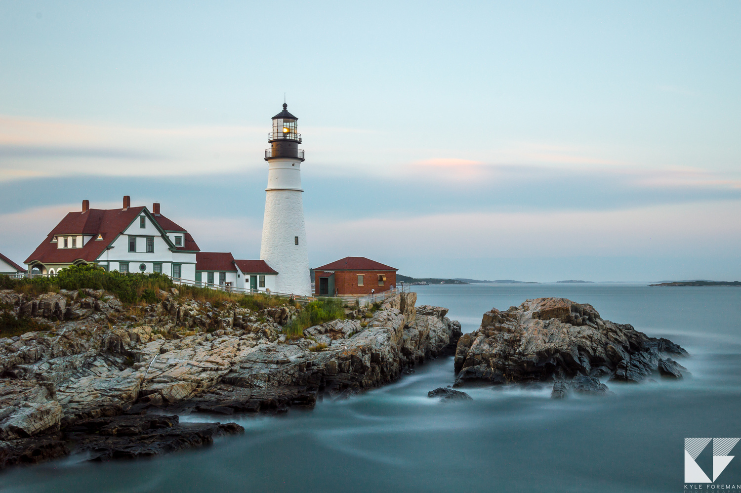
I like Number 2. Too much saturation in the first photo.
I agree with Scott
I prefer the 2nd (old) one. The new one is too dark, too saturated, lacks detail, the sky has gradient banding, and there are random rocks at at the bottom.
Whereas the 2nd photo has a nice clean look with lots of details.
You know what’s funny. You guys say it’s too saturated? I barely touched the saturation slider. Maybe I got a little crazy with the contrast but I did almost nothing with saturation. 🤷♂️
"Saturation" doesn't always literally mean the saturation slider.
These are just some of the things that I know of can affect saturation:
1. Contrast (except in Capture One)
2. Levels
3. RGB curves
4. Presets. They may be changing things you're not aware of.
Didn’t use any of those either. Just color effects pro to add some more contrast. There’s probably a happy medium between the 2 for me.
Color Efex Pro by default adds saturation when you use the Tonal Contrast filter.
Tweaked it a little bit.
I think the best would be between 1 and 2.
This is one of mine...
Nice! I wish I lived closer. I'm in North Carolina so....not close at all. It's a great location and I bet some weather comes through there which would make for some great photos. Unfortunately when I was there the sky was just ok. This is my favorite from that day though.
Kyle, I like both images (amazing capture), but I love your original processing. In your re-work the blue in the sky is a bit too nuked for my tastes, and the red added to the highlights isn’t doing it for me.
I really love this image, thanks for sharing it!
Thanks! I agree the highlights can be tweaked a little bit.
I like the new one . It has a more powerful feeling and I generally like the dark pictures with warm colors.
Yes! I personally like the new one better as well! Seems as though we are the only ones though. :-( To me the new one is also a little closer to how I remember it actually looking as well. It was dark. The sun had already gone down. It was the beginning of blue hour. To each their own I suppose.