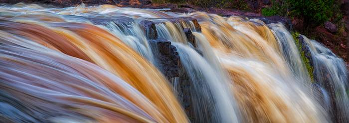
I made this image while on a trip to Minnesota a few months back.
It is a pano of multiple images shot with a D-850 and a Zeiss 35mm 1.4.
I am drawn to the specific crop format. A lot of the image was cropped away.
I would be interested in hearing everyone's thoughts about anything that strikes you (processing, crop, etc.)
Thank you in advance.

I like the idea of the crop, Roger and its compositional potential. I've done the same at waterfalls.
What strikes me is firstly the very vivid colours - of the water at left, and the dark rocks & plants upper right. You were there, but it looks unnaturally & distractingly intense to me
Secondly, to my eye the image has a kind of crammed effect, with "busy" water occupying a lot of image space. I think the crop is a little too tight at top left, with not enough breathing space above the water. The fact that the image is so wide while the direction of the water flow is mostly diagonal at left and nearly vertical at right means that for me the movement clashes with the framing. Cliché it may be, but I think a longer shutter speed may have tamed the busy look beneficially for me.
Why the pano? Is the scene very wide?
Hope I'm not being too harsh. The idea has potential, but is not quite there for me.
Chris - Thanks for the input. The type of info I am looking for.
That is the color of the water. It was in northern Minnesota at a place called Gooseberry Falls. The water is stained with iron ore and pine tanum. I did burn down the top right.
The scene was a bit wide. I shot this being approximately 10-12 ft away.
I agree - the water movement takes your eye out of the scene. I was thinking the movement was a way to guide through the scene.
Again - thank you for the words and help.
Hi Roger. understand about the efforts and patience for making such image. the Flow of water is well captured in long exposure. For my thoughts, a little breathing space or say negative is needed to appreciate the flow of water. Perhaps the texture in contrast or a frame in composition. OR the right top corner can be removed in crop to have abstract feel and little bit of ambiguity. Thanks.
I have a very similar shot of a waterfall (but not as colorful....) that I have tried a number of times to get to a level I can be happy with. Perhaps with both of us there is just too much going on withing the frame
I do like the detail and contrast in the flows and think if you crop a bit it may work a bit better (sadly not the case for mine....).
Following is a possible suggestion. Good luck - I'm hoping someone has a great answer I can use on my own....
Alan - Thank you for the input. When I get the chance, I will upload the original unprocessed raw file along with a different crop of the image.
I went with this crop because it was what I had envisioned while shooting it. I have found that I actually see different things while processing images.
Alan,
Please see the attached.
The first is the unedited file.
The second is an unditted different shot taken during the same session.
I tend to like both for different reasons but ultimately went with the 6x17 crop. I am a bit of a Nick Carver fan... I think both images have merit and are very different.
I used a shutter speed of 1/10th sec to smooth the water yet maintain a bit of force in it.
I think it is good to go through this type of exercise during the post-processing phase to help when actually capturing the images on-scene.
I agree with all you say Roger, all have their own merit and there's nothing wrong with having multiple versions telling slightly different tales.
For your vertical I think a tighter, narrower crop would emphasize the power of the flow, but this is down to my own personal preference (and may not match yours/others....).
BTW - after looking at these versions then going back to your original post the change in saturation is pretty striking. (Again) personally I prefer the more subtle (natural?) coloring.
I just wanted to add that the water on the left hand side is just butter to my eyes...
I almost want o just crop to that and use the rocks to frame the right hand side.
The photo reminds me of a rootbeer float and brings me back to my childhood. Okay, yeah, I'm weird, but aren't we all? :P (please take this as a compliment, the image strikes up memories and emotion, that's a good thing)
Used your original, this is only a crop and a little noise reduction.. Just my thoughts though, nothing more...
You have a wonderful photo.
Yet another good option....
Joe and Alan,
Thank you for your outstanding input.
I did a quick re-edit which matches Joe's crop and toned down the saturation abit.
See below.
Here is a drastically different option - I did a conversion to black and white....
Thoughts?
It's a great improvement over the original for me, Roger. I think excluding colour means there is less "going on" to use Alan's phrase, and now the movement goes diagonally right across the frame, in a slight arc. It all hangs together. I like colour, but here, with the dynamism and tonal range, colour would distract. You've distilled a couple of elements into a very satisfying whole. I didn't expect I'd like any version of this so much! Well done.