I posted this photo today and it was given a 1 star by someone. Rather than just rating, I usually give people honest feedback about what they could do better with their photos. Most of us, myself included, could always improve. I believe this photo was given a 1 star rating as because someone didn't like what I had to say about one of their photos. I know it's not a 5, but on the other hand, I doubt it's a 1. So if you could help me out and give me an honest rating that would be appreciated. If you leave a comment, I can return the favor and give my honest assessment of some of your photos in return. Thanks.
People are very quick to hand out 1 stars; not everyone of course but there are those out there.. Even the owners of this site said 1 stars should be a very rare rating. Same is said for 5 stars; also very rare. Which should really leave us with a rating system between a 2 and 4. I will never give a 1 star, 1 means no thought at all (there is almost always thought when taking an image). In my opinion 1 stars should show who gave that rating as they are more often given in retaliation then any legitimate use.
That all said, this image, In my opinion falls between a 2 and a 3... It dose need some post work but it is nearly there for a solid 3.
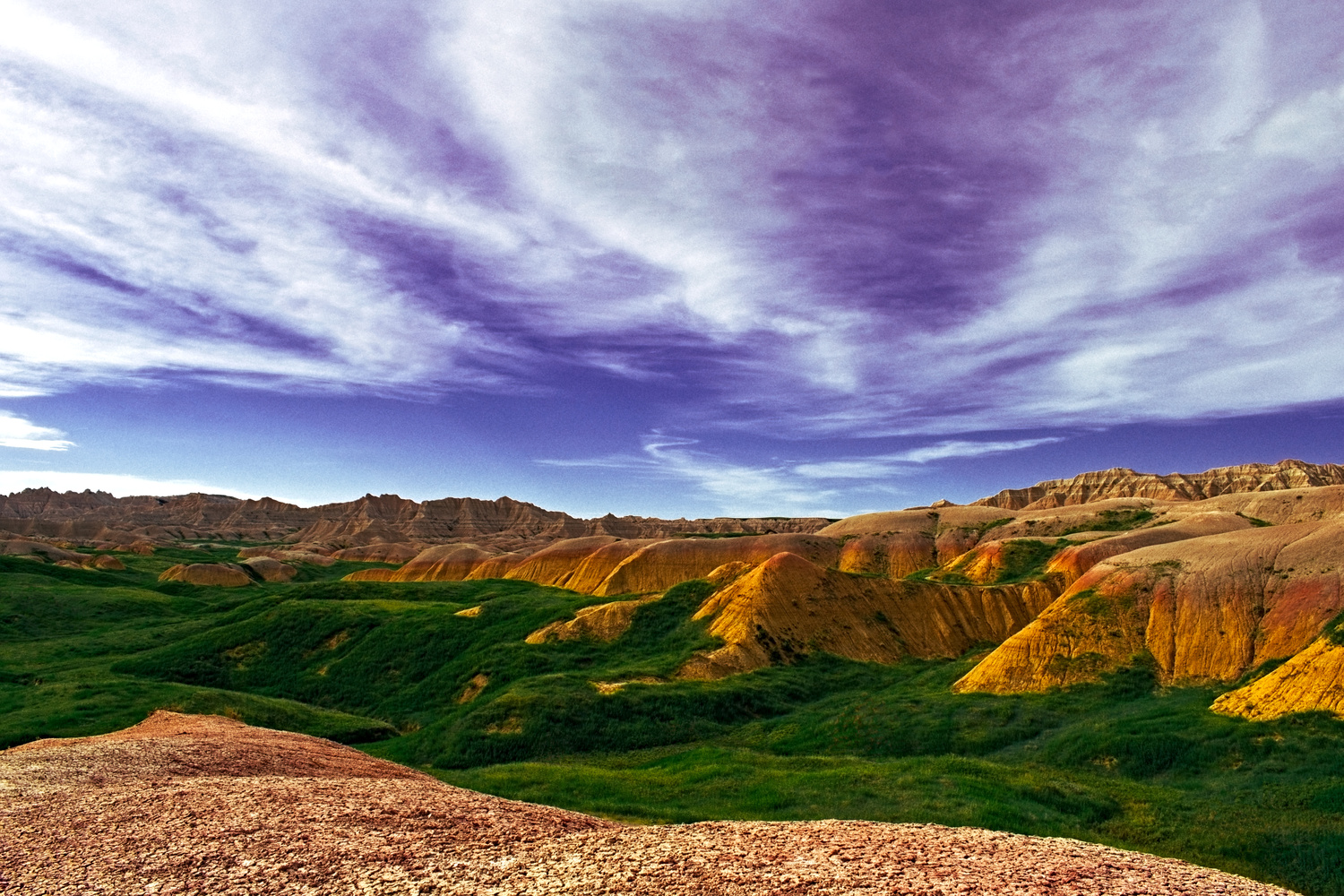
The CC and the why... The vista is gorgeous. It appears to be a HDR image? The image can be divided into four sections...
The Gravel - Not sure it's adding anything to the overall image and there is question to what it is, gravel, granite, a road.... ? It leads the eye from right to left.
The Valley - Also leads the eye from right to left.. Is fairly uniformed in color.
The Mountains - Leads the eye from right to left but is also balanced by the ridge that stretches the horizon.
The Sky - Takes up 50% of the image. The top 1/3 of the image/sky appears purple on my laptop. Did you use a Graduated Filter on the camera? There might be some color casting going on.
Something feels off, it could be the crop and the inclusion of the gravel in the foreground. As a viewer, is our focus the mountains, the sky, or the entire vista as a whole? I almost want to play with a 9:16 crop, or vertical crop.
The colors appear over saturated, we go from a tan to a deep green ot a strong yellow to a vivid blue. If this is HDR, process with a light hand.
Just my two cents of course.
[Edit, 16;9, I'm dyslexic. :) ]
Awesome. That’s the kind of feedback I’m looking for. Much more constructive than the “I do/don’t like it.” comments from friends and family. Thanks.
Its a nice photo Tong as has been said the sky looks a bit too purple , in my opinion theres nothing drawing me into the image , i cant find a point of interest but its not a 1 , the light area in the foreground draws my eye too much maybe take in later or earlier in the day to give it a bit more texture , its a good starting point , excellent try , dont forget views are subjective , hope that helps
Thanks everyone for the feedback. Due to everyone mentioning the colors, I attempted to calibrate my monitor and lo and behold, it was way off. That at least solves that portion of it. Of course, that also means all my photos are off...oh well.
Happened to me a few months back, I know that feeling, I've been there as well... All we can do is get close enough, as every display technology will display slightly different, even if calibrated. My laptop and my desktop are very far apart. My laptop is lighter and a little washed out, my desktop is darker and colors even more vivid.. even now.. ug. The struggle is real. :-/
I went through focus hell before I learned I could update the firmware on my beloved Sigma 18-300mm lens. Soooo many shots I won't get back. Argh!
It's one thing I dread doing, but I know I have too... All my gear is used and I bet focus is off all over the place. I need to go thru and calibrate my lenses.
Also, Joe - and perhaps Tong - you can calibrate your screens. Not hard or that expensive.
Yup, yup.. I did what I could using calibration sites, but I really need an external calibration device... a new monitor wouldn't hurt either, this one is from 2008ish..
I'd just be repeating what Joe said.
This group is for "discussion." If someone's lazy enough to slap a down vote or one star rating... without explanation? Pfffttt.
Remember... in figure skating, is it, they toss out the lowest and highest scores? So... don't let the one star turkey-givers get you down.
Yeah, the reason I joined this site was because I felt it was more geared towards putting out your best work and then getting feedback on how to do it better. Other sites just seem to encourage photo spam. So a 1 star with no comment just didn't seem very genuine. But the feedback I have gotten in this thread has been priceless and I'd rather have good feedback than stars.
Well said.
Hi Tong. I too am having difficulty with the colour cast and saturation. I have done a 10second edit to pull these down a bit. Lastly I have been thinking that there is a wee bit too much going on so have done a crop. Just my 2c
Nice, Ralph. The green span seemed to stand out before... as it was sandwiched between the two bands of earth tones. I like how your edit brings the hills into the main subject (I think, anyway). The sky color's more pleasing, too.
Is the sky fake? It seems low res/larger grain than the rest of the scene and the way it fades out, or doesn’t towards the horizon seems off
It’s all a single photo and shot without an ND Grad, so it was pushed pretty hard in post. I might have also applied “chromatic aberration correction”, which I’ve just noticed does nothing but substantially increase grain. Got to double check functions before I apply them is all.
I screw up and get grainy stuff in my astrophotography edits. Steep learning curve.
Cathleen, the only astrophotographer that adds grain to her astro shots... :P (teasing)
My opinion for what it's worth, I see where the gravel in the foreground forms a point in the lower left corner that "points" to an L shape in the grassy area, above L is another layer of grass that terminates at the base of the mountain and leads to the sky, and as far as the large portion of sky in your photo, to me it shows that perhaps you are searching for something above your normal experience. Maybe I haven't had my coffee yet, but that's what I see. And I agree with Mr Svelnys , some are too quick to hand out one or no star comments,
As a composition, its a very nice image, and i like the foregrounds presence as it gives a sense of depth, although it doesn't give any sense of leading lines (not that a pic should always do that)
My main issue is with the sky
1) too much sky as others have said
2) Its colors are off. The purple in it doesn't look real. I think it might have been over processed.
a 16:9 crop would have worked better for this pic as well
Hope this feedback has been helpful to you