
Whats looks better esteticaly for the print? Sunset or Sunrise?
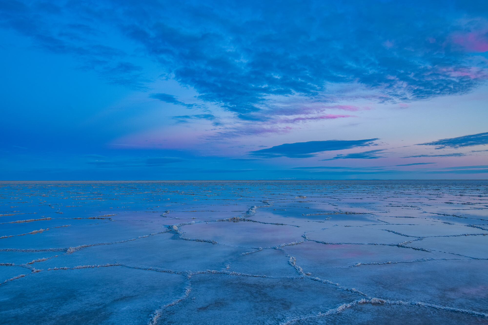
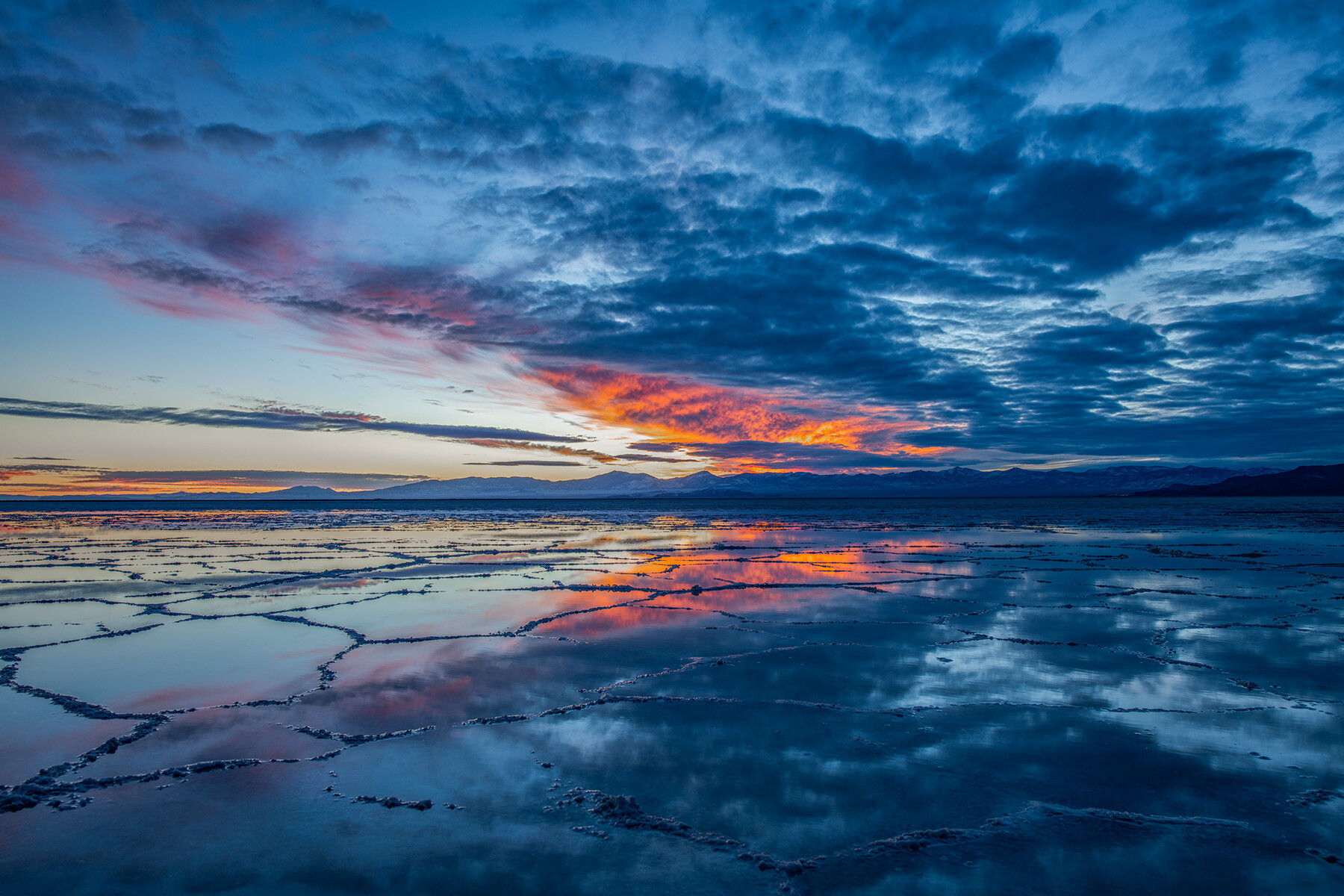
Whats looks better esteticaly for the print? Sunset or Sunrise? Two picture from the same day and the same location but very hard to decide which one looks better, or none of them.
Whats looks better esteticaly for the print? Sunset or Sunrise? Two picture from the same day and the same location but very hard to decide which one looks better, or none of them.

I've photographed Ady a few times now. We get better each time as a team. This image was a fave from our latest session. I hope you like it to.


Just a heads up for anyone that may be interested (and as things are slow in the group.....).
I've photographed Ady a few times now. We get better each time as a team. This image was a fave from our latest session. I hope you like it to.
I've photographed Ady a few times now. We get better each time as a team. This image was a fave from our latest session. I hope you like it to.

Available and natural light only, classic boudoir shooting in a fin de siècle hotel.



9 Comments
These are beautiful, Artem.
The first for me; however, I suspect the general punter will like the second more.
I agree with you, Will. Let's see.
First for sure.
I prefer the first, Artem, for the subtle combination of shades and hues, and also because the interesting foregound textures are more clearly visible, and invite exploration. I think it would hold my interest for longer if I were looking at it every day on a wall, for instance.
The second image is more eye-catchng initially, but this fades quickly for me. This is possibly simply because so many of us take such spectacularly-coloured images that it becomes a cliché, no matter how well done.
They are both excellent photos. I don’t think it’s a case of either/or. Both have great attractions. Why is it needed to choose?
i think that the first picture would make the better print. The textures are more subtle and for me much more interesting. I really like how the background fades out and the hint of pink on the salt flat.
Hi Artem. For me, both frames are the beginning of beautiful art work. Their elements are demanding to be expressed further.
In particular, for my tastes, I would reduce the colour saturation in the first image (I might just reduce the saturation of the blue for a start and see what that does), and perhaps lighten it a little. This I think would allow more play in the subtle hues & tones.
I'll also say #1 which i could happily hang in my home.