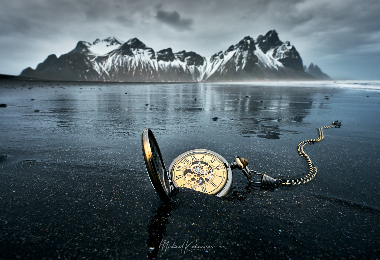
Time and tide waits for no man
One of my special pictures from Iceland
Z7 with 14-30 f4.
One shot.
Edit: Picture was taken one side, no composite.

One of my special pictures from Iceland
Z7 with 14-30 f4.
One shot.
Edit: Picture was taken one side, no composite.
Amberlie reached out for a session. We discussed a few looks including a swim look. I wanted to change it up by shoot the swim look indoors. I like the way it turned out. I hope you do as well.
First time this young lady posed and worked in studio. Just finished her Masters degree and is now pursuing her PhD.
Just a few interesting details walking around a couple of towns in Germany. In the second one, I was just captured by the setting sunlight in an alley.


7 Comments
On site, or composite? Cool picture either way.
Thx! It was taken one side in Iceland, Stokksnes with the Vestrahorn in the background.
A cool composition & idea! The mountains in the background a bit blurred, foreground nicely sharp. Looking convincing from this side. Sticking the watch in the black sand looks good: the composition is well hidden. You've done a good job! The watch appears quite huge. I can accept as expression. Odd to me is the color of the watch in contrast to the foreground & overall image color: The watch & its chain appears golden while the rest is in a blue tone. This contrast to too strong to me & appears not trustworthy. Maybe a reduction of the saturation of yellow might help?
Thank you for your kind words and your detailed feed back! The contrast of the golden watch and the blue toned sand is intended by me. What do you mean by "Looking convincing"? You do think it's a composite? Because it's definitly not!
Looking convincing! The complete image should appear to me that things shown has been there. No matter if they really have been there or added later. When I get the impression something seems to be manipulated, it is ' not convincing'.
Yes, that is my assumption: a composit. Especially that high color contrast led me to this conclusion. If it is not a composit, I am wrong. You made the photo and know it.
When you say, you applied the strong contrast with intention. Ok, we enter the area of personal taste. What one like, may another dislike. There is lkie or not. No right or wrong.
I love your phorography. It seems original to me.
It does not seem to me a composite.
The saturation of the clock is the same as that of the soil particles. So I see it as correct. Maybe my advice would be to lower the brightness of the clock a bit.
Anyway, it's a great job!
Thank you very much for your feedback!