More Posts in: Landscape and Nature Photography
I've photographed Ady a few times now. We get better each time as a team. This image was a fave from our latest session. I hope you like it to.
Just a heads up for anyone that may be interested (and as things are slow in the group.....).
I've photographed Ady a few times now. We get better each time as a team. This image was a fave from our latest session. I hope you like it to.
I've photographed Ady a few times now. We get better each time as a team. This image was a fave from our latest session. I hope you like it to.
Available and natural light only, classic boudoir shooting in a fin de siècle hotel.








4 Comments
I hope you don't mind.
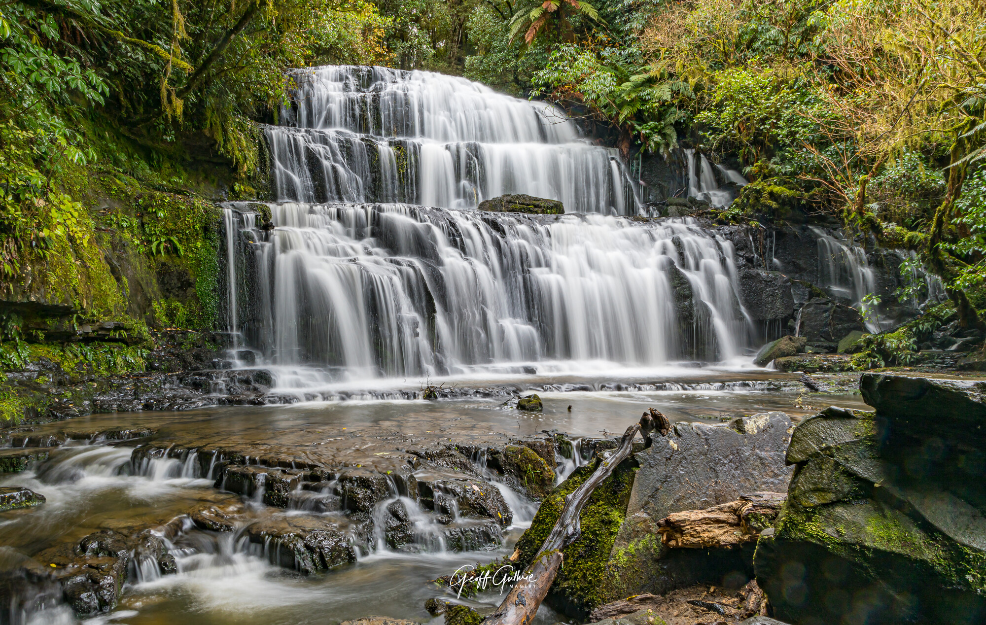
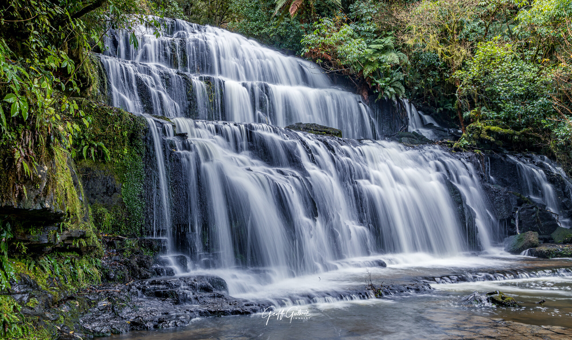
To my untrained eye I find the foreground on the right hand side a little too distracting. On the bottom one I think the waterfall should have been to the left more. I prefer the white balance of the bottom one, lush cool tones in the water.
The timing and exposure is perfect.
Apart from those two very minor personal opinion points, perfect. I prefer the intimacy of the bottom one, I can hear its thunder, very nice.
Thanks for the feedback Chris. Had I moved a little bit more to the left in the top one I'd have been able to get rid of the rocks in the foreground. However the position there was too slippery to stand on. Also agree with the comments regarding the bottom photo. I will have a look back through what I took on the day and see if I have one that has the waterfall is more to the left. Cheers.
Hey Geoff! I think you could actually get the best of both worlds here. I don't know what you use for editing, but in lightroom or camera raw you can use an adjustment brush to select only the waterfall. I prefer the composition in the bottom photo, so what I would do is make the image warmer, like the top photo, so there is more yellows and oranges in the foliage. I would then use the adjustment brush to select the water, and make it a cooler color. This way you get the warm lush colors of the foliage in the sun, and you get the cool colors of the water. This will achieve a balanced color relationship between your blues and oranges and make it even more pleasing to the eye. Beautiful either way!
Thanks Dylan. When I get time I'll have a play and see what I can achieve. Cheers