Which One?
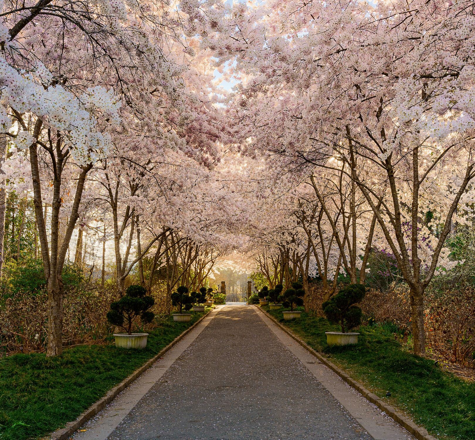
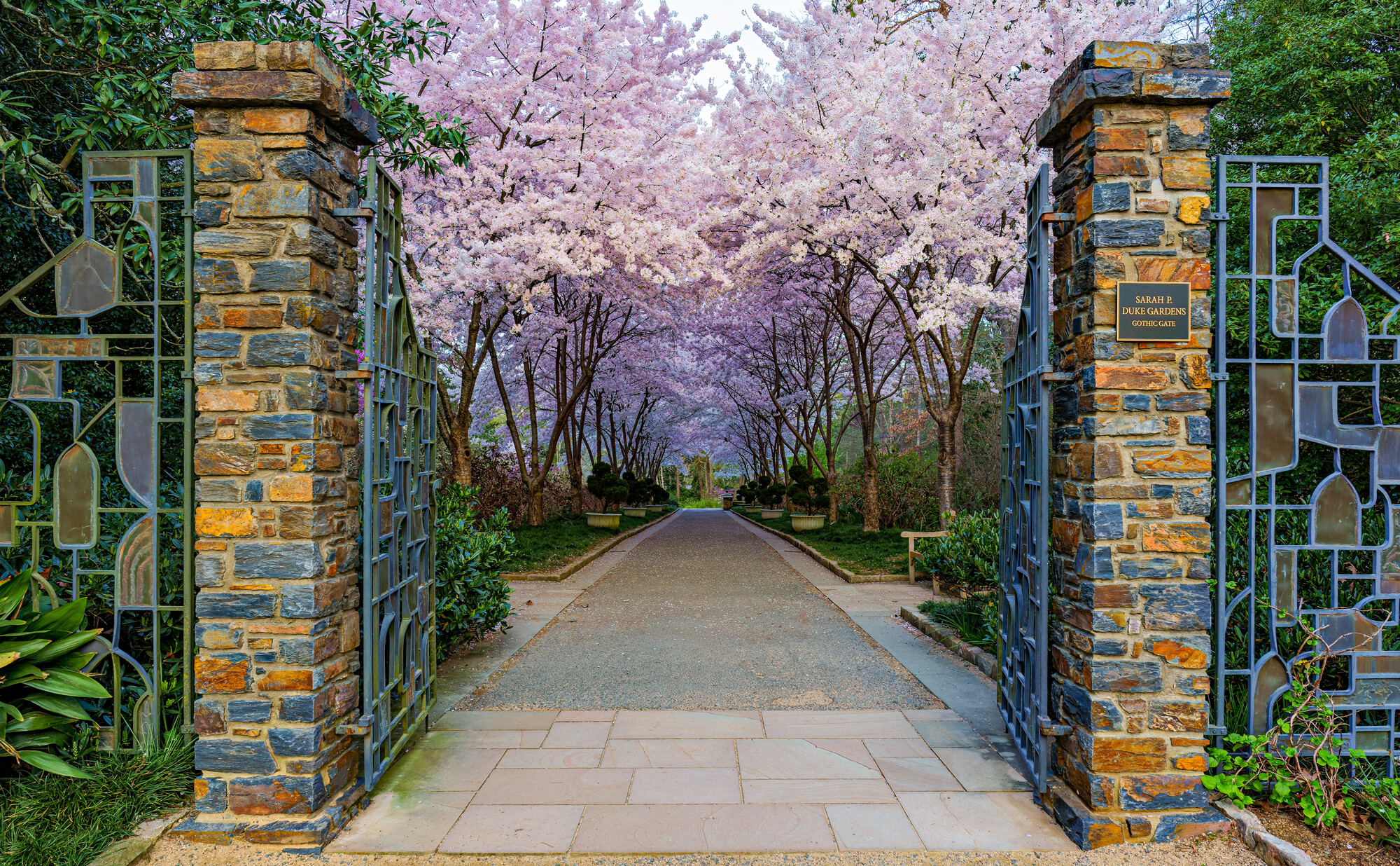
I'm having trouble deciding which one of these I like best and which one I'd like to add to my portfolio. I really like the golden light of the first one, I like the lower angle of the 2nd one but I think the 3rd one might be my favorite. I really like the soft light and having the gate in frame.
Which one do you guys like best?


13 Comments
Hey Kyle!
All three are good and differ in mood! I know which I would hang on my wall. According my taste and preferences.
Outsourcing the decision, but having your own opinion... We enter here the area of personal.prefetences. Ask 2 persons, you get 3 answers. You won't become happy about.
I want to encourage you, find YOUR OWN decision! Ask yourself: which reflects YOU best as it is YOUR portfolio. And having an issue today taking a decision, put it into the corner for a while and let it rest. In 2 weeks you will have a different view. That is the way how I find my decisions.
Yeah, I know I run that risk. These decisions can be tough. And it doesn't help that I'm an indecisive person, haha. I'm just curious which one other's like is all. Doesn't mean I'll end up putting what others like the most in my portfolio. Although, it may muddy the waters even more. I appreciate the feedback!
I agree. The three are technically solid, so it is just a matter of personal preference for cold or warm colors, etc.
I find the second composition more striking. I feel that the lower angle pulls the viewer in better. I would also be tempted to pull up the luminance of the path a touch to balance with the foliage at the top.
I agree with Steven Nelson about #2. I like that composition more, but there is an imbalance in the luminance.
I like the composition of #3 best, but I wonder about the colors. Is the masonry and the gate components really that color? It appears to me that you adjusted the saturation for the foliage and took everything else with it. Some masking might have been in order.
Kyle Foreman , sharing reflection as asked.
To hold the vision to the subject/concept, the distractions of side details, eliminated in image 3. This frame was prompting me to look "colder". If you have processed the image in software given HDR, auto corrected colours of the materials are looking inappropriate to me.
Sharing my version.
This is a rough idea of what I meant. I drew a mask around the masonry and turned down the saturation.
Honestly. Believe it or not the colors in real life are closer to mine than this. And the sun was directly behind me shining on the bricks. Could have also play a roll in why some may think they’re over saturated.
I accept being wrong humbly as my wife and daughter remind me that I am daily.
lol 😂 im not saying you’re wrong. I think a happy medium between ours would be good!
I do like the cropping on this. This is a single image. I didn’t do any hdr or exposure blending. I honestly don’t see a difference in my colors and yours. Maybe it’s because I’m on my phone. I’ll have a closer look when I can get back to my computer.
Kyle Foreman no colour correction in my version. just a reference for discussion.
Gotcha. I thought you meant you made an edit yourself.