Image Variations / Different Images from 1 File
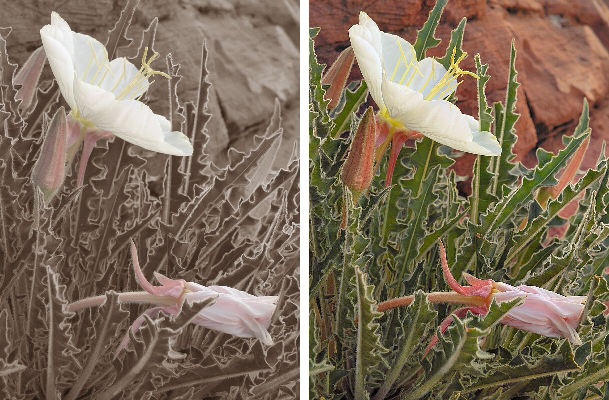
The image on the left is a result after futile attempts to process the raw file data to the image on the right. During early efforts I was unable to achieve satisfactory color in the leaves or the sandstone background an orange-reddish brown color. After work this image over a few days I closed it and left it alone for some time eventually going back to it. Worked on it some more. Starting over form scratch a time or two, finally I try a black and white conversion I still didn’t like. Next I began to experiment with a sepia tone look that began to show some promise. But sepia tone wasn’t totally working either. I was missing the wonderful flowers and bud the image’s main subject. The sepia tone was stifling them. Once again I walked away from the image, put it on the back burner and let it simmer for a while. It sat for some time only to be occasionally opened and studied for a minute or two. I finally printed a small version and displayed it rather prominently at my work station to make it more visible yet not a distraction. Then finally inspiration … a hybrid, sepia tone is a colored black and white how about a colored sepia tone hybrid. Before jumping in to work on it right away I tossed it around in my head for a while. The solution was eliminate the problematic colors green leaves “vermilion” sandstone keep the colors of the flower and buds. As I began to work the image again I found it was much easier said that done. The straight colored and sepia tone verses did not mix well. I needed a method to blend the two wholly different photographic disciplines. Years later I eventually arrived at a satisfactory straight photo version of the original image.
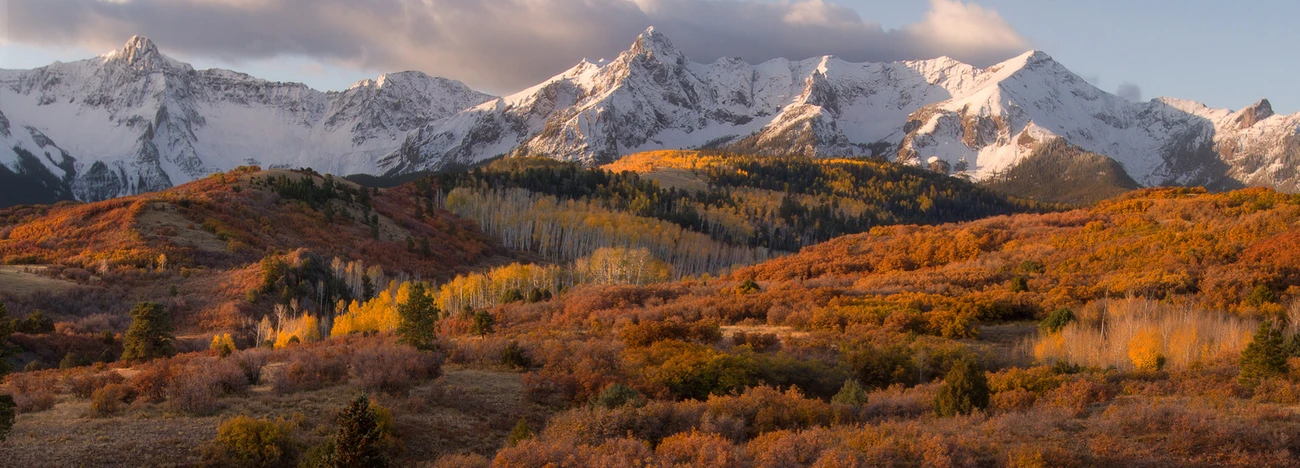
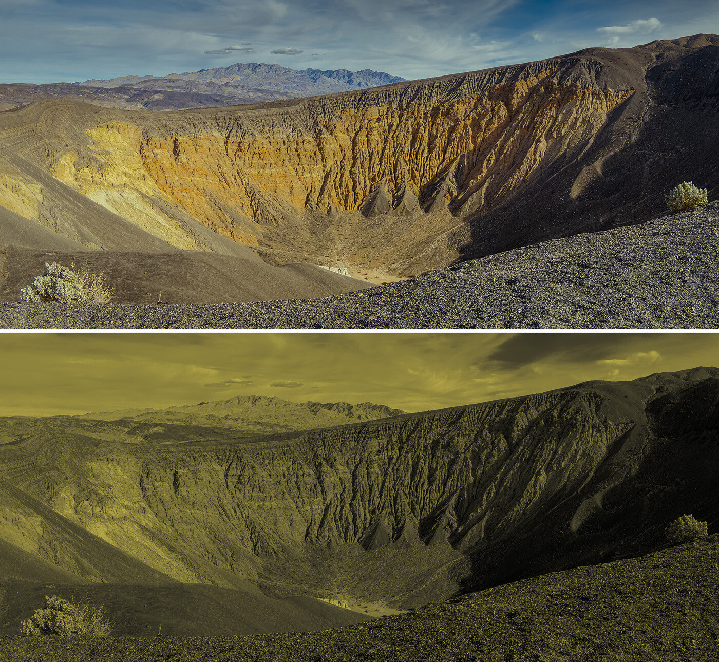
My other example was no where as complex. The straight version of the panorama came rather easy. At the end of 2020 the color(s) of the year were announced Illuminated and Ultimate Gray. Immediately I thought those sound like workable colors I could work with. I began on several black and white conversions and began mixing a warn and cool tone hybrid version to them.
Your thoughts feeling and critiques are welcome along with creative criticisms.


2 Comments
Hi Paul! I prefer the more realistic, coloured version of each image.
In the case of the flowers, to my eye the absence of green while other colours are present makes me question the image rather than look at it (is it real? does it look like that? I wonder what colour the rocks and leaves really are?) and enjoy the image. For my tastes, leaving just some colours in an otherwise monochrome image seldom "works".
Having said that, I did so in my portfolio Jaguar XK140 image, but the car was grey, and the only colours were in the lights, so I thought that aspect would be emphasised if I just left some colour in the lights i.e. I had a very specific reason for doing this.
In the second case, I prefer the colour image because I enjoy the colours per se - the soft blues in the sky, the rich yellowish cliff, the faded green shrubs. It all creates an atmosphere, and conveys for me remoteness, vastness, and semi-desert.
I have nothing against monochrome, but in the mono version the sky has lost some of its interesting contrast (the two clouds above the distant peak in particular stand out less), and I find the overall toning a bit bilious!
An interesting exercise! Thanks for posting and giving us something to think about.
Chris, good to hear from you again, and thanks for sharing your thoughts, perspective and insight.
As beings who primarily see our world in color not always the same colors as each and everyone else. I clearly hear and agree what you are saying, for the most part. Color or black and white (monochromatic/gray scale) photograph and other works of art when they have that WOW factor, on the other hand as well … it’s in the eye of the beholder.
On the flower and cliff image the amount of time and persistence to produce either version dumbfounds me. The unconventional version was a matter of months of on and off again attention to it, the straight color version several years once again on again off again style of work is meant in the most loose form of definition. The story is available in my portfolio posting. Long story made short the amount of time between these two variations is about I’d say 10 years granted the majority of those years it slept on a hard drive, out of site on the fringe of my mind. The color of this local sandstone has driven me crazy on many occasion and possibly the most difficult color I have yet to encounter. Speaking of color and vision you and others may find this interesting and maybe fun :
https://www.xrite.com/hue-test?pageid=77
As with the second image the “straight” colored version was a simple as falling off a log. That simple till as I mentioned about learned of the 2021 selection of the color(s) of the year. Thats what cause me to select a dozen or so images and experiment applying those colors to their grey scale conversions.
It was a least 10 or more years into my serious photographic journey before starting to grasp how to see in “black and white” thanks to working a couple of jobs on the graveyard shift. During the wee hours I was able to studying and observing the transitioning of shapes and forms progression from mono blackness to multi shades of gray before textures became visible then briefly true monochromatic. Before they began to fade into a world of pastel colors in the moments of predawn light. It was some years after that before I attempted a black and white image and years later before I succeeded at my first black and white visualization to photographic image completion.
Most of our worlds we see in full color it is unnatural for us the perceive it in shades of gray. I wonder it it was easier when all motion pictures/movies were in black and white, which makes me think about the believe we only dream in black and white which I would agree with when I was young but don't agree with now. Another lesson in learning about black and white which I really didn’t appreciate till photography went digital. While helping an uncle of mine with his TV and electronics service and repair business. In adjusting colors on a television set, precursor to a computer monitor / Red Green Blue Cathode Ray Tube (RGB CRT). The best way to judge color adjustment for accuracy was by removing all the color without touching your RGB channel/guns and this was done be tuning the saturation to 0, if the image looks good in black and white the color adjustments are correct.
One last point. I recently read a piece about photographers tangible prints verse view other versions and website versions of their images. And I can totally attest to this as true, Having been up close and personal to both prints by Ansel Adams and Eliot Porter and nothing else compares especially in this “modern” digital age as to their “Hard Copies” And even though I am bias, the pastel sepia tone Primrose is prone to this same affliction it looks as I intended in print form but struggles online.
Thanks once again Chris for you time, input and else all patience my friend of opposite hemisphere and shades of earth ;-) or LOLROTF if you prefer.