

Nothing represents St Louis like the Cardinals and the Arch. I love the combination of black, white and blue and tried to keep the distractions as minimal as possible. I wanted the arch to be a part of the photo but not to overtake it. The car is the feature, but I think everything plays a nice part in it!

In Lists


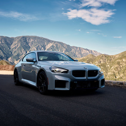
To many distracting elements in my opinion: the bow, the lamp, the logo of the hotel - less would be more.
You should see the original if you think those are distracting ;)
I originally had the logo of the hotel removed, but the person I shot for wanted it in there since she wanted it to be mainly downtown as it is. The "bow" are you referring to the arch? That's the main point of the location ;) To be able to have the St Louis Arch (Gateway to the West) in the frame! :)
I appreciate your comment though, and I do agree, I try to remove as many distractions as possible, I'll try and dig the original up so you can see what I did remove
Well I never recorded that particular photo's edit, but same shoot....
1 - https://www.youtube.com/watch?v=FG66_aHdqKY&list=UUuyU3JiMmEZT8CR-x4_gdOQ
2 - https://www.youtube.com/watch?v=SAO9tltMLno&list=UUuyU3JiMmEZT8CR-x4_gdOQ
If you're curious
Nice vids, thanks for sharing - yes the distractions are always the same - too much in real life to remove them all...