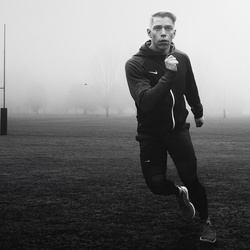
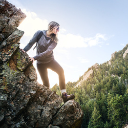
Each lululemon store selects influential fitness professionals in the community to be ambassadors. I've done some work for the Austin, TX stores, including this image.
This shot was made with all natural light, but because the whole environment is pure white, including the wall camera left, there was a lot of bounced soft light. The background was color and tone corrected to even it out and knock down the contrast. It's an entirely white environment, so my edit didn't change that dramatically. I think the lines, curves, and geometry are beautiful, and help lead the eye right to her, while her pose mimics some of the background lines. It's worth nothing that this is a personal edit on the shot, not one I submitted for their use and printing. Their brand imagery if focused on a very unprocessed, realistic look. I chose to place her in a more etherial setting, which I felt was still realistic, but somewhat dreamy.
@calebkerr || www.calebkerr.com


Holy batman background. Beautiful. Everything about this image rocks.
Thank you! It took some ninja photoshop work to clean up the background, so I'm glad you like it.
Can you pm me what the original image was? Scouts promise from one photog to another that I'll delete it as soon as I see it.. just want to see the before/after for my own education!
Love this! Dig your style man!