The first thing you think of when it comes down to shooting landscapes is a horizontal orientation. Perhaps that is why it’s called landscape orientation. That sounds obvious, doesn't it? But I believe it’s not always the better choice.
A horizontal photo is often referred to as a landscape photo. A vertical photo is considered a portrait photo for a similar reason. After all, it is often used for portraits. These names almost define the way we think and push a lot of beginning photographers into believing this is the way it should be.
If we follow this train of thought, it may not come as a surprise why a lot of landscape photographers believe it is necessary to capture the landscape with a very wide wide-angle lens. I don’t know if this is the main reason, but everything seems to point towards capturing a lot of horizon in a landscape.

Why should we always shoot in a horizontal orientation, especially when nothing of significance is present on the sides? Perhaps a vertical image is better.
Don’t Limit Yourself by Thinking Horizontal Orientation Is the Best Choice for Landscape Photography
I believe there are many occasions when a horizontal landscape photo does not work. We are focused on keeping the image in that horizontal orientation, even when it doesn’t lead to a nice composition. I have seen many photos that have a lot of uninteresting space on the left or right, which doesn't add anything of value to the image. Particularly when a nice foreground object is included in the frame, the sides are often of less interest because the focus is on the foreground object.
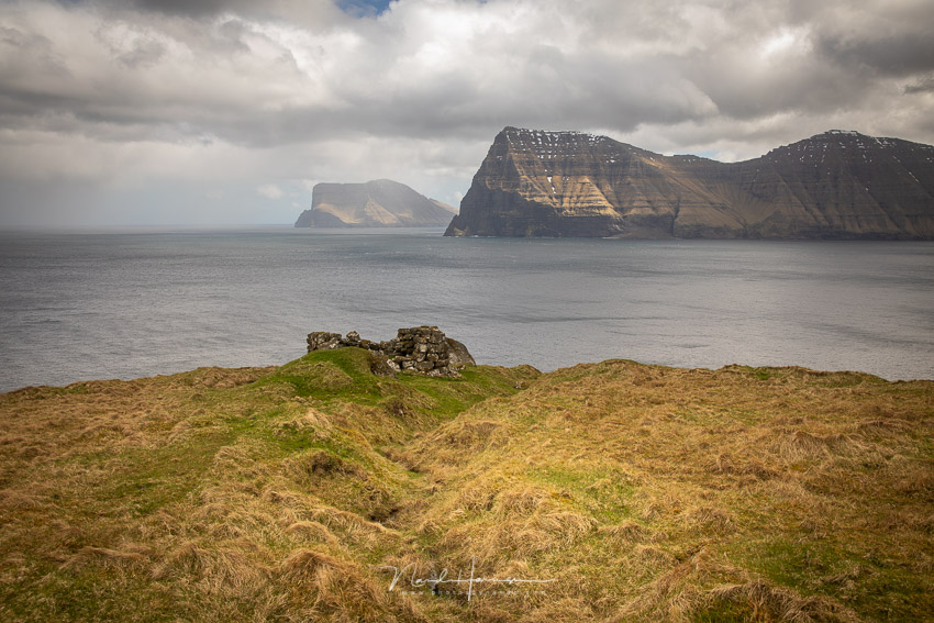
This example shows a landscape on the Faroe Islands. The most interesting part of this landscape is the ruin, with the Island in the back. By shooting a portrait image, I lose the sides that add no extra value to the photo.
On top of that, if a nice foreground is included in a composition, a horizontal orientation will force you to keep both foreground and background close to each other. After all, there is not much space in the vertical direction to play around with. The horizontal orientation will not only restrict the placement of both foreground and background, it will also keep the attention focused on these elements, thus leaving a lot of excess space in the image where nothing will happen.
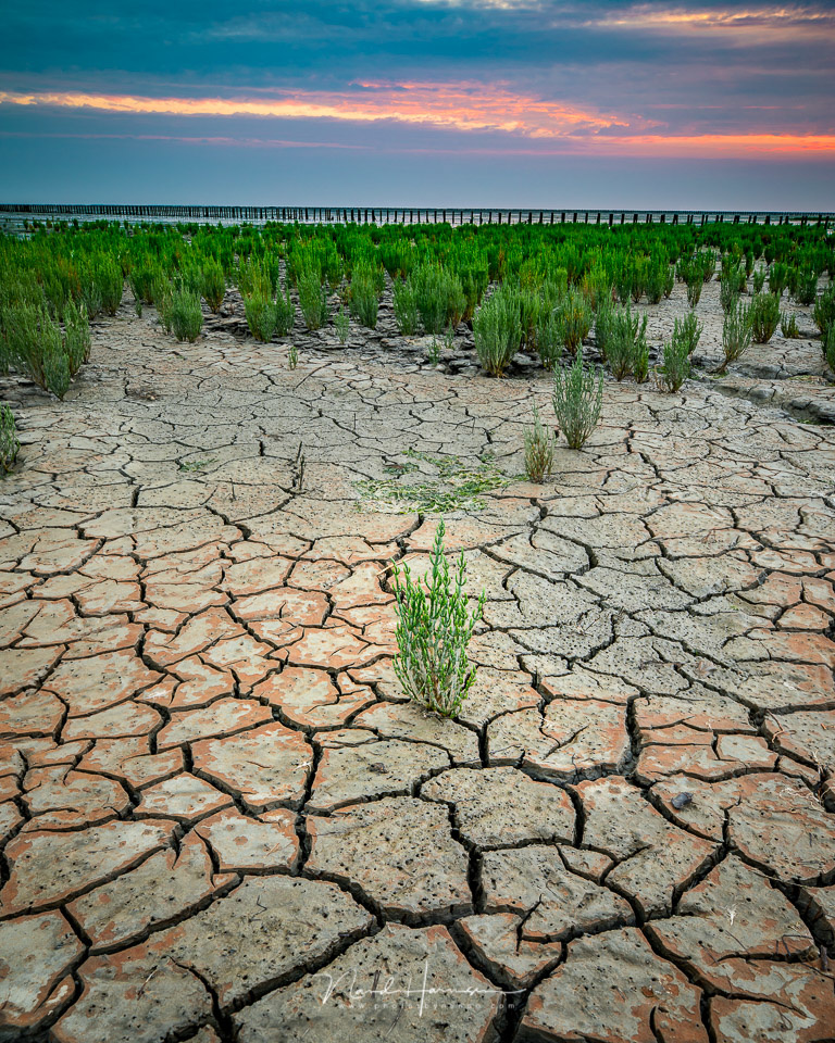
If you encounter this in your next landscape photo, why not rotate the camera 90° clockwise or counter-clockwise and make a vertical photo? This way, you have lots of room to play with the spatial orientation of both foreground and background; it will also prevent you from having unused space on the sides.
Fixing the Long Vertical Aspect Ratio
I often have an issue with vertical landscape photos. The aspect ratio of 2:3 that belongs to the full frame sensor makes the image very small and long. It has a strange look to it, and it keeps me from using a vertical orientation, because it doesn't feel right.
That is when I read an e-book about aspect ratios, written by photographer Bruce Percy. I’m not going to explain the reason why in this article, but he considered the 2:3 aspect ratio to be very unforgiving and perhaps even wrong. I wouldn’t dare to claim this myself, but I found it to be very true for the vertical images.
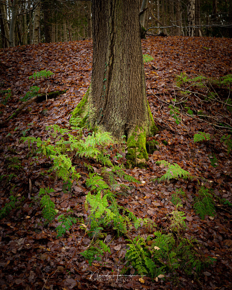
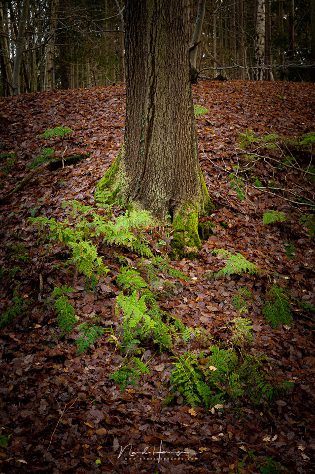
This is when I started experimenting with the 4:5 aspect ratio for my vertical images. To my surprise, it worked very well. The images no longer felt too long or too tight. It became easier to make a good division in the frame.
By cropping the image from a 2:3 aspect ratio into 4:5, the image becomes much more pleasant to look at. If you shoot with a medium format camera, or a micro 4/3 camera, you will have a similar aspect ratio already.
The results are much more pleasant to look at and much more natural due to a more balanced aspect ratio. I could also relate to the opinion of Bruce Percy about the difficulties of finding a good composition with the much more elongated 2:3 image. With a 4:5 aspect ratio, it becomes easier.
I am convinced the 4:5 aspect ratio is the best choice for vertical images, and every single image I take in this orientation is cropped this way. I make sure I leave enough space on either side of the image to make this crop possible without losing important image contents. This is, of course, a very personal preference, but you should try for yourself and see the result.

If the image is cropped to 4:5 aspect ratio, it has a much more pleasant feel to it. There is a better balance.
Vertical Landscape Images Are Not Always the Best Choice
Although I think vertical landscape images can be a wise choice on many occasions, there are just as many situations when the traditional horizontal orientation will work just as well or perhaps even better. I also believe a 2:3 aspect ratio can work very well for horizontal images.
If I shoot the landscape in a horizontal orientation, often, I want to show the vastness of the land. For this, a vertical orientation won’t work at all, and most of the time, I think even a foreground object in the frame will only distract from the vista. On those occasions, I like to crop to a 1:2 aspect ratio, giving it an even wider panoramic view.

A horizontal image is perfect when the subject asks for it. Just choose the best orientation in the field. I often crop a horizontal landscape image into a 1:2 aspect ratio to capture that wide view.
Use the Orientation of Your Photo That Suits You Best
It can be difficult to decide which orientation your image should be. A good landscape photo has a clear subject, I think. Often, the subject you want to photograph will guide you in finding the right orientation. Just make sure you are able to place the elements of your landscape in such a way that they balance the composition.
How do you prefer the orientation of your landscape photo? Do you use a vertical orientation a lot? Please share your thoughts in the comments below.


If the world was meant to be seen in a vertical aspect ratio, our eyes would be aligned vertically on our foreheads.
Just kidding.
I agree with pretty much everything in this article, particularly the comment about cropping vertical images to a 4:5 aspect ratio. Nevertheless, I do shoot in landscape orientation about 80% of the time, but that's probably because I like to fill the frame when I view images on my screen.
I try lying down, to get my eyes in the right orientation ;)
lol
A nice 16:9 crop can do wonders for a screen.
Thanks to Instagram I always try to get a vertical 4x5 or 1x1 shot (in addition to whatever aspect ratio best suits the subject)
Instagram and smartphone photography has made vertical shots also popular, indeed.
Love a vertical landscape shot Nando, good article.
I commonly do a balance of both and often do a panorama comprised of all vertical images which I've later used for a single shot too. I also use 4x5 but I often try to plan it first do that I can compose my image in camera to account for the cropping in post.
I agree that landscape photos are too often shot in "landscape" orientation. I find that most of my best photos are done in a vertical orientation, which gives more space to balance foreground and background. Thanks for putting into words what I've been thinking for years.
You're welcome.
Vertical shots format can be addictive, it's easier to include foreground interest and remove any distractions from the sides.
Thanks for the article
Thanks for your thoughts on this.
love the images