
The day has finally come in which we are no longer bound to the square crop within Instagram. The ability to post horizontal and vertical images has been requested by users since the beginning of the app. In the past, you would have to open your image in another app, add borders, and then export the new image to Instagram. Since this is the process I follow, I know it’s a huge pain. But even with this new cropping ability, I’m sticking with my old ways.
When posting to Instagram, I feel it’s important to have some sort of consistency in the way you post. I think it looks a lot cleaner for all your images to have the same crop, whether it be all square, horizontal, or vertical. When you have a mix between all the different crops, it tends to look messy and cluttered.
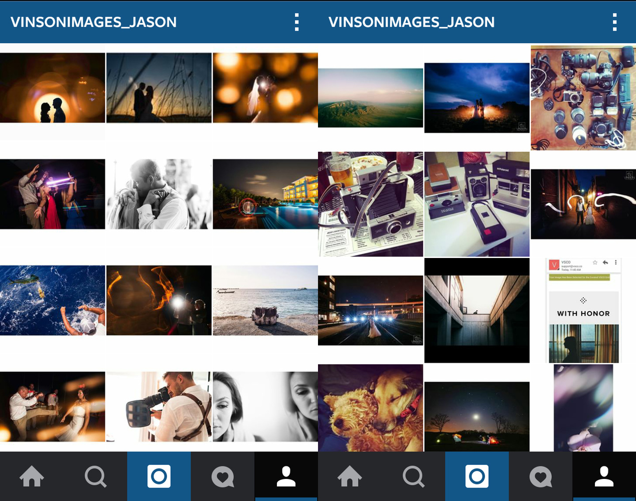
The left is my current feed. The right is before I got organized and almost every image in each row had a different aspect ratio.
Because of this, I have chosen to stick with horizontal images (that and 99% of what I shoot is horizontal). So, when the new crop function was announced, I got pretty excited. No more third party apps, no more borders, and no more having multiple copies of the same image on my phone to deal with. But when I tried it, I realized that it wasn’t that simple. Yes, the image showed as horizontal in the main feed, but for some reason, the image shows as a square in the gallery. I don’t have an issue with switching up the way my feed looks, but I don’t like that I have no option to choose what part of the image is cropped. I have a tendency to play around with abnormal compositions and this can lead to the cropped image not actually showing the main subject at all. If you are a user looking at my feed, you could end up seeing an empty box, or someone cut in half. This makes your work look amateurish and could lead to less engagement and less followers. Also, users have no idea if an image is square, or if it’s just a crop of the real image, unless they actually click it.

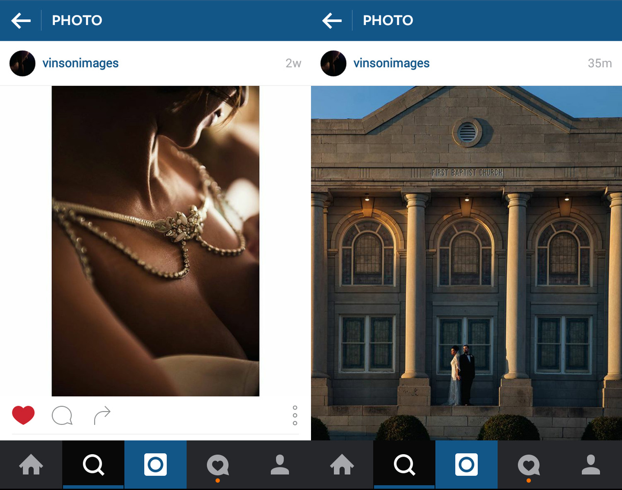
The first image in the feed just looks like a black box, but when you click it, you can see that's not the case.
One of the added bonuses of the new crop tool was being able to have images that no longer had borders around them. I was hoping to be able to take advantage of this new feature by having my Instagram auto-post to my Facebook account to save me a few steps. But as it turns out, images look completely terrible when you do this.
The only real advantage I can see with this new feature is if you post vertical images and don’t mind the images being cropped for your gallery feed. When posting horizontal photos, the images show as the exact same size no matter if you do the old way with borders or the new way without borders. However, vertical images are displayed significantly larger. They basically take up the entire screen now, which can make your image stand out in someone’s feed.
What do you think? Are you using the new Instagram crop tool? Why or why not?


Congrats on not using a tool.
Thank you!!
In the example "messy" profile, there are black bars (nobody does that), mixed with the white bars, and square images. That's messy. What you've convinced me of is that adding bars to the image is messy unless you paint yourself into the box (pun intended) of *only* ever being able to post landscape oriented photos. You don't like that the non-square images in the new layout get cropped square, and are worried people will judge your work based on a ~200px square image in the feed. If someone tells me I'm a bad photographer by looking at a 200px image in the main gallery of my Instagram, and didn't bother to actually tap the image, I'll laugh at them.
tl;dr - I think that the "horizontal only with white bars" thing is an unnecessarily limiting gimmick and doesn't utilize the platform very well.
I'm not saying off of one image. But if there are a series of images cropped badly, and I have to click in to see each one not even knowing if I'm going to find an uncropped image, then I'm not going to stay long or bother with my time. All the time I'll go through someones gallery zoomed out and be able to make a decision without clicking into an image (like I just did for your profile, nice work). If a user has to click into an image, that's an added step that could turn some away.
(Thank you, likewise). I suppose that's true, the squint test is important. I just feel that the thumbnails are so small, you have to click into an image to really see it anyway. And it's a matter of what's more beneficial overall—having each photo look better as they're posted / viewed in a stream, vs how a profile grid view looks.
Totally unrelated, the attached image is one that I marked a while back as inspiration for awesome wedding photos. Really good stuff.
Very true. I guess my thought process is that having my images show well in the stream does not bring in new followers, because only current followers will see them that way. Unless they are being viewed through some type of tag.
and thank you! That's definitely one of my favorite images as of right now.
"Huge Pain"??
I'm always surprised at what people think is suuuuuchhh a huge pain. The quality of articles on this website has declined considerably since inception. I do like the BTS with Elia Locardi though...substitute this stuff with more content like that.
Good, engaging, in-depth content doesn't just grow on trees. Some articles are meat and some are filler. I don't think they're pretending this is a groundbreaking piece, just light commentary.
its all relative and could boil down to first world problems obviously. But I post pretty much everyday so having to spend time in a third party app just to get my crop and then having my phone fill up with images does become a pain.
As for the quality of articles, I'm up for suggestions if there is something you are wanting to see.
With all do respect Leigh, these seemingly "filler" articles while not "ground-breaking" still create great conversation amongst followers of the site (like this one)... and things like this are often times the exact thoughts, concerns, etc. that are on the minds of creatives but we may think we're the only one thinking of it.
2 great points were made here and gave me serious food for thought, both of which did not come from the article itself BUT the discussion it inspired...
1) "All the time I'll go through someones gallery zoomed out and be able to make a decision without clicking into an image (like I just did for your profile, nice work). If a user has to click into an image, that's an added step that could turn some away." - Jason Vinson
2) "I guess my thought process is that having my images show well in the stream does not bring in new followers, because only current followers will see them that way." - Jason Vinson
What matters to some may not matter to others, and vice versa... I LOVE IT!! Keep Rockin' FSTOPPERS!!
I'm bad lately with my IG social media accounts. I find the more I shoot sets I can't immediately release, the harder it is for me to find content to share, and I've never been big into bts stuff. Maybe I should start! I'm sticking with my old ways for now and wont be using the option either
When Kim created her account, we decided to go horizontal too (as a way to post a different version than my squares). We had a lot of discussions this week about if we change or not. For the moment we'll stick as it is. So your post is greatly appreciated ;)
However, theres a major disavantage of using #nocrop apps: you rarely get featured. It barely never happens for Kim, but on my side I get many every week.
https://instagram.com/kimhenry.dance/
Interesting... I don't think I have ever been featured. I assume I would know if I had? Don't even know where to check actually. I guess that would be another thing to take into account when deciding if Instagram is biased toward certain crops/borders. I would be interested to know if it changes now that they allow different aspect ratios.
yeah that's a good question. I know that some features account specify "square images only". That reveals a lot!
The square culture is very strong and will stay like that for a while.
I love that kind of posts. And the ones from the_gris also ;)
Oh and yes, you would have know if you had been featured. Anyway you have to use proper hashtag for that.
Check out this one, it's my biggest feature so far. Did it worth it? You can not imagine... ;)
https://instagram.com/p/2_d0bsITsF
I have quite a list, by theme/region, if you're interested ;)
Wow Eric! Such an amazing work in your IG account. I'm astonished!!!
We've been discussing the same thing this week. In particular, wether the overall feel of the thumbnail / gallery page is important. It isn't that we expect be judged on 200px, but on the feel of the page as a whole, at first glance.
I agree that a variety of crops looks messy. Subjective, sure, but still, I appreciate that someone was thinking along the same lines as I was.
I definitely think how your feed looks at first glance is much more important than how your photos show up in the stream. I've only been doing true square crops for the past few months and was real excited about this new update but when I posted an asymmetrical photo and realized how bad it looked on my feed I instantly deleted it and got over the hype of the feature. Once they have the option to choose the feed preview I will use it but until then i'm sticking to the good old squares. As soon as an account has a real clean feed im much more likely to follow so I plan to keep mine looking as good as possible.
It's 2017. I just want to be able to choose the feed preview (thumbnail) for landscape photos i post. Is this really still not possible?
Fair enough. I for one am embracing this new crop feature as most of my work is panoramic. Now I can show nearly the full shot. Instagram has never been about posting high res images either, so the resolution factor really doesn't matter. As for the 'messyness', not sure what you are talking about as my feed still shows square previews?
@mack_photography_nz
i was saying it looks messy when you do the old way of borders for your horizontal/vertical images. The new crop works good for you since you already posted square prior and landscapes don't get hurt to badly by getting cropped to a square for the gallery view.
Ah yep I see :)
I think the news few if more important than the gallery. People who would notice the inconsistency in shapes on the Instagram gallery are other photographers looking to critique. Normal people will be too busy looking at good work than to notice.
have you seen the people that only shoot for the gallery view? I cant find an example right now, but they basically cut their image into a bunch of squares and post all the pieces to make one large image in their gallery. What are your thoughts on that?
I debated. I used a white boarder on all my landscape photos for years and my profile looked so nice and orderly. But when the crop features came out I decided to go that route because of ease of use and how my more retaliate I could utilize.
BUT, for someone who who shoots subjects, the square crop in your profile very likely will crop out people and important details of your photos as you've highlighted very well. The feature isn't for everyone, and most people who use Instagram are not professional photographers who just to share their Chicken Parm with the rest of the world...
My wife was just complaining about the same thing - the lack of control of the crop in the gallery feed is a total pain
As a videographer and photographer, being able to post higher resolution photos and video takes the cake. It is not very hard to "instasize" my work, but rather then running it all through a re-sizer and adding useless borders I would much rather post it directly to Instagram in the aspect ratio it was supposed to be seen in. Consistency is cute, quality of work is more important in my mind.
That's the point of adding the borders though. So that the work is seen in the aspect ratio it was supposed to be seen in. otherwise you are forced into a square.
Useless article.
If you can't post good looking square pictures maybe you should get yourself website where you can post your portfolio instead of flooding Instagram with duplicates of your Facebook photos.
I actually have a website and most of the images I post to Instagram are not posted anywhere else.
New update just ruins authenticity of Instagram. Square format and FXs Instagram used referred to real film format and film development process techniques. Those who still posting vertical/horizontal pictures on Instagram remind those people who try to use their two door sport car as a family van. Facebook and VSCO are good enough for posting your portfolio work and Instagram should be used in its original way. There are bunch of photographers who managed to post interesting beautiful pictures in square format; those look original, not just a duplicate of Twitter / Facebook feed.
"Referred to real film format"? As if square is the only film format? No.
The is Steve McCurry's instagram feed. for me it's about content. Bu that's just me.
He is not using the new crop feature either.
Also, here is a screen grab of his most recent posts....
It is not that bad, well when you upload any type of image either vertical or horizontal and then open it, it can be seen full size. I agree the thumbnails are small but the real image is not, so you can reconsider it.
Jennifer Susan - Software System Engineer at http://autolikesig.com
Why even bother with an article like this. Who cares...
except for the part in the article where I talk about images getting cropped to square for the gallery view and the possibility of cropping off important detail.
It's 2017. I just want to be able to choose the feed preview (thumbnail) for landscape photos i post. Is this really still not possible?
Let's resurrect this topic. It is so true! I am going to rephrase the article a bit.
I want to have control over how an image is framed or cropped within the square shape provided by the Instagram grid.
As a photographer I visualize either a landscape or portrait composition. I know that I can have these orientations in my IG posts but what about the grid?
Let's say I post an image in landscape layout. That is my preferred composition. But that image also has to appear in the grid - fitted to a square. Maybe I want to choose the right side of the image (rather than the center) to be my square crop for display in the grid. I suppose I could accomplish this in Photoshop or Lightroom but it sure would be nice if I could control which area of my landscape frame will be framed withing the grid square. I have searched high and low for an answer. Maybe its simpler than I am think.
Any new ideas for adapting to this little design constraint in 2018 ?
I think it's a good feature, because when someone upload a photo, can select the part the user wants to shown up. This has some problems also as you said.
Sandra Lucio - Engineer at https://www.takeinsta.com/