As any photographer knows, understanding color space and color management can be one of the most difficult concepts to wrap your head around. What is the difference between Adobe RGB and sRGB? Why do magazines always print my images with funky colors? Why do I need different profiles for different devices? I still have trouble with these concepts. Luckily photoshop guru Kevin Kubota has made a really useful video explaining how color management works. If you are simply displaying your images for the web then most of this won't really matter but if your images are being used commercially and sent to different devices then you might run into problems. If you have any questions or comments, please leave them below. My rule of thumb is , when in doubt, edit for the iphone/ipad!

Related Articles


Something that should be noted is that the quality of your monitor is extremely important. He's using an Eizo which are the best. Buying a monitor is like buying a lens, you always buy the most expensive you can afford.
Believe it or not, MAC monitors are not high end...look into NEC, Eizo, LaCie...those are the best!
Good point.
I've JUST been looking at monitors recently and was fairly surprised to find than most consumer monitors (even good ones like my Samsung) will only cover sRGB anyway - so won't see much of a difference with this stuff.
In the UK "wide gamut" monitors which can display AdobeRGB, or close to it's entirety start ~ £400+
Question that I ALWAYS do every time an "expert" talks about it and NO ONE could give me a decent answer until now:
IF, inside of that "WHOLE SPECTRUM" there are colors we can not see or can even be printed, HOW, in the name of our Lord, they put them there and we are seeing?
The FACT is: if you don't know WHERE you will print your image, and make several tests BEFORE to know how the calibration of you monitor will be post script (EPS) to your printer PURE BS to useANY kind of device. Even "calibrated monitors" show us DULL images what you can make 'pop' from the paper with a simple application of a UV varnish.
SO, if you know you final media, good for you. Still working hard to TRY to match with what you see in your, mine, his, her monitors ...
I you don't, repeat after me: "The Lord is my Sheppard an even I walk ..."
Nite Nite everybody!
But Kubota ... how you can teach about colors if you are color blind? Or you will want convince us this shirts that you use are NOT from your wife's closet?! Kidding buddy ... nice to see you again and sad to know you retired fro Wedding ...
Really cool video. I've gotten very good results from mpix pro labs, but I've always saved my jpegs with the quality of 12. I'm interested to see the difference, if any, when the jpegs are saved to the quality of 10. Can anyone else attest to Kevin's findings?
He seems to look at colour space in the opposite viewpoint I have. I would rather work in RGB colour space so that I dont loose colour space later at the printer. In his example you can see how the saturation changed from the adobe colour space to the printers. If you just edit in RGB you would not be loosing the maxim value for the colour as the printer is able to encompass the whole colour space. This is especially important for web work as a lot of the time the only colour space supported is standard RGB. If you are to edit in adobe RGB the moment you upload to the web your photos will look a lot different.
Ha I was actually thinking the same thing....if it looks good in sRGB then it should fit inside all other spaces with the exception of CMYK. 9 times out of 10 the most important medium for me is a normal uncalibrated home computer or mobile device because that is what my clients are viewing my work on.
I agree with Patrick. The typical consumer isn't going to notice any shift in color from a small color space. Unless you're shooting for Fortune 500 media campaigns (who will have a designer who proofs and color matches, etc) the most important thing here is what he almost skipped over - get a Spyder (or similar) and calibrate your monitor. sRGB is what 99% of the world will see your images in via their web browser. Adobe RGB vs sRGB is splitting hairs.
Bingo! So long as your screen is calibrated via a hardware device (ala spyder) you have a correct reference point to start with. While other clients screens may not be calibrated, it should at least be close to the desired look. The worst thing you could do is have a uncalibrated screen and edit all of your photos to fix the problems that reside in your screen. For example if your screen has low contrast you may end up cranking on way too much contrast in post to compensate. Later when those photos are viewed on another screen they look terrible. The good news these days is that a lot of mobile devices seem to have pretty decently calibrated screens. Work proofed on my PC looks nearly identical on the iPad, iPhone or Samsung Galaxy.
The reason we would urge you to work in a larger colorspace rather than a smaller one has nothing to do with how you show your work. It has to do with with the mathematics on how values are shifted when an image is retouched or developed. Today, even Adobe RGB is "too small" to play along with the wonderful cameras out there.
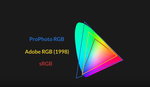
When I did my last webinar for X-rite, I got heaps of emails from people around the world asking the most asked color management related question of all; why should I work in ProPhoto RGB when my even my high-end monitor cant cover the full volume of an Adobe RGB profile?
Well, your monitor cant, but your cameras can. And by far, go past the Adobe RGB colorspace.
So we recommend working in ProPhoto RGB to make sure you have all the info your camera can capture, even though you only need Adobe RGB for print, or sRGB for the web.
Once you have developed your image the way you want it, convert it to fit your destination.
Jon R. Trengereid.
Photographer & Educator
X-Rite Evangelist.
Too funny he's saying to work in adobe RGB, when most every lab out there asks for sRGB when you send them files...sure you can work in adobe color space, but you're going to throw out everything when you have to convert to sRGB, which, like someone else mentioned, is how everyone is used to seeing images....Even Bay Photo prefers sRGB.....if you're in to wide gamut ink jet printers, that's great, but for people who deal in RA4 printers, sRGB is sufficient...
I switched from Adobe RGB to sRGB because when I was uploading my pics to Flickr they were heavily desaturated. Anybody had that issue? Am I supposed to post sRGB files on Flickr and send Adobe RGB files to Bay Photo? That would be a pain....
It may happen when you use "Assign profile" instead of "Convert to profile"
Thanks for the clarification.
My camera and I imagine, most cameras (if not, all DSLR's) have the option to shoot in Adobe 1998 and sRGB. Does that affect the photo if it's taken in RAW format?. And is it better to shoot in Adobe 1998 mode?
It does not affect the photo if you shoot i RAW.
i couldn't see anything on his screen when he switched to Adobe RGB cause my monitor is sRGB...