Automotive photography can be an extremely rewarding niche in the photography industry. The fast, shiny, power-inducing machines that rush by in a blur of color can be a thrill to anyone photographer, but it can also be daunting making sure that every detail is just perfect. Automotive photographer John Zhang walks us through the post processing of one of his lates shots of a Lexus LFA.
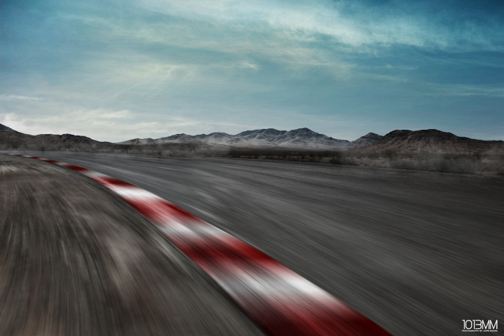
"There are certain circumstances when you get a chance to shoot a dream car, but you are faced with a location or environment that isn't too ideal. In my case, I was given a chance to shoot my friend's new Lexus LFA and wanted it to look special in the end. The original shot can be seen below. It was shot on the highway with my Nikon D800E out the window of another car."

"As you can see the original shot was anything but special. I shot it knowing that I would composite it. And so I did."


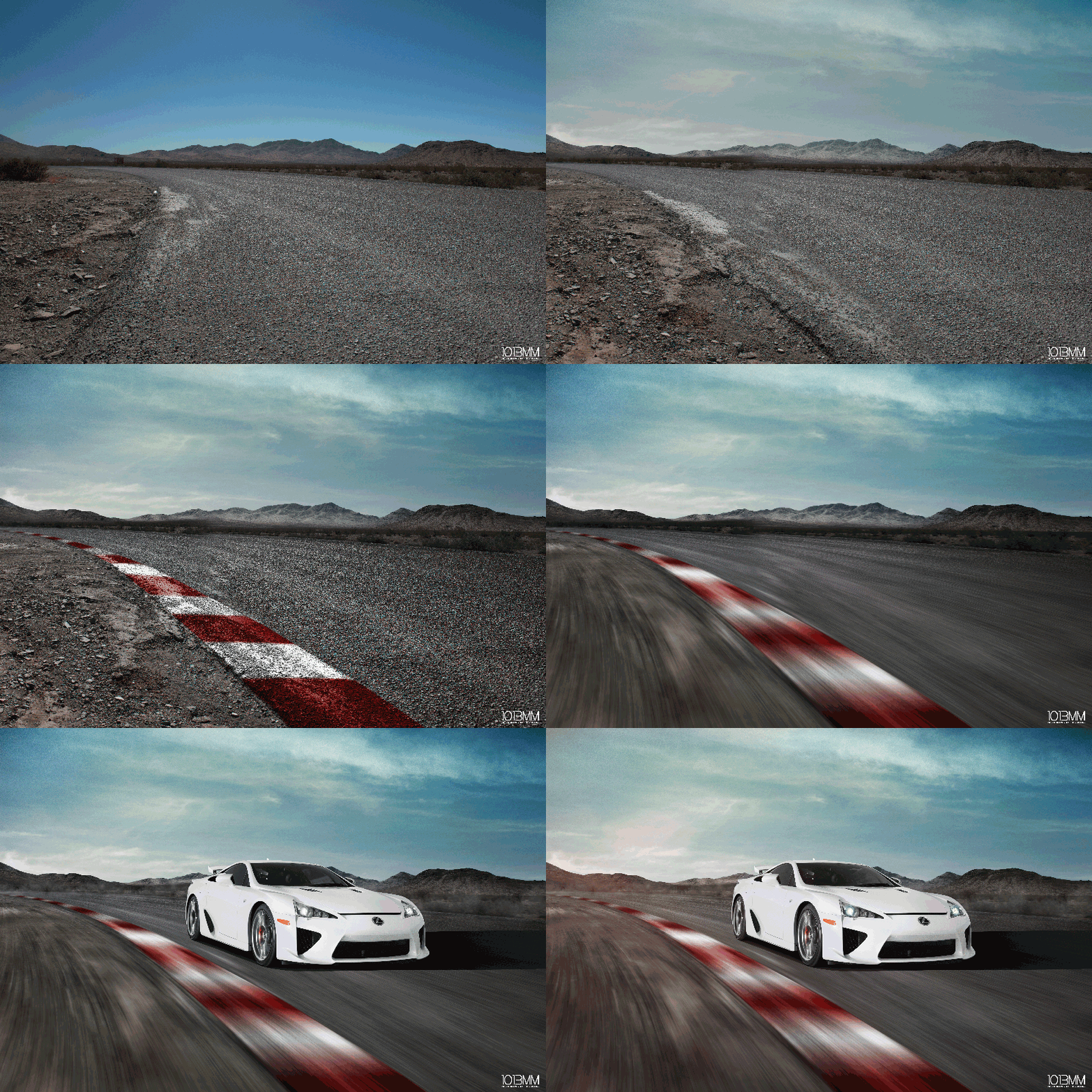
"Whenever I don't shoot cars, I shoot back plates for future composites. I have a library of about 10gbs of back plates to chose from. The main back plate I chose for this image was from the desert. I shot them, while I was on the way to Las Vegas. The great thing about shooting multiple angles of the same back plate is that you have more room to get creative and a better foundation to work off of. In this case, I was able to change the way the road turned to better suit my car."


"Next up, I bumped the contrast and played around with the color grading. "


"Then I added some rumble strips in Photoshop. They didn't need to be 100% perfect because I would go onto the next top to add motion to it. To add these rumble strips, I merely chose a hard brush and brushed the red and white in."

"Then I added some motion."


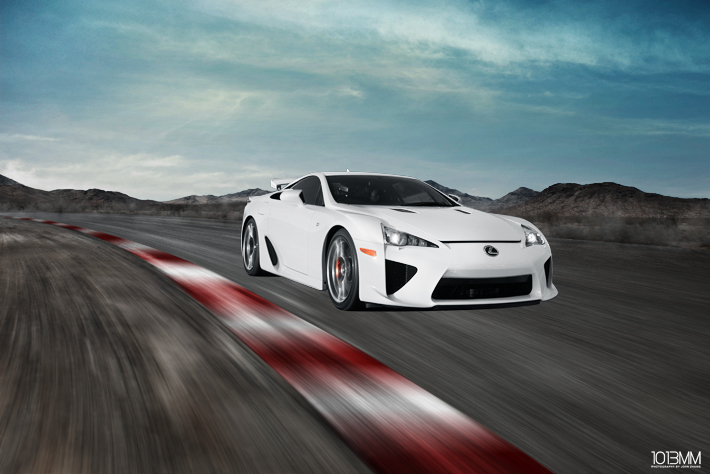
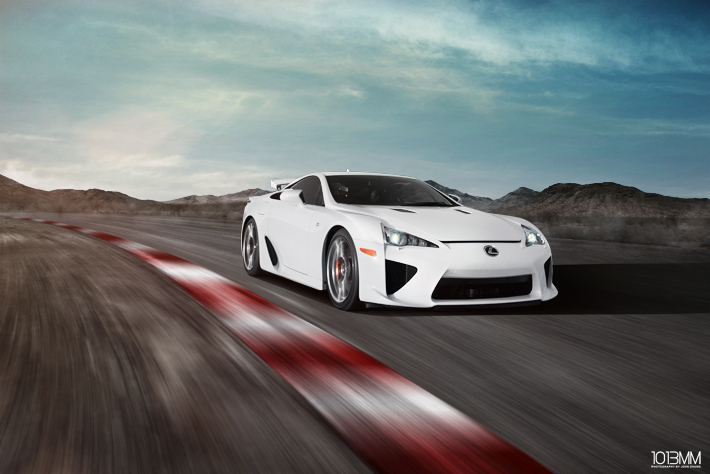
"The hardest part is to add the car into the scene and make it look believable and not "floaty". This means, that the shadow I draw for the car would have to match the main light source. In this case my main light was the sun shining down from the top left of the image."


"Below is an image build gif that will show you in one animation of what was done to the image."

"My name is John Zhang. I also go by 1013MM. I am a freelance automotive photographer from the Los Angeles area."
I would like to thank John for taking the time to breakdown this amazing shot for all of us at Fstoppers. If you would like to check out some more of John's work you can find it at some of the links below, and if you would like to guest write for us at Fstoppers please send your submissions to contact@fstoppers.com or rebecca@fstoppers.com.
John Zhang:
Website: http://1013mm.com/
Facebook: http://www.facebook.com/1013mm
Instagram: http://instagram.com/1013mm
All photos and guest text created by John Zhang and used with permission.


how did you add the blur? did you use that special program (cant remember the name) that is used for motion blur?
virtual rig studios?
Either that one or Bleex if you're using Mac to edit.
its a filter motion blur @yamaha83:disqus
how do you get motion blur to curve in the direction of the road?
why not just take one photo of the car and not composite anything?
because that "track" does not exist anywhere in the world.
reminds me of that iranian airplane.
Some times less is better.
A slightly different angle on that highway and i'd stick to that. There's so much detail that distracts the user from what we should be looking (the car).
The first image is blah at best, the only thing that stands out is the actual car. Which normally is interesting in it's own but for advertising or a project, it isn't. By no means is the original picture better than the finished composite.
Either he used a different photo of the car for the composite than what he shows above, or he's done a ton of work making the car appear as it did in the composite too.
Same car flipped the other way....doaaaaa!
I know its flipped. I'm talking about the lighting. The car in the original photo is tan/brown due to the shadow all around the car. The one in the composite is straight up white. It looks like a lot more work than cranking up the brightness. And he flipped the Lexus emblem (though that part is easy). Maybe it's not as much work as I'm thinking, but he certainly made some adjustments to the car in the composite.
oh yea, for sure.
He probably just pen tooled the car, made a selection, then hit it with curves and a hue/saturation adjustment layer, desaturating the yellows and bumping the brightness.
this is what i am looking ... Tanx fstoppers
Awesome!
The end result just screams "shopped" to me.
It does, I personally like the original shot better. I know its plain vanilla, but that was done on purpose. I personally believe a composite should only be used when shooting with a lot of variables. I think some extra creativity could have made this a better picture
still something wrong w/ the shadows/lighting...doesn't match IMHO..
Hey guy´s what do you think about my Digital Artwork from a Mercedes SLR AMG?
http://this-is-the-life-of-chris.blogspot.de/2012/07/digital-art.html
inkl. a litle Making of video
I think the composite looks amazing! I think John took a somewhat boring shot and make it his personal style! John imo did an amazing job! Keep it up Mr. 1013mm!!
Beautiful work done with the motion car with incredible photo effects.
http://www.salvageautosauction.com