
Recently, someone in our comments suggested a really cool idea, and we need your help. If you've been featured on an episode of our Critique the Community, help us with a future video by responding to this post.
Critique the Community is a series we release on our YouTube Channel, where the readers of Fstoppers get to have their best images critiqued by Lee and I and sometimes a special guest. For the most part, the first time we ever see these images is when we film the episode. Therefore, rarely do we get to hear the full story about how the photo was taken, the challenges that the photographer faced, or some of the accolades or income the photo received after being published.
What I'd like to do for a future episode is showcase some of the most popular or controversial images featured on the show and share the full story behind the image.
If you have been featured on Critique the Community, please upload your image below along with some background information about the photo. Also, if you remember our critique of the photo, please give your rebuttal and share any information that might make us see your work in a different light.
When will this video go live? I'm not sure yet, but hopefully, it will be online in the next month or so.
For those of you who have never been on the show, you can submit your images to Critique the Community by clicking this link or by going to the Contest tab at the top of the Fstoppers website. We have new themes every week or two, and you can always watch all the previous episode here on our YouTube Channel.

Join the Fstoppers community for free
-
Post comments and join in the discussions
-
Browse the site ad-free
-
Share your work and get featured in the community
-
Compete in the photo contests for fun and prizes
44 Comments
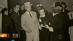
I was fetured a long time ago with this shot.
The critiques were basically along the lines of "Was this in camera or photoshop" and "It'd look better with a different model"
The full story behnd this image is that a local musician needed some images for press/album/socials/etc. I was just getting started with photography probably 6-8 months and was inspired by the work of Nick Fancher who does this sort of thing but way better. It was done totally practically by having three speedlights with three different coloured gels, which meant that the shadow of light #1 got filled by light #2, the shadow from light #2 got filled by light #3 and the shadow from light #3 got filled by light #1.
Overall, I still like the image, and you two were right, with some different processing and a different model/pose it would be a four or 4.5 but as this was a musician, and not a mode it sort of gave it a 'three' ceiling. But still it was in my portfolio for probably a solid year and change.
I had my photo critiqued in the commercial photography episode. Needless to say it wasn't good as I had applied a little too much HDR on this shot. I didn't take it too badly though because good advice always helps to make you a better photographer.
This aerial shot was of a heavy transport move. It was captured by an Inspire 1 Pro with an X5 as the load was coming on to a bridge crossing the Mississippi River near St. Francisville. The cargo was a manifold for a chemical plant and I don't remember the weight but it was quite heavy as it required a trailer of that magnitude to carry it. I do this type of photography work all the time and this is one of the smaller loads. We do the same type of big moves you see on the show Mega Movers and we were on the Discovery Science Channel's show called Heavy Metal Taskforce.
FYI I don't apply that much HDR on all my photos. Lol
You could also request the story of the picture in its description, as a condition to participate, it'd be easier I believe.
If you look at lots of the images in the critiques many of them already have the shot info/story (the mercedes photo in the recent one for example) they just don't read them often
The images are often presented to us without us ever seeing them (or only one of us seeing them). Having to navigate to each image and then read a story would make them too long. My hope here is we can hear the stories from some of the most interesting images.
Could you not simply create a 4th tab in the contests of "featured photos"? then all you have to do is pull that up for the video using your built in website gallery and you would already have the description on your ipad beside the picture. It would also be nice for users; I often want to look at the images after (or during) the video to read the descriptions and it can be quite annoying unless they are on the first page of top rated images.
I also don't think one person pre-reading or printing off the descriptions for the images ((if they have them) is an insurmountable amount of prep work for the video. I would use the skip button less if half the critique wasn't answered by the image descriptions
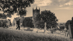
This shot *almost* won the `moody` contest. It lost to a volcano long exposure.
I've had hosting a photography meetup in my small town outside of LA for roughly six months before coming to the conclusion that the larger photo community in this area is more interested in shooting babies in boxes than the style of photography that I've been practicing. So I stopped doing the photo meetups and decided to refocus that energy into making larger-scale images, with the help of the few folks that I found were still engaged.
This particular image came about because I was watching Ole Joergensen develop an image on instagram (https://www.instagram.com/p/B3q6B1VHtgF/) and I figured it would be a really simple way to get everyone's feet wet in narrative photography. All we needed was 1-car, 1-model, and a location, super simple. Well, the idea ballooned into a crime scene, with four models, four sets of the wardrobe, a car, location, and cohesive story to tie it all together. "No problem, I wanted to do larger images," I said.
I put a casting call out for the guy behind the vehicle, and that's how we found Allen Dawber. I reached out to Brooklynn directly, as she said she wanted to work with me whenever there was an opportunity. And she worked perfectly because I wanted the girl to be the immediate draw - so wearing a white dress, blonde hair, in the headlights, so the brightest element in the shot. Garret, the dead guy, is one of our core local photographers in the group, and I volunteered him to be in the shot - in addition to helping with production. And our shovel man, James, was the brother of my hairstylist who just happened to own a 1960's era pickup. We had originally planned and booked a fella with a 60's 4-door Oldsmobile, who was going to be our shovel man & car. However, his car broke the day of the shoot forcing us to push the shoot back a day, and scramble to source a new talent & car. I scouted a few days for a good location, and stumbled on this private back road. It was going to work perfectly because I was going to be able to have the "on-coming car" either rounding that far backbend or show the headlights in that distant road.
For me, this shot was an exercise in:
a. Low, low budget production: I believe the total spend on this shot was $125 in wardrobe and miscellaneous costs. All talent and production were done voluntarily.
b. Dynamic Symmetry: The composition was laid out on a root 4 dynamic symmetry grid, and it was shot with an anamorphic lens. We laid out the shot and the grid with tape and marks on the ground. As usual, after I got into post, I recognized a lot more opportunities to develop coincidences and leading lines... but chalk that up to 20/20.
c. Creating a layered narrative: I wanted this story to unfold – and I wanted it to unfold in a particular order. My intention was to have it go:
1. Brooklynn (potentially broken down), Guy behind the car is potentially her husband, Brooklynn's gaze guides you to the dead-guy storyline (it's also the second most lit part of the image).
2. Dead Guy (Uh-oh, a little darker) Guy behind the car is with the guy with the shovel
3. There's a car coming, and this nefarious situation is about to be intruded on
There are elements I wanted to remain qazi mysterious – like what's Brooklynn's role in this plot? And who is driving up? Is it a friend, or is it trouble?
4. I always wanted the end result to be for Brooklynn to appear as though she has regret. About what is up for grabs.
This was all shot in about an hour and a half. Between 6:00pm-7:30pm. The background plate was shot about 30min before sunset, and color adjusted to look like a full moon night. Garret (Dead guy) and James (Shovel man) were the first talent, shot at sunset, so I could get all the free fill light. The second was Brooklynn immediately after. She was lit by two strobes acting as headlights, and I needed to pull out a bounce + box to get enough rim/fill. Afterward, we shot the truck and the lights inside and emitting from the truck. Then last, we photographed Alan Dawber behind the truck, with a beauty dish + bounce card. All the lights were gelled with a full CTO. The oncoming car was painted completely in post.
I believe the critique from you (Patrick) was that you wanted more expression from shovel man. And I believe you both didn't like this "glow" of an on-coming car but preferred to see a car in the distance. I did intentionally have his stance be somewhat indifferent to the oncoming car – this was to keep those questions about what's happening strong. As for the on-coming car, I didn't shoot one (I should have shot it just after sunset), although I intended to. It was chaos on set. It was a private road; I didn't have permission to shoot there (there was nobody to ask really), and if a car did drive down it they would either yell at us for whatever the fuck we were doing, or they would be stoked that this was happening. This chaos was all compounded by the fact that I needed to get it all done in quick succession - according to where the sun was. So since I had to add the headlights 100% in post, my best option was to make it a dull glow, and not make a comical attempt at my original plan (which was to have real headlights coming down the street).
This is amazing. Love seeing the BTS of this - well done!
I absolutely remember this shot, Beautiful work
I was featured on the wedding photography critique posted on May 16th, 2019.
My image was the title image and many commenters debated over your comments about photo-shopping the bride's scar off her shoulder.
This image was taken during the bride and grooms first look, just moments into the groom seeing her. So everything was happening very quickly, and I was working hard to capture all the nuances of their emotions and interactions, as this was one of the most important moments for them (more than any posed bride and groom images). So I knew going in it, that I wanted to represent it honestly and empathically. My style has shifted over the years (I've been a full time wedding photographer for 10 years now) to focusing much more on honest photojournalism and moment driven images. So in general, my clients hire me to simply be a witness to whats actually going on throughout their wedding day, instead of staging a majority of the "moments". I absolutely understand that other photographers (like Pye) ascribe to a different approach, and his clients hire him for his refined style and expert posing/lighting. But for me, I try to be as honest as possible. And that includes the images that I show on social media and my website (or as y'all say, "Portfolio Images"). As much as I understand the reasoning behind why y'all say that we want to perfect the images that we put in our portfolio, I think that at the end of the day, including things like scars are beautiful and perfect. And I think my clients hire me because I have that framework in mind.
A couple's wedding day focuses as much on their past, as it does about their future. Memories, traditions, and family all intersect on a couple's wedding day, and I try to celebrate all of that. And some of those memories include the physical reminders of falling off a tire swing and getting a gash in your shoulder when you were 12.
So while I do agree, we should be refining our images that we will be putting in our portfolio, I think the mindset behind what we do and do not retouch shouldn't be a "standard" for all photographers/couples, but instead, can depend on the couple's priorities and approach to their wedding.
On another note, Pye also critiqued how I cropped the image, and I totally agree with him. Cropping the image a bit tighter would have made it more impactful. And I should have noticed that and tried it.
I think this is a great idea that y'all are doing and hope I make the cut!
Cheers,
Scott
This shot, "Stranded #2" won the Stylized contest. The infamous `Lee's wife` critique. Katie loved it and had nothing bad to say about it. Lee loved it and also had nothing bad to say about it. So there's really nothing to follow up on there. I debated even posting this one here as a result, but I'm still going to because of how the shot came together, and what I think makes it worth talking about, despite it being one of the most simple images I've taken.
I'll start with the story being told in the image - which is a frame from a short story narrative project that Chris and I are working on together. This was shot as a concept art to shop around for producers, to help put the project together.
# The Story
The story goes that there's an accountant for a property developer in the desert suburbs of greater Los Angeles, who is the only link between the developer, and some shady characters that the developer employes to remove holdouts on the property they want to develop (Yes. Very western). The property developer hires her landscaper to "clean up" the problem. The landscaper brings the accountant out to the middle of the desert (because that's what they do in the movies), but doesn't want to be a murderer... So he leaves the accountant in the middle of the desert to either die of dehydration or to kill himself with the gun (that the landscaper brought to do the execution). The gun has one bullet. The briefcase has the "documents" that the property developer wanted "cleaned up" as well. So the story – from the point you're seeing in this still – is how will the accountant die, or does he live to enact revenge?
I tell the story only because all those story points are what went into the elements you see in the frame. There's a vast desert. He's sweating because it's incredibly hot, and he's quickly dehydrating. He's looking back at the briefcase as 1. the only other resource he has in his current predicament, and 2. the resource that got him into this current predicament. If he lives, it'll be his revenge. If he dies, it will be his demise. He lost a shoe in the scuffle of him being dragged out of the pickup truck. And he's holding his life or death decision in his hands - the gun, with one bullet.
Pre-production was as simple as dressing him like a nasaly accountant. Finding a location that looked like it didn't end. Finding a briefcase that fits the character, and finding a gun that the landscaper would have thought made the most sense. It was lit with 1-bounce card camera right. I had forgotten my tripod, so my camera is sitting on a cheap calumet a light stand.
So what I find interesting, and the only reason I'm dropping this image in here is that you can make an image that has a lot of impact, with almost no equipment at all (literally a camera + $5 foam core bounce card and $25 worth of wardrobe), and an abundance of backstory.
*Shot anamorphic. Because Sergio Leone.
My photo of George was featured on the ‘Environmental Portraits’ Critique, which received a 4 star average from the guys, I was happy with it!
I was working on a personal project(That I didn’t follow through on :/), taking environmental portraits of farmers in my area, and I knew my neighbour George would be perfect for the project. He has so much character and was very pleasant to photograph.
I noticed the old piece of equipment in the back yard and decided to use it for our location. I just told George where to stand, and he was a natural from then on, I hardly gave any direction.
The lighting was just as the guys had guessed in the video. I used the sun as a rim light and a strobe with a 2x3 soft box.
George and his wife liked the photo, and I received a lot of great compliments on it. One of my favourite photos I’ve taken.
https://fstoppers.com/photo/219455
I was featured in the Technology episode with the blue one. This was a two shot composite, one where I used a fiber optic wand to do the light painting, and one where I used a small flashlight to get a bit more detail in the guitar.
Most of the conversation was Lee and Patrick arguing about whether different guitars sound different, and wondering whether this was a Gibson Flying V (For the record, it's not).
Shot-specific critiques I got:
-The headstock isn't visible. I agree with that one.
-It looks more like an experiment than a finished product. I'd call this one half true. I do a lot of light painting, but I hadn't really done a shot like this until this shoot. I did a lot of different things with the fiber optic wand to get different effects, and out of maybe 15-20 attempts this was in my top 2, the orange one being my other favorite from the set.
I won the Swimwear and Resort comp with these 2 top scoring shots but was never featured or critiqued. Does that count! LOL
I was featured last year with my “flour angel” image. The biggest cc I got was with the lighting. I for some unknown reason lit it from the bottom up. I shot both images in my living room with the same lighting setup. I shot the girls first and sprinkled flour all over them. I made sure to be sloppy and get quite a bit on the floor so the masking would blend well. I then created the scene in the same spot and made flour angels with my finger. After that, just basic compositing and grading. I plan on doing something similar again, but this time I’ll make sure I light it properly. I definitely appreciate these critiques. Even seeing other people’s flaws helps make me push to do better. Thanks for all you guys do!
I was featured in, probably, the only critique where neither you nor Lee were the hosts, my shot was critiqued by Elia and Mike and it was a little controversial for the guys because for Mike (I still remember him rubbing his hands in excitement when he saw the shot) it was 4 stars (thank you Mike) but for Elia, it was a mere 2 stars.
This shot was taken in Namibia in the famous Sossusvlei area where there are these gigantic sand dunes, all of these dunes are named with a number and this is not the most famous 45, but I preferred this one because of this tree that gave a sense of scale, and I chose to use a telephoto lens and to not show the whole dune because I thought it gives you the idea that this dune can go up forever and the S shape of the crest is a nice leading line to the tree.
Even though it was almost the middle of the day the light was still interesting to me because of the light/shadow separation in the picture.
They said that with an animal in the picture it would have been much better and I can't agree more, so if one of them could pay for me to go back to Namibia and wait for an animal to come by I will be more than happy (for the sake of the art of course).
This was the other picture of mine that was critiqued, this time it was you guys, and I also won the free tutorial because of the random number, and I remember Patrick guessing I would choose Joey Wright tutorial which I didn't :D.
This was shot in the Italian Dolomites at Alpe di Siusi, and I shot this during a workshop I remember you guys talking about the light in this picture being too much for a stars' picture, well this is the light pollution condition in Italy, the light that you see on the right is from a ski lift while the light on the left and on the horizon is from little towns in other valleys. This was a moonless night and still, it seems like it was shot during the day.
This is probably the picture where I did the most postproduction work on as there's a huge dodge and burn work done using luminosity masks to bring out the snow dunes that were otherwise flattened by the lens.
I won the contest "your unique photo" a few weeks ago and was a bit confused about the critique as it was pretty harsh for me but well, that's the game! This picture is the result of a studio shoot mixed with 3D Elements. I placed a 3 point lighting setup with 2 flashes (Godox AD600BM) and stripboxes with grids on the sides for the edges, and a third flash (Godox AD200) with a beauty dish on the top. There are actually 2 pairs of tights over each other to make the legs even longer than the wide angle does. The spikes were done out of paper and Ducttape. And this was shot with a canon 5D mark IV and a Canon EF 16-35mm at 16 mm F7.1, ISO 100, 1/160s. The background is a 3D model and all the shadows and reflections were done in photoshop. In the critique, the image was analyzed as a photography and not as a composite, so I'm honored that the fstoppers team didn't notice it. Anyway, thanks for your support to the photogaphers. And by the way, the tutorial from Fstoppers is great! Thumbs up!
Best regards,
Thomas
I was featured a while ago with this photo.
IIRC you guys were wondering where this place was and whether this photo was taken from a helicopter.
The quick answers are: (1) this is the Grand Prismatic Spring in Yellowstone N. P. and (2) it wasn't taken from a helicopter but from a nearby hill.
Full Story
When I arrived in Yellowstone I had the highest expectations from the Grand Prismatic Spring because of some photos I saw online, but when I got to the viewpoint I was utterly disappointed because the raised footpath basically is at level with the spring and you can't see much of anything. After some research I found out that to get a better view I had to climb the hill on the opposite side of the spring after following a maintenance road for a mile or so. I went back the day and got the shot. Given the distance I used a 600mm lens to zoom in and get a more abstract and unique image
A few random facts:
- It's my understanding that the National Park Service decided to build a road/viewpoint to get to where I took this photo (correct me if I'm wrong, I haven't checked).
- It's basically a straight-out-of-camera shot.
- The white cloud-looking stuff in the photo is steam coming out of the spring.
- when I posted the photo online a few people asked me about the footprints you can see in the yellow area of the photo since people are (obviously) not allowed to walk out of the wooden footpath. The answer is that a few bison walked past while I was getting there and left some marks in the sand (or whatever that stuff is).
I was featured in a critique the community with Elia and Lee many years ago.
Elia was wondering if this was a drone shot. This is Egremnoi beach in Lefkada, Greece which has been included many times at the top 10 beaches of the world. You have to step down 350 stairs to get there (or you can take a boat). You can guess what I have chosen. I took this shot during my summer vacation. There were people on some of the sunbeds so I had to clone the umbrellas to get them out of my frame. If I could revisit the beach I would have avoid it. Also I changed the color of the umbrellas to make them look like a rainbow. I did it at first for fun but I liked the final result and so I kept it this way.
This is one of my favorite photos. I have a 60x90cm print hanging on my wall at home.
It was also chosen as picture of the day here at Fstoppers after the video went live on YouTube.
This was a photo that was featured in an Critique the Community some time ago. The comments of Patrick and Lee were: “What kind of lighting is that? It’s very flat,” “Where did the photographer get the models?,” “The styling of the clothing could have been better.”
Actually, I was riding my bicycle on the street in Beijing’s Houhai Lakes district and noticed a group of “Polar Bear Swimmers” warming up against a wall after a dip in the mid-January waters of the lake. I only had a split-second to get the shot before they became aware of the camera (one was aware and is the one who is hamming it up). I tried without success to clone out a parked bicycle handle in the foreground that blocked one of the swimmer’s feet at the bottom of the frame, but couldn’t reconstruct a credible foot, and so I reluctantly cut all the subjects’ feet off.
This is the story behind the photo—one that shows the difficulties faced by candid photographers!
Everything was covered in frost and it was a really beautiful day. I was really cold too, below -20C (-4F). I have photographed these trees many times in a nearby pond although I'm not a nature photographer. The that frost gave them an extra kick. And like you said that frost on the top of the trees really looks like a bad photoshop sky replacement. Now I see it every time I look at this photo 😃
Unedited raw export
Another camera clubber Niko has this wonderful vw beetle which is pretty photogenic, so I asked if it could be a model in my photo series. JP is moving to southern Finland but he managed to find time to model one more time (but hopefully not last). So we had a group together and we headed to the center of Kuopio. For lights we used Yongnuo speedlights and took several images that were then put together in photoshop. It was a cloudy day and it was getting dim so we managed to emulate the night pretty easily.
Hello,
I had this photo critiqued for the "Night" episode.
Me and my girlfriend were on holiday in Thailand.
After a 16 hour journey, I was super jetlagged and got out of bed to sit in a chair. I noticed the amazing tungsten light coming in from the street and grabbed my camera.
There was no light hitting the subject's face so I decided to shine my iPhone light through the balcony window which produced the blue light you see illuminating her face. The room was super dark and my settings were F 2.8 at 1/50 shutter speed, I believe my iso was quite high also. This made the iPhone light a lot more prevalent.
There was some debate on if this was a snapshot or planned, I guess it leans more towards the snapshot as the only lighting I used was an iPhone, but this image still remains one of my favorites.
This was quite a controversial image in the episode as it got under a 3 star by the community, Lee gave it 5 stars and Patrick gave it 3 stars. But Lee may have gone down to a 4 and Patrick may have come up to a 4 it was kinda unclear.
I was entering the critiques for quite a while and never got featured so I was ecstatic when I saw this video and got such a strong response.
The purpose of the picture is that animals often have to work in their most unnatural environment for our entertainment.
You were right that the pictures were taken from the internet (except the chair).
The smoke I added because I thought it increased the mood.
The shadows were added by me.
Thank you for choosing the image for the criticism.
Special thanks to Patrick for the 3 points. : D
I was lucky enough to have two images featured at the same critique.
Funny enough a third image was selected but when it was realised they were from the same photographer one was cut.
The first image I call "Barcode Flight"
I captured the image on a trip back to Denmark to visit my dad who was fighting cancer. Dad lost the fight while I was there.
This image was part of the folio that I won 2016 AIPP Australian Landscape Photographer of the year with aswell as 2016 Queensland Professional Photographer of the year and a few other awards too.
The second image I called "Power Hill" I really don't like that title much today.
Captured in Tasmania Australia.
That hill would once have been covered in trees and now all there is left is steel structures created by mankind.
It also makes me think of the pregnant belly of mother earth and how we suck all the power out of the environment.
It got an silver with distinction at the 2017 AIPP Australian Professional Photography Awards.
Beautiful images. Sad to hear about your father. :( Again great work.
Thank you 😊
I love the first one from the moment I saw the critique it was in and interesting meaning on the second one. Also sorry about your father.
Thank you mate
I have been in two critiques with basically the same shot done twice. My upload has both photos side by side. The shot on the left was featured in the Technology Critique and the shot on the right was in the Unique Critique.
For the left shot, the comments were that they did like the crop, the astro, the lighting and it was over sharpened, but surprisingly taken all together they thought it worked and both gave it a three. They also thought it looked like a photo from the 1980s and was unique. The 1980 look was very surprising since the photo was simply an attempt to practice night photography in 2016.
Since they commented that they hadn't seen a photo like that in CTC before, I thought I would reshoot (right photo) for the Unique contest. I shot with their previous comments in mind. In the second review Lee thought it looked like a 1990s shot, so I guess the look became more current by a decade. They didn't have any real criticism otherwise the second time around but the rating still stayed at three. So they were consistent.
The critique was a bit off base regarding how the tower was lit, thinking it might have been street lights or my lights. The tower was shot from hundreds of feet away in virtual complete darkness but the few flashing tower lights were enough to light the entire tower when taken as a long exposure.
I enjoyed the comments and the perspective. I thought the 1980s /1990s comments were funny and unexpected. The other criticism was constructive and well taken. Lastly, Lee was jokingly wondering what the mysterious streak was in the upper left of the of the left photo. The streak is a legit meteor capture, but from another time and added to this photo for a little creative fun.
I'm going to add a couple more because I've been urged to by my friends who watch these with interest.
This photo of Chris was selected for the "Quirky" critique. And the discussion was split between both Patrick & Lee. Lee wanted it to be more obviously quirky (holding a knife or something? a wad of cash?) - more overtly wacky. Where Patrick felt it was definitely quirky and that it fit the tone of the critique. What was interesting was that both of y'all said that it would be stronger as a series. Well, it was envisioned as a series that I call "Out of School Portraits."
I photographed Chris (that was critiqued) for a headshot and asked him when the last time he had his portrait taken was. He responded that it was probably "Senior Portraits in high school." I thought at the moment how hilarious it would be to see a set of senior style portraits but with everyone in their early to mid-thirties. And then I realized that I was a photographer - and that I could do that. So I started getting wardrobe from the 80's (when most of us were born) and gathered up a bunch of friends to shoot "School Portraits."
Final one! This was in the most recent "Backlit" critique.
It was received well by all three parties: The community (I think I got the highest-rated, but not highest rated at the time of selection), Patrick and Pye. We all know the way to Patrick's heart is through a good story. And I chalk my humble success on these critiques (thanks to the community) to focusing on the story an image tells. The story of this series is to illustrate a world where digital technology hasn't taken over our lives. For this particular shot, I did end up going back and re-shooting it. I tried putting the original up on my website, but a lot of the problems I had just felt magnified when I put it on that kind of presentation. That said, here's my list of gripes with the original:
1. It's too "Instagram", I wanted to experiment with subtle stories (as seen in Vermeer's genre paintings). And while I think her pose and the story on this image is compelling enough. In the process of focusing on the pose, I completely neglected the background and setting. And in order to make the image stronger, I did a little bit of "Instagram" to the coloring. Adding that blue and yellow, with her in the intersection. It's fine - but it's a cheap trick. And I don't want potential customers seeing cheap tricks.
2. It's unbalanced compositionally. The pillow adds an incredible amount of weight to the left of the frame. And the pillow on the right is adding an undue amount of weight on the right. Mary's position relative to the window frame is far too off-center - adding to the unbalanced composition.
3. That pillar colliding with the profile of her face kills me.
4. I wish the wall sconce was on. It would make more sense for her to have a rim light if that sconce was on.
It's worth mentioning that the first go was my first exposure to trying to light the inside of an airstream. All I can say about lighting an airstream is that it sucks. The second time around I was much more prepared and more ready to take on the beast that is an airstream. I put silks over the door, and all the non-visible windows - shooting lights through each in order to bring my internal ambient closer to the outside. And I filled the airstream with some haze to reduce the contrast. Sarah (model 2) is centered in the window frame. There are no elements throwing the balance off. The sconces are on. And I planned for all the colors to be warm. I even threw the throw blanket on the left to balance out the kitchen counter.
The second shot can be accused of being more boring. And the first shot might be more "grabbing." But my goal is to show attention to detail. And I don't want any of my images to feel "As Seen On Instagram." Another entry in this series actually won one of these contests (hot lights). The major critique for that one was her nose ring, her nipple piercing and tattoo took away from the "70's period" feel of the image. But those elements *as well as a lot of the elements in my second shot) were left on purpose to remind you it's a contemporary world, with nostalgia for a time when screens didn't control us.
Lucky enough to also get one featured in the backlit critique that was just done.
The image is a single capture of the blood moon and Mars setting over lake moogerah in the fog. Shot in Queensland Australia.
It was mentioned it would be a stronger image without the two lights in the sky. Wonder if knowing it was the blood moon and Mars would change anything?
The light to the left was a building on the other side of the lake. Perhaps I should clone it out but I also like it in there too.
Thanks for the critique
I was featured in the "Backlit" episode.
Since during the critique they asked about the meta data, here is all the gear and settings I used:
Camera: Fujifilm X-T2
Lens: Sigma 50-500mm (Shot at 500)
Dumb EOS-FX adapter
Shutter Speed: 1/32,000 sec
Aperture: F/4
ISO: 200
Image was shot at Adam, Oman
Since I used a dumb adapter, My lens was stuck at wide open aperture of F/4, and had to manually focus.
I had the idea for this photo about 6 months prior to the eclipse. The mistake I made though was not going to the location early enough to plan properly.
I used the app "Photopills" to plan out the shoot. Since the eclipse in my country was happening very early, totality was only about 50 minutes after sunrise. I figured I wont need a hill that large/high to photograph the model from.
I used the app and searched for hilly areas that fall in the path of totality. I visited few of them but they all turned out to be too low, and I won't be able to back out enough to make the model smaller than the sun.
I settled at last on a hill that was on the edge of the path of totality.
Little did I know when I reached the location, a day before the eclipse, that it was a small mountain and far off from a hill. My friend(The model) had to hike about 2 km to reach the top. I over estimated the distance and the model turned out to be smaller than I want in the frame.
My plan was that I could move freely in the flat valley below the mountain, in order to align the model with the sun
At the time I had a solar filter on the lens to protect my sensor from burning(Saw the horror stories during the eclipse in the US). That made it impossible to find the model when everything in the frame was black, and nothing was visible but a round orange circle that was the sun.
I finally took the risk by taking the filter off and just shot without it. Made sure not to point at the sun for more than a few seconds.
Since I had no filter on and was stuck at full open wide aperture, I had to use the fastest shutter speed available. Thank you Fujifilm for electronic shutter at 1/32,000! which was barely fast enough for the bright sun.
It was a very fun learning experience.
While I agree about the critique from Pye and Patrick that a slimier image can be made way better in photoshop, The flare and haze shows the extreme brightness of the sun and gives the photo a sense of realism. I wasn’t going for a perfect, noiseless work of art, I look at my photo as documenting this rare event with an artistic aspect to it.
Would love to get Lee's opinion on this photo, since he hates David Strauss's "Atlas with the Sun". haha!
This is the most recognition I had from a photograph, reaching over 14K likes on Instagram when my previous highest liked image just had over 1K. My followers increased from 5K to 8K. And I was featured on a few famous Instagram accounts and on a Critique the Community episode on this website.
All in all, I am proud of this image.
I was featured in one of the earlier wedding critiques and while I thought some of the feedback were fair, I wanted to address Lee's "How is this possible? This HAS to be photoshopped" concerns!
This shot is almost entirely SOOC (just a bit of toning and contrast tweaking). The lights in the background are actually the powerful spotlights used by the DJ. He was testing them during setup and I thought they could look really good to accent Carrie and Nick so I asked if he could point them at the table we'd set up in the middle of the dancefloor for the cutting. I'd taken a few test shots in advance using some of the groomsmen as stand ins (who later would fire the confetti canons) and got my settings locked down. Settings were f/5.6, 1/160, ISO 2000. I wanted to freeze the couple, but maybe get just a hint of motion on the falling confetti. I shot in burst to make sure I had options where the couple's faces weren't obscured.
To light the couple I'd put a basic Canon 580EX speedlite on a stand, slightly to camera right and put one of those pocket collapsible softboxes on it. By exposing for the very bright background lights and filling in with a flash, the otherwise dimly-lit ballroom fell into darkness in the background, leaving just the dramatic beams you see here. The room was also large and the other guests were probably at least 10 feet away, so there was very little spill.
So as far as my equipment goes it was a single light setup, but the real magic comes from those DJ lights I put to use. I'd be interested to see whether the effect could be replicated with snooted strobes.
Thankfully, David was much kinder with his "I can't find a flaw with this cake picture" comments!
This image was critiqued by Patrick and Lee in the 'moody' images episode. Patrick impressed with his contemporary knowledge of 'the cyberpunk' style of photography that's so hip with the kids today ... The image was critiqued pretty hard due to its lack of story and suggested that perhaps the guys pose could have been more interesting. The image was indeed shot reactively in a candid street style so the options for curating the scene were very limited. As alluded to, it would have been great to return and shoot the scene properly, but then again that wouldn't be spontaneous, candid street photography ...
man o man , my photo was the worst photo they ever saw :)
little background, when I scouted the location everything was fine light and such had no problems at all, though the evening of the event they changed all the lighting and refused to even switch on any of the white lights so the entire event had this retarded purple glow all over it was fun did what i could with what was available though I did not even charge the client or anything just sent them the photos and went my own way
The event itself was a 21st plus a 18th party together, so heaps of young people running around and the artist was a local one , super great person at that, though fun started when the grandmother showed up, she complained that the lights where to bright so they switched off all the normal lights and kept the purple and green led lights on for the entire evening, that screwed me over so much, hell the only reason I did the event was to help out another photographer though seems the only reason he did not want to do the event was due to the fact that they keep changing things every few minutes
ether way definitely the most crap photos I have taken in my career was from that evening was extremely exited to see them critic it then the silent what the hell on there faces priceless almost the same face I made when I showed up to the event :P
I was featured in the Macro contest with this shot. I made the watermark after seeing your contest for Water Marks with Mike Kelly. You noticed it during the Judging and you thought it looked like a bunch of bumps. If you read it top to bottom, it is DBP (Danny Brown Photography). I've made a new one since then, but would love to see another contest or insight video on the subject. Thank You
The image was part of the cars critique.
My recollection is that Lee questioned why the front wheel was turned out and also questioned the positioning vis a vie the background.
The image is a composite of two images, included here for reference. The car was parked in the paddock area of a private race track facility southwest of Chicago. The background image started with an image of the EL station at Washington and Wabash in downtown Chicago.
I included a picture of the car on the track for reference. In this part of the course he is probably going about 150mph. He was learning high speed driving skills from an instructor associated with the company from which he purchased the car.
Patrick Hall I know you may already have thought about this but it would be great to have photographers interacting with you with a video call.
This photo is from the group contest in late April 2020 and is the third time I've made the show. Both Lee and Patrick rated this 2 but they really thought it was bad (a one rating). I think their comments really missed the mark.
Lee said his eye kept going to the guy on the right and he didn't think the guy added to the photo. I'm glad his focus went there because that was the intent as that guy is the main subject and his zombie look while running the marathon is the main point of the photo as well as the grimaces of the runners just behind him.
Patrick thought I should have just captured the some better looking runners. The intent was to capture a real group of runners struggling at a hill on the course. Patrick also suggested a different field of focus like others have done but that was not the intention or point.
The following is from photographer Ben Long in regards to how to critique a photo:
“Now, when it comes time to critique, what most people do is feel like, "Oh, well, to be contributing, "I have to find something positive to say about it, "or I have to find something wrong with it "that I can suggest would make it a better image," and those are both fine ideas, but I think the real key to good critique is to not worry about finding something wrong, finding something that can be improved, finding a way to say something nice. I think critique starts by looking at the image and trying to discern what you think the photographer was trying to do. What do you feel in this image was their goal? If you can get to that, if you can get to that heart, to that essence of the image, everything else falls in place. Once you know what they were trying to do, then you know how they might be able to improve or where they might have stumbled.”
I was featured in the Senior Portrait Critique.
I'm a fashion photographer in Dallas and don't really shoot Senior Portraits but Chelsea has modeled for me a few times and asked if I'd shoot her graduation portraits. I agreed because in addition to being a friend she was graduating from her university with honors (Cum Laude) and as a NCAA All American in the High Jump and I wanted to create images that celebrated her achievements as scholar athlete.
It was July 5 last year and we started the 3-look (graduation dress, casual, track uniform) shoot with her school’s track uniform at the stadium around 1pm. At that time of day, I knew the light wasn’t going to be great so I used as single strobe with a soft box in high speed sync mode to overpower the sun. As much as possible we waited for the sun to go behind clouds to shoot. We started off in the high jump area and by the time we got to the stadium bleachers the sun was no longer directly overhead (yay). It was the sun peeking through the clouds that created the much discussed highlight on her shoulder. My assistant was at camera left and just outside the frame (no need to photoshop her out). Settings were 1/1600 sec, f 2.8, ISO 100 at 24mm focal length. Since then, that shot has been referred to at the “Home of the Lions” glory shot and several other graduating Seniors have reached out to me to photograph their graduation portraits.
I was happy with the 4-Star critique. The only comment I felt like responding to was that you felt the crop was a little “tight” at the bottom. The actual photograph did have more room at the bottom but your staff must have cropped it for the video or your tablet.
Regarding others commenting about you “guessing” how the shot was made when in some cases there are details in the submission description… My submission did have a description just because I assumed you read them and I wanted to give some context for my submission. Following was my submission description.
“Chelsea graduated magna cum laude and NCAA All American in the high jump. I wanted to create an image that celebrated this scholar athlete and her achievements.”
I’ve included a 2nd image for context. Maybe only known to Chelsea and I, the yellow high jump bar at the top of the frame was set at her personal best and is what earned her her All American title.