Fstoppers wants to thank all the participants of the latest Critique the Community. Everyone's participation with the new contest system was a huge success with 1,152 submissions and over 38,000 votes. Here are the results.
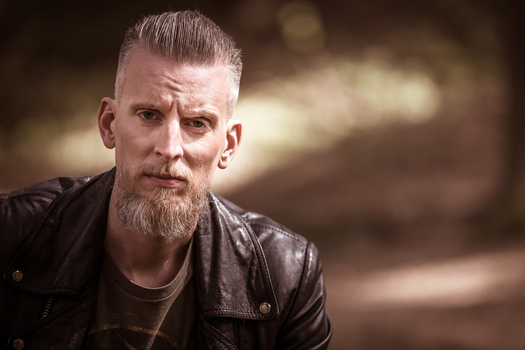
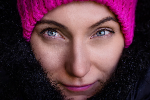
First, congratulations to our two winners of the Fstoppers tutorial prize. The first winner, with the highest rated portrait voted by the community, is John Platanou. Congratulations on your beautiful portrait. The second winner was a randomly chosen participant from our 20 selected images. This prize goes to jonas y. We will be in touch with both of you via your Fstoppers account to claim your prize.
The overwhelming number of submissions not only brought out some incredible images to the forefront of the website, it also brought out some great interaction between community members. Most images ended up with between 30-40 ratings from fellow photographers. If you participated and didn't get selected for the video, you should still have a good idea of where your work stands. It also gave Lee and Patrick a great discussion point on where the community agreed or disagreed with their own ratings on each image.
If you missed your chance to participate in this episode, our next Critique the Community will feature iPhoneography. In other words, the image image must be taken with a smart phone. Submissions are now open HERE.


Thanks for including my image in your review. Enjoyed hearing your feedback!
I appreciate the opportunity for one of my images to be selected for your video critique. I enjoyed hearing the feedback!!
Thank you for including our image! Enjoyed hearing the feedback! We know the location looks grungy but that was in grand central terminal in NYC lol.
Thank you Fstoppers! Not just for the price but also for the constructional critiques!
Very cool. Interesting critiques!
Thanks guys ! i was the creator of black and white portrait, and i agree that it has some hard lines at the hair etc. but my i wanted to be more artistic and minimal instead of just a portrait. The black skin was made manually by me and it took a lot of work for a natural look(so you cant tell if it is photoshop or make up with the first sight). This portrait in reality was a crappy portrait of my sister but i think as an artistic minimal project wasn't so bad :P. Thanks Fstoppers for the critique. You are the best! <3
Can you explain the basic premise of how you made the skin black? Patrick and I started arguing about this again yesterday and now I have to try to recreate this shot in 10 minutes.
haha! Yes, after i desaturated the image, i did that using the Selective Color at Neutrals putting the slider of black all the way down. If you play correctly with the sliders and repeat 1-2 times you will have a very good black skin with natural highlights just as a black skin. I want to see yours PLEASE haha
I don't get it. You were using 'Selective colors' in Photoshop, right?
I may start off the next critique with my edit.
wow Lee Morris sooo harsh, Patrick Hall got the concept of my image. It was a lifestyle shot for my portfolio. All natural light with a gold bounce reflector to bring up the skin tones. that's it no HDR a little adjusting in the sky on the left of the image. and yes the parking lot sucked and I actually didn't see it in the shot and thought about removing it in post but just left it.
Why were the girls in bras or are those shirts?
those are female shirts, it's a style I guess, the stylist put them in those tops for the bubble part of the shoot. I am NOT a stylist by any means so I just go with it....lol
ok not shirts (as my wife just pointed out). Lacey tops not bras but not shirts. I have no clue what she's talking about .....lol
I gotta get my wife to wear some of these shirts
First step is to ask....
Thanks for the critique, Mine was the 3rd one (baby portrait) and just so you know that was my 2.5 yr old son. It was a spare of the moment thing we did and looking back at it we wish we put some shorts or something on him instead of a diaper. Back then we didn't even think about it looking weird since he was our son and we were used to seeing him wear one. This wasn't for my portfolio either, just for fun. Thanks for the input!
Well either way, I still loved it!
Thanks!
Awesome, as always :D
PS. Is there a way to turn off notifications for comments on this post? In settings I can only see options for my content' comments...
Use the tree dots at the top of this post
The bell on the post itself will turn notifications on or off.
LOL me - thanks guys :D