
The histogram is that graph that accompanies your image. It tells you a lot about not only about the exposure, but also the contrast of your photograph. Knowing how it works can help you improve your photography, and it’s not a difficult thing to learn.
Contrary to the title of that book, for most photographic purposes there are 256 shades of gray. Why 256? Well, that has got to do with how computers work, and the binary system. I’m not going into that fully here. The important thing is that in photography we want to see a smooth transition from black to white 256 shades are sufficient for the human eye to be unable to differentiate between those adjacent grays.
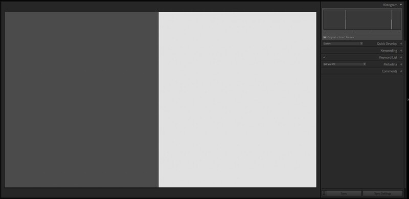
Histograms are bar graphs that plot the number of pixels of each shade of gray, or tone. The columns represent the number of pixels appearing in each tone of the photo. On the left is black, on the right is white, and mid-gray is in the middle. So, if we had an image that was just half dark gray and half light-gray, we would see two single columns of equal height towards either end of the histogram. They are each just one column wide because the corresponding block in the picture is one shade of gray. The columns have the same height because the area of each block is identical.
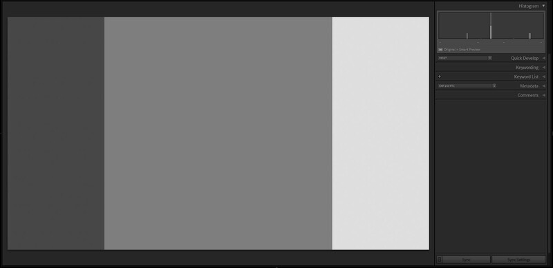
If we now add a larger area of mid-gray to the picture, then the new peak in the middle of the histogram corresponds with that. It’s taller than the other two peaks because it represents a bigger area of the picture.
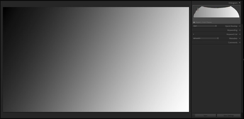
If we place a gradient diagonally across the picture, from black to white, you will see all the tones have pixels allocated to them, and so all the columns in the histogram are filled, though some more than others.
Of course, a more complex picture will have a less uniform histogram.
What Should My Histogram Look Like?
This is one question I am often asked. The answer is this, there is no perfect histogram. It just tells you how different shades appear in your images. However, a histogram showing all the pixels pushed to the left means that the image is dark, and it may be under-exposed. But, equally, that may be the look you were after.
Conversely, a histogram pushed to the right means the image is bright with lots of highlights and whites. Again, it may be over-exposed, unless you were aiming for a high-key image.
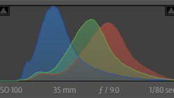
A lot of photos you shoot will have a smooth bell curve with few blacks, and whites and the majority of the image sitting near the center of the histogram. Black and white photography often (not always) benefit from a strong separation between the different tones, so one will see two or more peaks in the histogram. The bigger the separation between these peaks, the greater the contrast.
But How Can the Histogram Help Me?
The main benefit of using the histogram is when you are shooting and want to check the exposure. Why? The screen on the back of the camera is not calibrated, and indeed photographers increase and decrease the brightness of those screens depending upon the ambient light. I turn the brightness down when shooting at night so as not to ruin my night vision and, on a sunny day, I make the screen as bright as possible, so I can read it. Consequently, you cannot use that screen as a guide to exposure.
Furthermore, your camera’s metering can be fooled into giving you incorrect exposure. In the evaluative/matrix/ESP metering mode (why can’t manufacturers standardize their nomenclature?), the camera will try to make the picture, on average, mid-gray in tone. So, if you are shooting a particularly bright scene, the camera will under-expose.
Some cameras are getting better at not being fooled in this way. Nevertheless, using the histogram helps you to decide whether to use exposure compensation.
I Cannot See My Histogram
With a mirrorless camera, you should see the histogram through the viewfinder (if your camera has one), in live view, or when playing images you have taken. With DSLRs the histogram is not visible through the viewfinder, and so only accessible in Live View or playback.
By default, the histogram is usually switched on, and you can display it by pressing a button on the camera body, but you may have to activate it in the menus first.
There are too many menu variations between manufacturers and camera models to list them all here, but if the following links should help you find how to switch your histograms on. Or, you should find your camera's settings by Googling your camera make and model, and the word "histogram".
The Histogram Isn’t the Same on the Computer
One thing you may notice, especially if you shoot raw, is that the histogram you see in your camera is not the same as the one you see when you upload it to your favorite editing program. The reason being is that these programs generate their own unique preview of the raw file. The applied default settings are, consequently, different from the ones added by your camera, which is embedded in the raw file. In fact, if you have an array of editing suites on your computer, you may find that the default histogram for the same photo is different in every one of them.
Two Types of Histogram
You will notice that there are two types of histogram available to you. The first includes colors, and so you can see the luminance of the Red, Green, and Blue Channels. The second is simpler, just showing the overall brightness of the entire image. For most types of photography, the latter has all the information we need.
It’s Not the Only Tool in the Box
Your camera will also have highlights and shadows warnings. Sometimes called zebras, these show pure whites and pure blacks as a flashing colored overlay in your image. Most photographers want to avoid blown highlights, as they are irrecoverable in developing. Similarly, black areas in the photo can also lose their details.
These warnings are available in most raw developing tools too. Look for the little triangles in the top right and left of the histogram in Lightroom and On1, or the “show clipped shadows” and “show clipped highlights” buttons in Affinity. Capture One doesn’t have this feature, and if you are familiar with the histogram, and if your screen is calibrated, it may not be necessary on a computer.
Something To Try
Open a photo in your editing software and look at its histogram. Slide the exposure up and down and see what happens to it as the image gets brighter and darker. Next, try the contrast slider. Increase the contrast to maximum and not how the histogram is stretched. Then decrease the contrast and watch the histogram get pushed together. Try the other sliders too, to see how they affect the image and the histogram.
I hope you enjoyed this brief introduction to histograms. Please let me know if you have yours switched on in your camera, and feel free to ask questions, and I'll try to answer them.


Join the Fstoppers community for free
-
Post comments and join in the discussions
-
Browse the site ad-free
-
Share your work and get featured in the community
-
Compete in the photo contests for fun and prizes
9 Comments
Zebras do a lot more than show pure black (0%) and pure white (100%). Setting the upper level to 70% used to be the video standard for correct skin tone exposure.
Good point, Ansel. Thanks for replying.
Thanks, Ivor. It may be worth mentioning that the RGB-histogram depends on the white balance of the camera. So if one changes the WB in post, the histogram may look very differently, especially on the right side of it. I take pictures of dance performances where the light changes quickly and dramatically from the deepest blue to the brightest red. The light sources are relatively narrow banded high power RGB-LEDs. And it happens, that one side of the stage is blueish while the other side is reddish (from orange to red). Those RGB-histograms sometimes look very weird and if one changes the white balance of such an image, one of the colours generally blows out very fast.
Great point, Jan. Thanks for that. Super picture too. That must be quite a challenge shooting images under coloured stage lighting. I find purple lighting the most difficult to cope with.
Thanks, Ivor. I use 'darktable'. The "new" scene-referred (instead of display-referred) module allows full RGB (and not Lab only) manipulation of the colour space (of the image). I choose linear Rec2020 RGB or linear prophoto RGB als working profile, otherwise there is no way to recover high lights. I am still very impressed of Nikon's JPG-engine, which produces great images.
Although most of the photographers do use LR, this information here puts a light on how the conversion from RAW to a displayable image is done best. Please have a look at https://www.darktable.org/2019/12/darktable-30/ , scroll down to "A workflow that extends over the RGB space:" You might wonder, what this has to do with White Balance (WB) and histrogram. But this is the essence of it all.
"The linear RGB workflow ... allows to free oneself from the graphic heritage of the years 1980-1990 centered on low dynamic range photography for paper printing. This traditional workflow, known as display-referred, assumes that RGB values encode colors (in the perceptual sense) and manipulate them in a psychologically realistic way. Unfortunately, psychophysical models that link (physical) light to (psychological) color sensation are only valid for images with low contrast (or low dynamic range), in the order of 100:1 (6.67 EV), which poses increasing problems as modern cameras see their dynamic range increase (currently between 12 and 14 EV, or 4096:1 to 16384:1). To be anticipated if you want to push your low lights: parasitic shade turns and over- or under-saturation problems, color that explodes when you correct the luminance, luminance that explodes when you correct the color… Hell.
The linear RGB workflow, known as scene-referred, assumes that the RGB values encode light emissions, i.e. a light spectrum reduced to three intensities through the camera’s sensor, which is nothing more than a colorimeter. It manipulates RGB values in a physically realistic way, digitally reproducing the effect of optical filters. This not only makes it possible to accommodate any dynamic range, without having to change algorithms (and therefore no more specific HDR processing), but also to obtain more natural and predictable results...."
RGB led lights can be a nightmare. I have had a shoot completely unusable because a very over bearing pink lighting. Gelled lights are fine, its how the LED lights create the colour...
Yes, it gave me a lot of headache too. Since I switched over to the scene-referred workflow in darktable (should have done that earlier), I gained a lot more usable images. Sometimes the whole image looks fine but the highlight in the face (forehead, nose) of such high powered light sources destroy it completely. The transition between the different colours or even the shades is very ugly.
The first image is processed in the older traditional legacy mode, aka display-referred (see above) of 'darktable', working colour profile is sRGB. The second image is processed scene-referred with linear REC 2020 RGB colour space. Please have a look at the histograms. You'll see clearly what happened to the blue part of the image's colours. Look also at the white parts on the floor behind the dancer. The difference is obvious.
Edit: First image above: Nikon D800E, 36mm, f/4, 1/160s, ISO 6400, +0.5EV / second image here: Nikon D4, 165mm, f/4, 1/80s, ISO 4500, -0.3 EV
Thanks for the primer on histograms. I have a Leica SL and as soon as I learned a little about the histogram, I turned it on and it stays on all the time. It is a great tool for getting proper exposure. I would like to attend a workshop/ class where I can learn more about it and how to apply it's information to improve color control as well as exposure.
I'm sure if you could create a mini series of articles covering the basics and then progressing to more advance uses, many here would read it, appreciate it, and use the histogram more effectively.
Hi Brian,
Thank you for the nice comment. I am trying to do just that, write articles accessible for beginners to help them improve.
Do get yourself on a course with an instructor. They make a big difference. There are some fabulous online resources, including Fstoppers, but having one-to-one or small group lessons makes a big difference, because you can ask questions and tutoring is much more than just passing on information. Check their online reviews first and ask locally for recommendations. They do vary hugely in quality. I would invite you along on one of my courses, but you are a long way from Northumberland in the UK!