
To people unfamiliar with the term, negative space might seem like something bad. On the contrary, using negative space can greatly enhance your compositions and make your subject stand out. Here's what it is and how to use it.
When I first heard someone discussing negative space with regards to compositional styles and components, my immediate position was to assume that it was something undesirable and a blight on an image. Too embarrassed to inquire further, I never could have imagined at the time that negative space is quite the misnomer, as, in reality, it can be a very good thing when used with both thought and intent.
What exactly is negative space? In short, it is deliberately opting to leave large parts of your frame devoid of strong compositional elements to help your subject stand out more. Think less is more. When we look through the viewfinder at a scene in front of us or look at an image on our computers before making post-production choices, we have to decide what we want in the frame and what we want to exclude from the frame. Sometimes, it's important to have multiple elements in the frame to express to the viewer your reasoned intent, but often, it's just as important to leave large parts of the frame empty to give your subject some breathing room and let it have more impact on the viewer.
When we first begin our journeys into photography, we often see things in front of us and want to include them as much as we can. We fear we might be missing something vital, so we pack as much in as we can. This often leaves the frame far too busy and cluttered and can detract from the actual subject or even completely obscure it. If we use conversation as an analogy, think about periods of silence. If someone's on a first date, they often feel they have to keep the conversation rolling no matter what, lest their date think they're boring. But with friends or long-time partners, silence is comfortable and can be a good time for reflecting on things that have just been said.
There's no need to pack a million things into the conversation just to avoid the dreaded silence. Silence is good. It's a time to rest. Just like in composition, we want to give the eyes of the viewer a natural resting point.
With all that said, I want to give you a few examples of images to let you see what I mean by negative space.
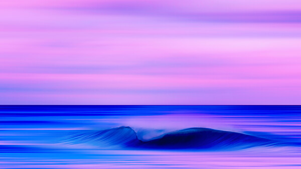
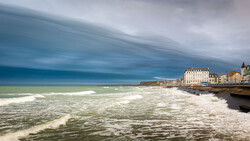
In the image above, more than half of the frame in the top portion doesn't have any striking point of interest. The sky here is an example of negative space. On this particular evening, the moon was rather striking as it rose in the sky, but I deliberately opted not to include it by angling my camera away from that part of the horizon. Likewise, I didn't shoot any waves when the seahawks that inhabit these parts were flying through the scene. Had I included either the moon or the seahawks in the top portion of the frame, then they would have been a focal point of interest in the scene or a resting point for the eyes. This is not a bad thing at all, of course, but I made a deliberate choice not to include them because I wanted the sole point of interest to be the breaking wave.
I should say that very often, when I use negative space in my images, I like to have the empty parts of my frame with just a little bit going on so they're not completely devoid of any interest. In the image above, I have some subtle streaking lines going through the clouds, which can just help the viewer's eye linger there long enough to ensure they have absolutely nothing to look at except the wave.
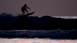
You can see another example of this below.
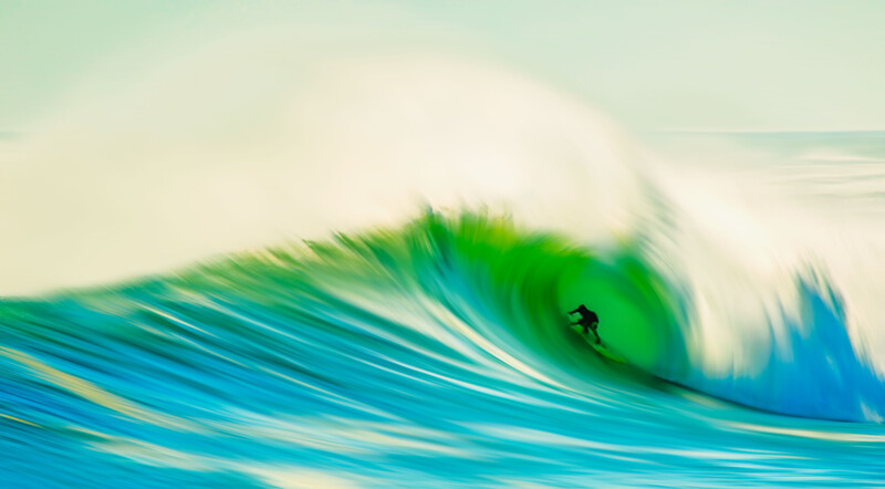
In this image, the only real resting point for the viewer's eye is the surfer inside the wave. The offshore spray flying off the top of the wave and the bland blue of the sky holds no elements of interest at all that might distract the eye or let it rest somewhere unintended. I've used some leading lines in the face of the wave to draw the eye toward the surfer, but again, the lines are not strong enough to tempt the eye away from the surfer for too long. In this way, I deliberately chose a composition whereby the only thing that the viewer can focus on is the subject. There are some other minor points of interest but nothing to take away from the positive space, or the subject.
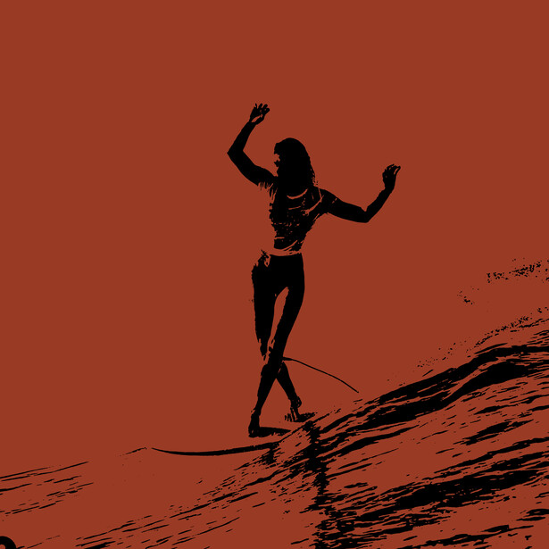
To be clear, you can use negative space in any type of art you want. And if you so desire, you can use blocks of solid color if you think that will help your subject stand out more clearly. Here is an example below.
Finally, I want to show you an example of an image that does not use any negative space, just so you can see the differences more clearly.
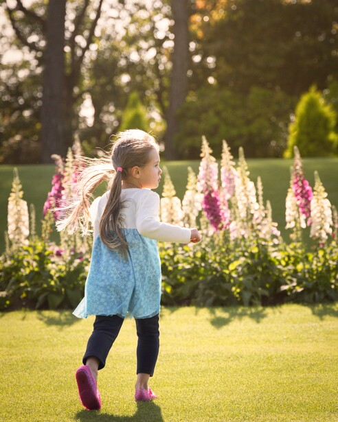
In the image above, you can see that all the parts of the frame have elements of interest. In creating this composition, I liked the contrast between the light sun on the grass in the foreground creating shadows and the darker trees in the background. I also wanted to use those flowers in the center part of the frame because they matched the color of my daughter's shoes.
You might contend that the grass in the foreground is devoid of much interest and could justifiably be called negative space, but this is just coincidental. I did not make a deliberate compositional choice to leave large parts of the frame empty to enhance the subject. Besides this, only my daughter's legs are in that area of the frame, so the grass isn't doing anything to help my subject stand out. I liked it more for the light and dark contrast between foreground and background as opposed to the decision of leaving parts of the frame empty to enhance the subject. Moreover, the fact that there are other things for the viewer to look at in the frame would choose grass as a negative space rather redundant anyway.
In summing up, you don't always have to clog your frame with multiple elements. If there's nothing in the frame that visually enhances the image or adds impact, don't be afraid to leave it empty. That will help your subject stand out more and introduce you to the concept of minimalism, where less is more. Please leave your thoughts in the comments below.
Join the Fstoppers community for free
-
Post comments and join in the discussions
-
Browse the site ad-free
-
Share your work and get featured in the community
-
Compete in the photo contests for fun and prizes
2 Comments
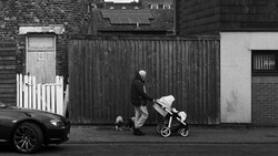
As I have a 24mp camera, I tend not to want to crop the image. This means if I take the occasional landscape (I'm no landscape expert, more a street photographer) I will make the negative space work for the composition. Also, as a street photographer and well used to the 'exposing for the highlights' method, I often like to have negative shadow space in my compositions when out on sunny days.
Holy vibrancy to 100 Batman.