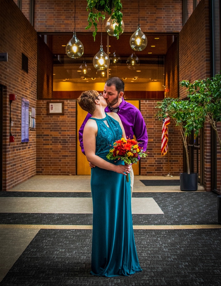
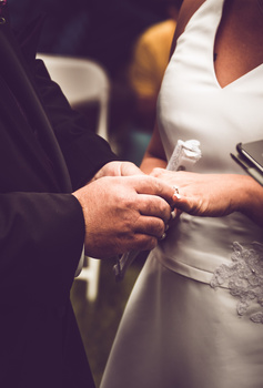
Little courthouse wedding. My 1st paid wedding actually. I’m very much desiring your opinion on how to improve. Please, give me your honest critiques. I’ll happily accept them. Thanks!
Contest Submissions
Click on the thumbnails below to comment and rate each image.
Click here to learn about the Fstoppers rating system and what each star value means.


12 Comments
Someone is going to have to give me some feedback to explain how I’m getting 1 stars. Snapshot? This is considered a snapshot?
If that is true, please include a comment so I can learn what I’m missing. I genuenly thought this was a good image.
Hello Logan, for me this is not an 1-Star Snapshot. I like the Shot. The Community here is sometimes harsh for no reason.
The left Hand from the guy isnt visible that confuses me a little bit. and the wall on the left isnt that beautiful, but for me its a three Star Image. I mean i think you made it at the Registry Office? im not sure, but i like the composition.
Thank you for your feedback Maik. I’m also greatful because I see that you took the time to review my portfolio. I made sure to follow you so that I could return the favor once you’ve uploaded some images to your profile.
So, addressing your comments on this photo, I’m OK with people being harsh in these competitions. I just wish that people were more like you, and would give specific feedback. Like you pointing out that the left wall is not particularly beautiful. That is a constructive observation.
Also, you are correct in identifying that this is in the lobby of the municipal building just outside of the mayors city council chambers where they got married. It is essentially a office building lobby. The double doors directly behind them lead to the chaimbers where the ceremony was held. I Actually have cloned out a lot of the less visually appealing aspects in the shop. I removed fire extinguishers and emergency exit signs, However completely removing the items on the left side made this feel unbalanced, and completely eliminated any indication that this was a courthouse wedding. I actually asked the bride whether she would prefer me take those items out, and she chose to leave them in. However, I think before using this to attempt to attract future wedding clients, I will clone more of the distracting items out. Specifically, the red fire alarm lighting.
Thanks again for your comments. I can’t wait to see some of your work. Will you be submitting a photo for this competition?
Likewise with my photos mate, supposed to help us with this stuff but people just put any rating down unless your a Top-Dog person that they love for no reason. This photo could do with cropping in tighter to them both, and the thing that always annoyed me with my photos, was removing distractions, like the flag, frames on the wall. With a good crop in around the couple, you can eliminate most of them though.
I do like the greenery above but the lights may be a little too much.
Her position isn't the greatest, one of those "give him a kiss" and she goes awkward and goes in without moving anything but her head. (I do this too by the way, I need to learn to stop lol)
With the crop, don't worry about the noise, no camera is noise free with that lighting. Try some noise reduction after cropping in.
Thank you for the feedback. That is exactly what I wanted out of this competition.
Same here mate. I'm pretty much on the same level as you with weddings. I thought my competition photo was good, but clearly just a snapshot lol.
Hey Logan! You were awesome giving me critique last competition. Most people rating just give 1's to boost their images, or are very stuck up/high on themselves. Usually when you look at their portfolio's, they're pretty lackluster, so try not to dwell on it. I would place this probably closer to a 2-2.5. Reason I wouldn't go 3 is partly because of the location (just being an entryway into a building doesn't excite me too much, though depending on the shoot, you can't always control that) and the other part that I would have liked to see a bit more of her face to better connect with them both. I would have maybe had him bring his head forward and then she would not have had to look back so far.
The part I liked is the light leading lines from the building up top, good lighting and colouring and also great composition. Keep it up man!
Hey Logan, for me it's not quite there. It's a nice keepsake, ad I'm sure the couple will love it, which is the ultimate goal. Obviously you were struggling against the location, which is so often the way!
Some things I would have done would be to shoot form a lower angle, You're shooting from your eye, I'm guessing, and it's looking a fraction down on her, so she's looking a bit shorter than she could. Try a lower angle, and you'll make the couple look taller and more imposing in the frame. Also, it looks like the light is coming from the right, so I'd probably have reversed their positions, and maybe tried to get them close to the windows so I could introduce some light and shadow. you'd lose the symmetry, but that's not a bad thing, since if the light is strong enough, you could have darkened the background and kept them illuminated.
Also, the pose looks a little staged. It's tough to come up with new poses for wedding couples, and I understand that. Maybe if you explored some tighter crops, you would have had a bit more to play with?
Hope that helps, just my thoughts!
That is a very constructive and specific criticism. Especially about shooting from the lower perspective. I was shooting from about chest high on a tripod. However, the bride was considerably small. I will definitely make sure to adjust my height for each shot in the future to give myself more options on the perspective. Thank you.
This is no where close to a snap shot. As far as an image that you would place in a portfolio to sell yourself I'm not really sure. I would go around 2.5. I think technically the picture is sound it is well exposed and sharp as far as I can tell. The building is not adding to the image so I would crop in more or light them more so background can be darkened. I also would try to get bride to move her arm away from her body a bit creating a gap which will thin her out some. It will also move the flowers closer to her hip. I also agree with flipping the pose to light up the groom more. Overall I think you are well on your way and the B and G probably loved the image.
Thank you Justin. All of that is very constructive and helpful.