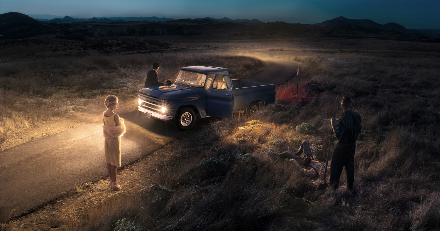
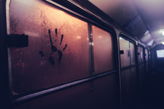
I submitted this earlier via my phone. But after looking at it on the computer monitor I noticed that what I uploaded to my Fstoppers portfolio was the older version. And if I'm going to put it in a contest I figure it might as well be the final version.
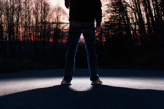
Shot with a 35mm + Anamorphot lens adapter to make it a little wider than 16:9. Additionally, the image is composed with a dynamic symmetry composition. My first attempt at doing so - and leveraging the layout as a storytelling element.
All the elements in the photo were shot on location and composited together (after much work). This was due to the fast-changing position of the sun, and because we were blocking a public road with the truck - and we didn't obtain a permit to do the photo (or the requisite traffic control crew).


11 Comments
Very cool shot!
The only thing that pulls me out of the story is the light behind the truck. I assume another car is coming around the corner. But the light seems to be illuminating the road and the background.
Really cool photo, man.
very nice shot. What is a "dynamic symmetry composition"?
Let me answer that with a youtube video:
https://www.youtube.com/watch?v=OM_7zLDJezc
There are lots of videos, books, and blog posts detailing how the masters used dynamic symmetry to develop their compositions. If you're interested, message me and I'll show you the dynamic grid I used when laying out the elements of this photo.
I shot tethered, with the grid overlayed in capture one.
thanks for the links to the videos -- very interesting!
Here's the under sketch of one of Diego Rivera's murals. Where you can see they dynamic symmetry grid laid out.
https://www.google.com/maps/uv?hl=en&pb=!1s0x85ce01ccf3f4ec13%3A0x7751f…
Nice story and creative idea the composite it's obvious unfortunately when I look at the final composite shots I want it too look seamless like it was done in one take in the final product. With your photo I could tell right away it was composite without reading your description because the subjects lighting in the dark areas of the shot doesn't quite match the scene with how light would naturally fall which is a dead giveaway that it was composed. It gets a solid 3 from me.
I appreciate the feedback.
There has obviously been a huge amount of work put into this. I like a lot of bits, but for me it doesn't quite hang together. Close, very close!
This project was really a whole different scale for a personal project than I’ve done before. Although there was a ton of people helping - it was still really just me on the production end, with some support from a local crew of photographers.
Additionally there was some issues we had to work around in an incredibly short potion of time. From first shutter to last shutter, all the assets were shot in one hour. For all the moving pieces, that’s not a lot of time. It was shot at sunset-blue hour without a permit. Since that was the hour we worked in, the color shifted dramatically across all the assets. Causing a ton of work in post. That being said, the only element that I think isn’t really fitting 100% for me, is Brooklynn. She was the second asset we got, and I think as a result she has too much fill light. I will probably go back into the file eventually and drop the shadow side of her a stop or two. But after so many hours in post, you need to call it at some point. And I’m not really ready to get back into it yet.
That all said, I’m aware it’s not perfect. But am happy to be working at a larger scale. It was my express purpose for this image. And to be working with dynamic symmetry.
Great story in this photo!