
explorations on the lake
I recently spent an evening down at the lake as the sun went down and practiced varying ICM techniques.
Just throwing this out there for review. ICM is so subjective, but I'd love to get an understanding of what resonates.
Let me know if any appeal, and/or any you feel are failures. Of course I'm always open for tips on improving :-)


7 Comments
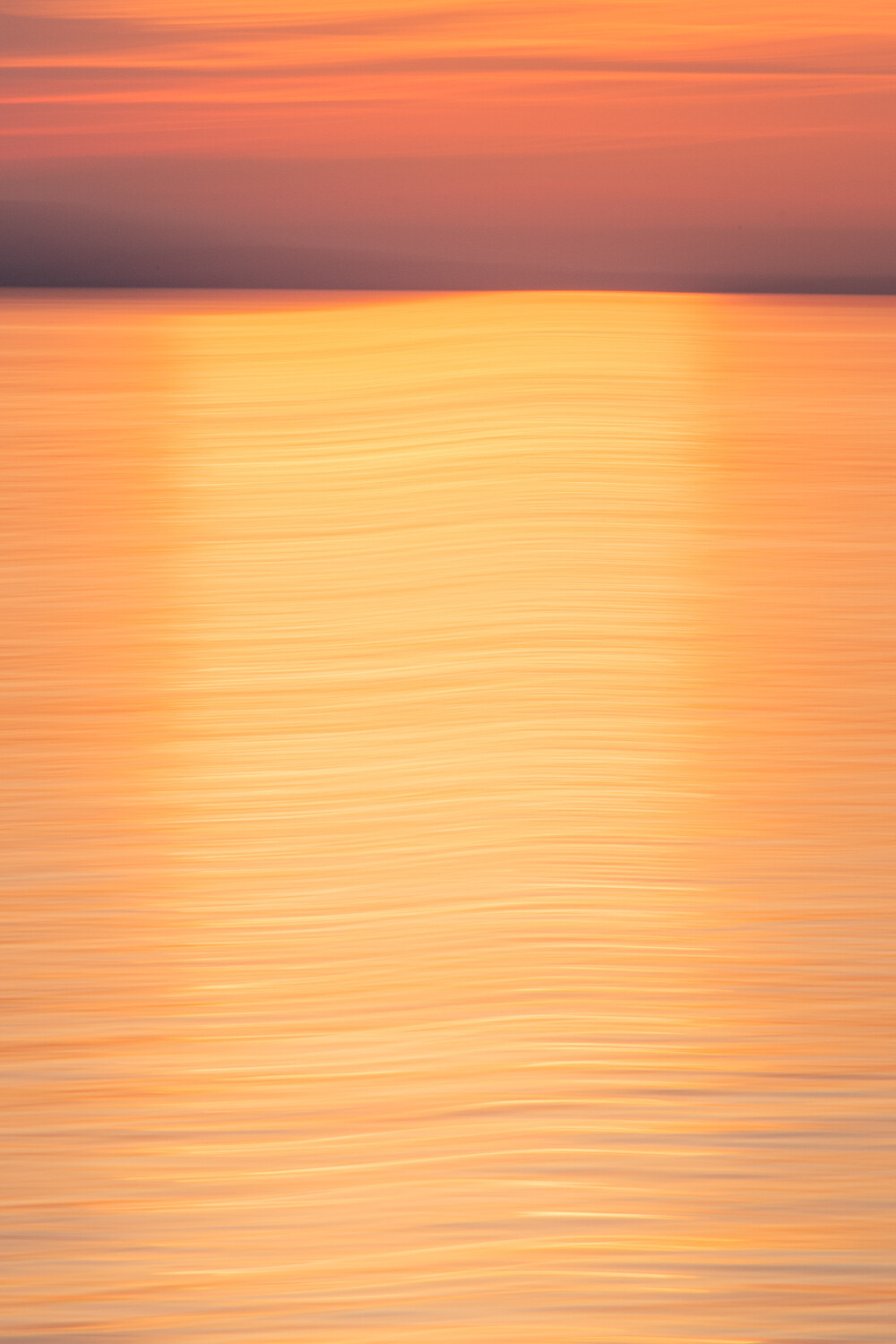
I like the first one the best, but I think it could have used a bit more of the sky. Maybe 1/3 sky, 2/3 lake. As it is, there is just a lot of lake. The colors really draw my eye in.
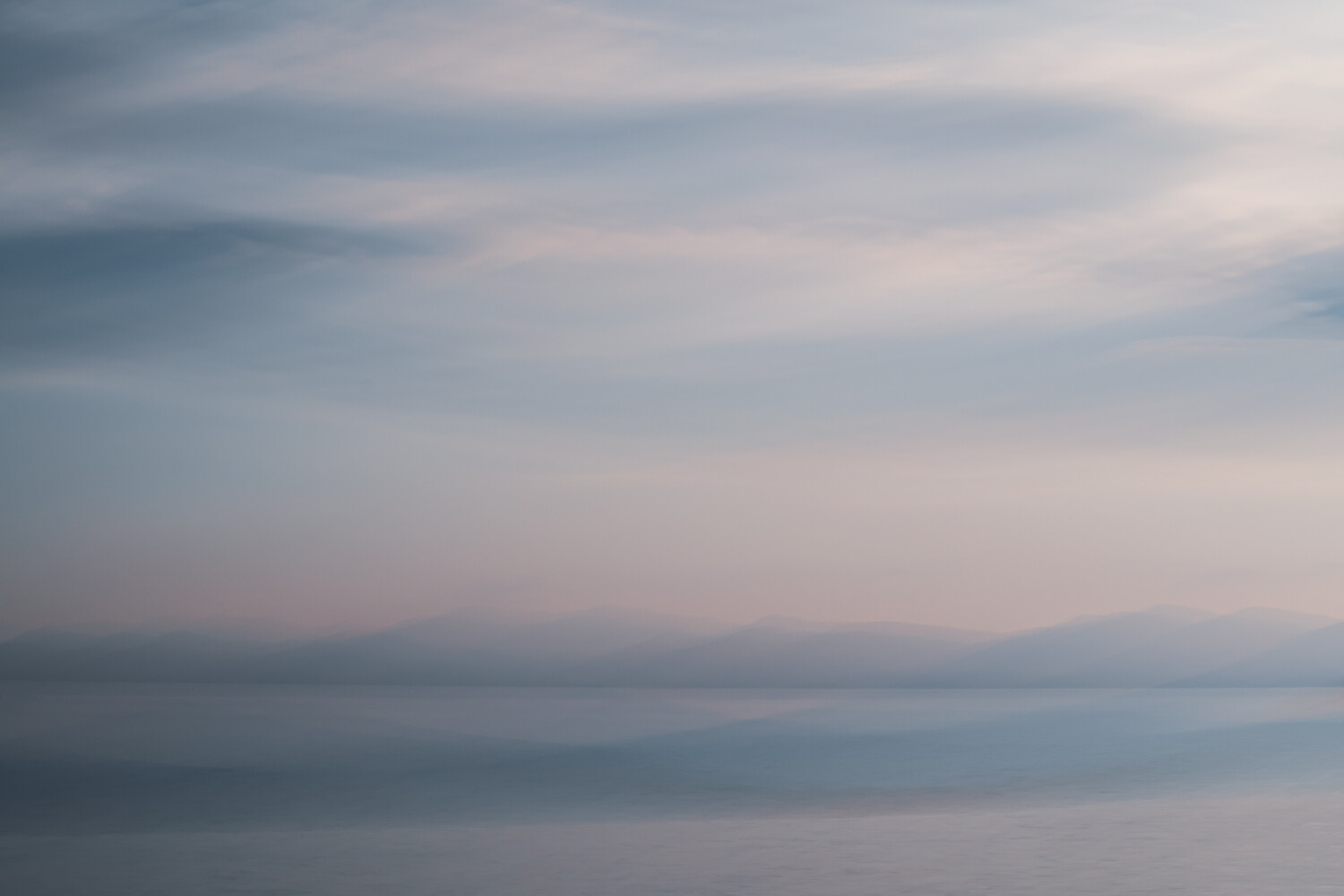
The second one doesn't appeal to me. I've noticed that I like the more concrete ICM shots, ones with more noticable textures. This one is more of an amorphous gradient with no real variation of color or texture.
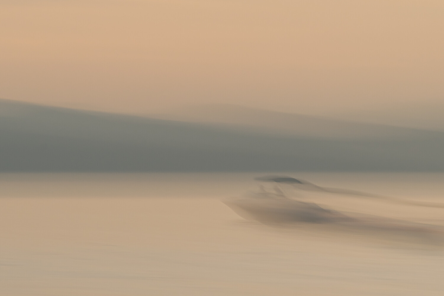
The third is great compositionally, but I don't feel that it is bright enough. The low-key tone doesn't do it much good. I would have loved to see the same shot with a blue and green trees, and a blue sky.
Thanks for you sincerity Matthew. I actually like the balance of the first one (the 'heaviness' of the top counter-balancing the visual weight of the water) but can see your point.
I can also see your point on 2 & 3 - I really want to maintain the understated mood but may give your suggestions a try.
I was envisioning something more similar to the fourth image on your blog post about this. I would enjoy a vertical crop of it.
Hi Alan,
First image clicks for its vibrant colours and contrast.
However am seeing equal potential for image 2 after processing it for some highlight and contrast. image 2 has good texture.
Image 3 for has good potential too with mirroring it and same above treatment.
cheers.
Thanks Vijay. As with Matthew I may play around with these further, but fear adding contrast and texture may kill the mood
I seem to be odd-one out (not that it matters), with three as my favorite. It's probably the first ICM shot that makes me feel something, which is interesting because I'm not a huge fan of the technique. If I was a boat owner, I'd commission you to shoot a similar piece.
I think I'm onboard (no pun intended) with three also. I like it because i can make out that its still a boat yet it still has an abstract quality. Like Matthew, I would like more brightness and color variety.