
ICM and composite Exploration
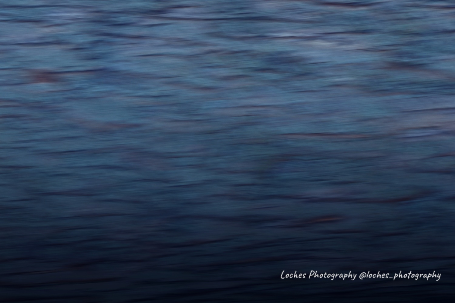
I have a minimal amount of experience in IMC, but I wanted to try compositing. The original picture is of a tree. I did some post work on it, saved it, then composited the original over it. The first is the composite, the second is the initial edit, and the third is the original. Any CC is welcome. Thank You!!


8 Comments
Considering these images in their own right, I rather like the middle one, Chloe. But that mainly reflects my liking for bluey-grey colours, probably due to their resemblance to the sea. The second image calls the sea to mind for me as well by its wave- or ripple-like pattern. I'd never have guessed that you started with a tree! The original is a bit grim. Your final composite works well too.
My original idea for the image was, like you noticed, water or a sea. My inspiration was largely Mathew’s tree he made look like water. Being new to ICM I was very worried with how the final edit was technically.
As it's so abstract, Chloe, how it is "technically" surely hardly matters, does it? It could be a painting. I don't much like typical ICM images, because they're too obviously photographic in origin, but this is far removed from its origins - and all the better for that!
Thank you very much Chris!
I too, prefer the ICMs that are less obviously photographic, but I usually prefer a watercolor look than the clear-stroke example shown by Chloe. What are your thoughts?
See below.
I find the final image a little too "crisp" for my liking. The ICM images that I like the best, and that I attempt to make, are a lot smoother. On this one, each little stroke is entirely distinct from the rest. If I had to guess, this is what makes it appeal to Chris. Other than that, I would straighten the photo a little and make the bottom less dark in the final version.
For some reason I'm not moved by the whole ICM genre as such, Matthew, but think no less of those who like it. I generally try to make constructive comments if I can to those members like Chloe and yourself who experiment and are open to feedback.
And like you, I prefer the softer water-colour-like look. It's the tonal softness (lower contrast for one thing) of the second that makes it the best of the three for me. I agree with both points in your final sentence.