
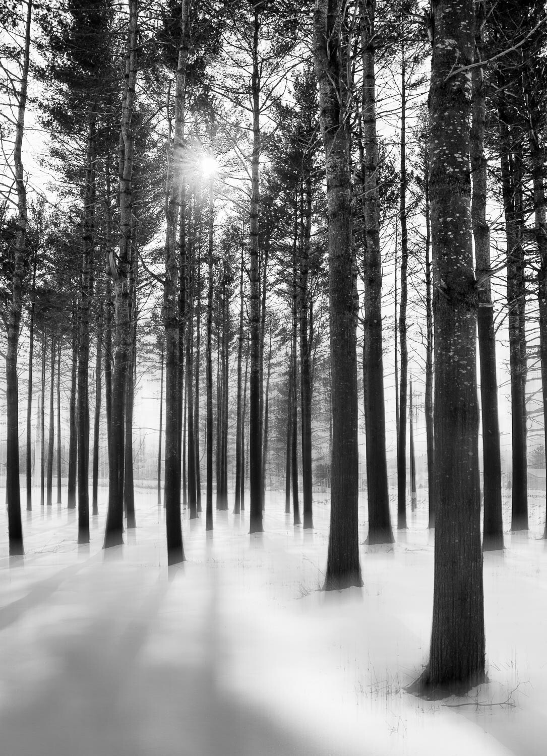
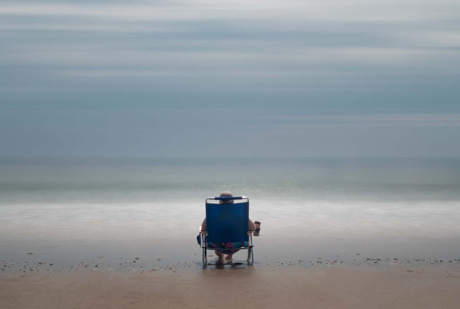
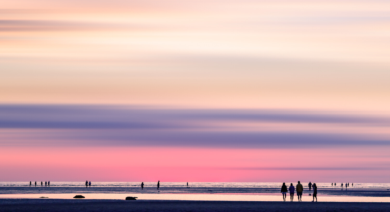
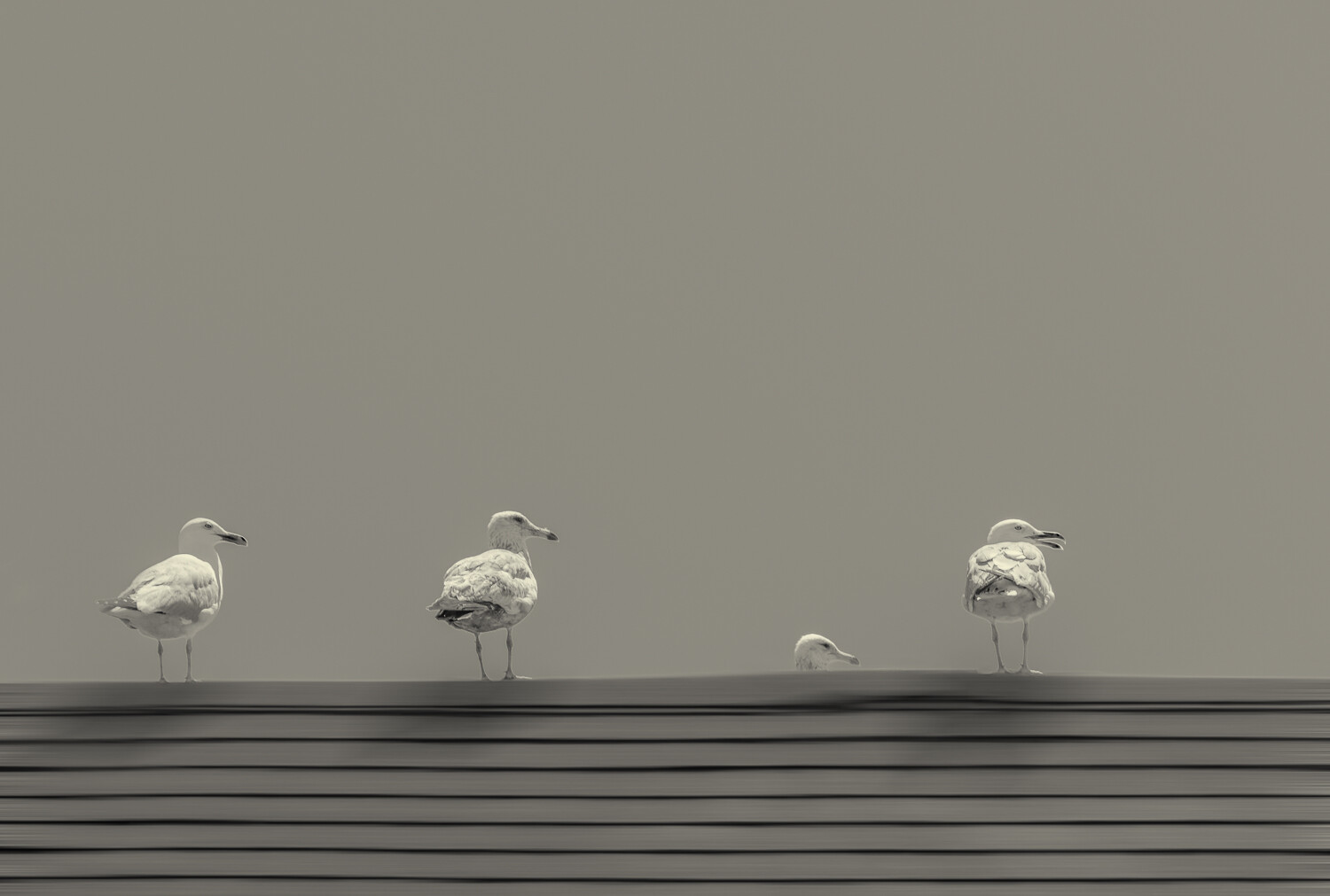
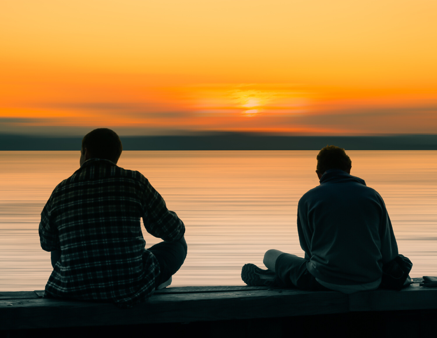
Hybrid motions
I have been looking at option of embellishing older photos using the addition of motion blur (in Photoshop) to key areas of the image. Images are a sample of experimentation, just to give an idea of how this might be used in your own photos.
I feel in all instances the addition helps minimize some distraction and changes the mood of the image.
I'd love to know how others feel about this type of embellishment (ALL comments appreciated as they help the group) and whether others have used this or similar techniques in their work.


14 Comments
I do like this technique sometimes. Sometimes it looks like a normal photo combined with a long exposure. There's a lady I follow on Instagram that does a ton of motion blur water shots with a non-blurred surfer and they look great. IDK if she does it in camera or in PS. I suspect PS though.
I think that a lot of the provided photos look like composites of regular and ICM shots. I do like the effect given off by the technique, especially in the second photo.
You are correct Matthew - the exact same effect could be accomplished by compositing (that is essentially what I am doing in PS, blending the original with a duplicate layer with motion blur applied).
The advantage of doing in PS over a true ICM is the amount of control - I can adjust the blur layer in PS to best suit the area I wish to apply.
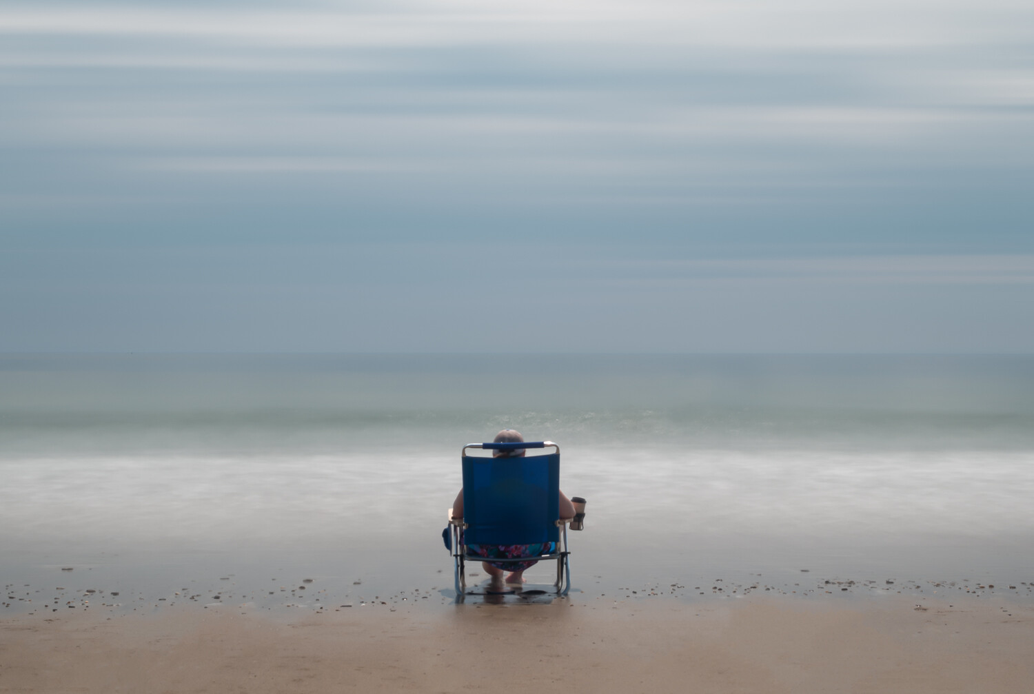
BTW - the 2nd shot was a long exposure (on-tripod) but there was too much remaining detail in the sky for my liking.
Hi Alan! Hard at work as ever, on your images and the Group.
I'm only commenting because you ask for all comments. I usually only comment on work that evokes a positive reaction (which might be "rough diamond" work from a newbie) and you know I'm not a fan of ICM or "in the round" as such, although both can yield interesting, attractive images. For some reason I can't pin down, these kinds of techniques, including pseudo-motion blur turn me off, whereas I'll happily manipulate tones far from the original RAW, and add vignettes & gradients that look fine to me!
The first image here "has something" for me, reminding me of your snowfall tree trunks a year or two back. You have a way with trees, generally, I'd say.
There's a generic, almost bland quality to some of the others, although the gulls are more interesting. The deck chair man has a bit of a halo, but maybe he's a saint. The final image is a bit symmetrical, and calls to mind a "lifestyle" stock image.
I'm only being blunt because I know you can take it! You're very tough for someone so kind and gentle. I really admire your persistence and experimentation - I don't even have the ideas to experiment!
Hi Chris, your comments are ALWAYS appreciated - I would never take offense from sincere opinion. We can't expect all to have the same feelings (especially so in experimentation) and it is always good to hear views on the negative side to gain a rounded understanding.
I appreciate your authenticity and willingness to take the time to provide informative feedback.
Keep on offering your perspective, and get out and play with the camera for goodness sake :-)
I haven't used this technique but I find myself liking the effect. As always, it's easy to have a heavy hand but I feel that these aren't overdone. Like Matthew, I'm drawn to the 2nd photo.
Thanks Bruce. You are right, the addition of any effect needs to work with the image, likely more effective when used in a subtle manner.
Just another tool to keep in mind as an option going forward.
That 3rd shot is pretty nice, I like the colors, the 2nd photo with the guy sitting in the chair that too is pretty good, I do agree with Chris, there is a small amount of halo around the guy, also, the white water could also be toned down to match more of the ocean and also the beach....otherwise, I like em!
Thanks Don. For the beach scene I'll have to check the original image to see about the halo - it may be specular highlights from the wave breaking beyond.
Looks like a common processing artifact when contrast is increased in any way, Alan.
Thanks Chris - it's an older image so my processing techniques were likely less refined at that point. I'll have to dig it out and perhaps reprocess.
You can just burn in, Alan.
Burn it??? That's a bit harsh Chris :-)
I have added an updated copy of the bottom of the set.
Hi Alan! For some reason I can't reply to your comment about adding a fresh edit of the second image. (This seems to be a newish glitch in the FS site; others have commented similarly.) I'm glad you didn't burn it after all! It is an improvement, and subtly different around much of the white-water area.
In the first version, there is a sort of halo around the entire seated figure, but what drew my eye is the area around his head, firstly I think BECAUSE it's his head, but also because the green wave crest seems to get inexplicably pale there. That effect still caught my eye in the re-edit, and I had to save and compare the two images directly. scrolling between, to see what changes you'd made.
I've circled roughly the area I'm talking about below.