Architecture Exterior01
Any helpful critique to improve my work?
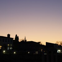
Twilight exterior.
This was shot in my home town; Port Elizabeth, South Africa.


Any helpful critique to improve my work?
Twilight exterior.
This was shot in my home town; Port Elizabeth, South Africa.
A few shots from the winter of 2025. The last one was inside of the Acropolis Museum. (Unfortunately, I could get everyone to walk exactly where I wanted them to. hahaha)


For iPhone users - a new version of Bluristic has dropped (v1.8) which offers new features and significant improvements in stability & useability.
I am interested in learning Macro/Closeup photography and understanding that Focus Bracketing is a good part of the process, I thought I would give focus stacking a try.
Another visit to our garden using a vintage lens (Canon FD 50mm f/1.4) on my Canon R5. NOTE: With this lens the minimum focusing distance is 18" at which point you have 1/4" depth of field.


6 Comments
Excellent shot, Johan! I think this is very well done. I love the composition, the colors, and lighting. Is this an HDR image or a composite with flash? I think the only thing I would have done differently is touch up the grass a bit. Maybe clone out some of the more brown spots. Other than that, I love this image!
Thank you Korey!
I captured multiple exposures, no flash, manually layered & blended them together. Normal dodge & burn, cloning & cleaning. Long exposure helped with the effect on the pool.
Appreciate your kind words. I have another shot which I took very wide to emphasize the structure & lines.
Hi Johan, I agree with Korey, this is a great photo. Its unique in the low perspective which helps bring out the porch overhang in a very understandable way. And the colors are very soothing. The one issue with the photo that throws me off is the 5 trees on the right. They get me to the point where I think there is ground lighting underneath each one, but then theyre too bright at the mid to upper parts of it. This confuses me as to where the light is coming from. Other than that its a great shot!
Very nicely done.
My points would be to pay attention to cropping. IMO there is way too much foreground.
In addition, I would crop to eliminate the structure on the right. Generally the client will want to focus on the building to the exclusion of all other structures unless they have a related specific role to the subject.
I would also darken the edges to draw the eye to the center and focus of the building. As it stands the light area at the bottom causes the eye to "fall off" the bottom of the image.
The images commissioned for architecture are meant to evoke a fantasy of the designer/owner/builder. Technical details like "proving" the length of the pool detracts from the idea of a romantic retreat in a luxurious setting.
I would also note that many photographers seem to be enslaved by the 24x36 or 4:3 proportion of their cameras. Thus we end up seeing way too much ceiling or floor.
Here is a quick example of what I was saying. A bit overdone on the sky but the idea is there.
Thank you all for the helpful critique! Appreciate it :-)
Nice image! The sky appears to be “burned in” because just above the trees, behind the house it’s got a lighter glow. Make sure your masking covers the entire sky so there’s no unevenness.