What do you thinks of this one?
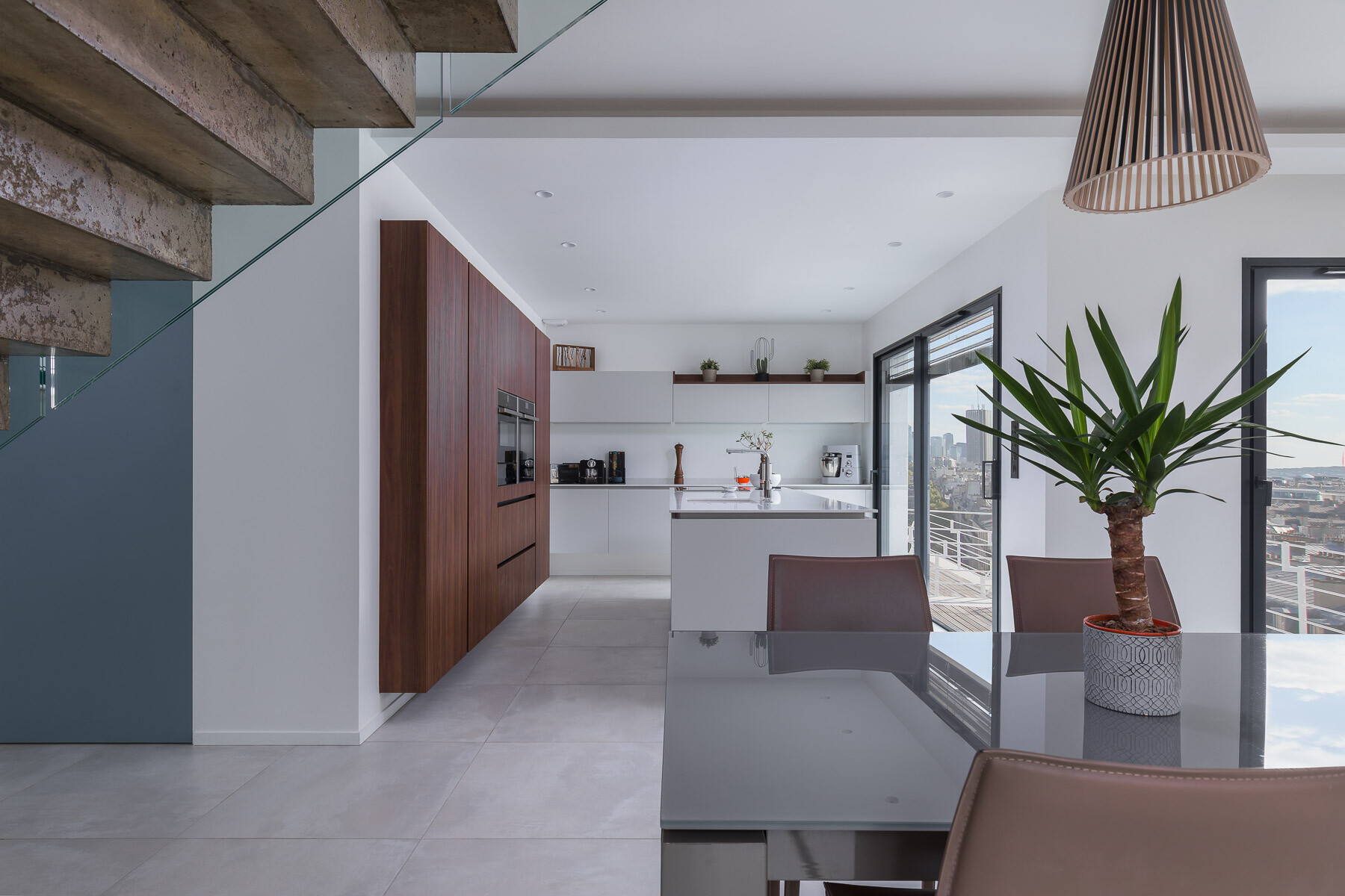
Hi,
I made this picture to improve my book. The exterior was replaced.
I make my best on this one and any comments on picture issues or advice for improvement is welcome.
Tanks! :)

Hi,
I made this picture to improve my book. The exterior was replaced.
I make my best on this one and any comments on picture issues or advice for improvement is welcome.
Tanks! :)
A few shots from the winter of 2025. The last one was inside of the Acropolis Museum. (Unfortunately, I could get everyone to walk exactly where I wanted them to. hahaha)


For iPhone users - a new version of Bluristic has dropped (v1.8) which offers new features and significant improvements in stability & useability.
I am interested in learning Macro/Closeup photography and understanding that Focus Bracketing is a good part of the process, I thought I would give focus stacking a try.
Another visit to our garden using a vintage lens (Canon FD 50mm f/1.4) on my Canon R5. NOTE: With this lens the minimum focusing distance is 18" at which point you have 1/4" depth of field.


10 Comments
Looks good to me. I would just crop a bit from the left and maybe just remove the chair (the one from the foreground) to make it clean.
thks, it's better without the details on the stairs!
Nice image! I'm nitpicking, but I'd consider stamping out these reflections. I'm not so sure I would've used such a large plant for the foreground, and the seats behind it don't look aligned. Lastly, does the ceiling light fixture have an natural tilt to the opening, or is that optical?
yeah, i could had remove the plant's reflection and yes it's the normal shape of the lamp, a friend already told me that it looks strange
At just a glance I thought the whole scene looked about 1 stop underexposed. Also, I'm not a big fan of lining up surfaces (the vertical lines of the table & island) because you tend to lose visual depth.
i just tried to expose 1 stop higher and it lokks awfull. i thinks it's the best exposure for this pic. the table was already in line and it looked nice to me. i'll try next time to move object in this kind of aligment
This is a good solid shot with only a few tweaks that I would have made.
I felt it was bit dark. Modern design with white walls and large windows is all about bright.
I would have changed the plant on the table for something smaller with color or removed it altogether.
I do like the the fact that you have carefully composed and lined up the scene. This is another design feature (conceit?) of modern interiors. However I would have raised the camera a bit to show the separation between the table and the island.
Lastly, I would have moved the flower that is behind the faucet to the space between the faucet and the coffeemaker.
Here is my edit (absent camera position change).
Oh yeah, I changed the shape of the lamp over the table to be less distracting.
thanks a lot! for those comments & good job with the light!!
i will try to take a longer time before starting the shot and check closely for the details!
This is how I would edit it. One way anyway!! There is a strange blue colour casting all over the scene and the overall image seeks some contrast. I hope you like it!!
look good, maybe a little much contrasted. thks for your comments