
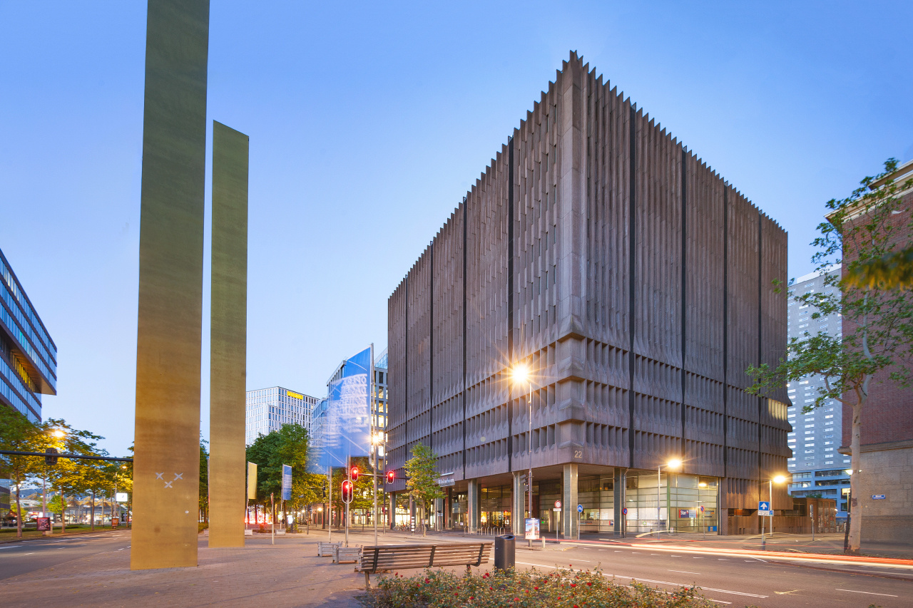
Brutalist icon to be demolished
Hi everyone,
Looking for some feedback here.
Last weekend I shot this image of a brutalist icon (one of the very few in my city), the image is exactly what I envisioned, but I don't like it. However looks allright, it's kind of dull and boring in my eyes.
How can this image be improved?


8 Comments
Compositionally, the building feels distant to me.
As far as what can be done in post, id desaturate the yellows and greens quite a bit, and turn down the street lights, they are very strong.
Thanks for replying, the distance is something I was struggling with myself. Maybe I should just get closer.
I will see what I can do with some selective editing in Photoshop, good suggestion.
I'm building an architectural portfolio right now and struggling with these things myself. In a busy city it can be very challenging to get a composition that feels right without having obstructions or being too far away from the subject.
Maybe I would go there again and scout for some shots for a while. The frame feels a bit busy to me as well, lots of trees and other building for the eye to lead to.
I'd also attempt to do a sunrise shot, that way u can get something more interesting happening in the sky and can get rid of the street light problem. Now that I look at the image again I see street lights coming in from many different angles in the image, it seems to be messing with the perspective a bit.
I see you have some nice tilt shift lens, did you try doing some close up shots? Sometimes the charm of brutalist architecture is seeing the details of the grungy building.
I think it's basically a very sound, well-composed image, Thijs! It lacks mood or drama, especially as it seems to be an evening shot. I'd simply darken it for a start, especially the sky. Also, it's not straight. I've rotated it 0.7 degrees (actually over-correcting, but it looks better this way to me because the main subject is off-centre) and partially corrected converging verticals which gives the subject building more presence. Some artifacts have crept into the sky, but I hope it conveys the idea.
Nice edit. I agree about darkening it.
I'd even consider a square crop. The left 1/3 offers nothing compelling.
Thanks to the both of you for replying!
First of all it really bothers me to find out the shot is not straight since I used a tilt-shift lens. I really have to buy this small spirit level I guess.
Thing with the exposure is I wanted to keep a lot of detail in de main building without making the image look HDR-ish. Maybe too much of the good now, because your suggestion looks kinda good.
With regards to the crop... Stupiud I didn't think of a square crop for a square building...
Thijs, I've used spirit levels, and now the electronic virtual horizon in the Nikon D700, D800E and D850, and none are accurate to the 0.5 degree this image was out by. A sea horizon against the viewfinder grid is the most accurate, and even then I STILL almost always find some error to correct! If you're sensitive to this like me, just do your best, and accept the necessity of a final tweak, is my friendly recommendation!
I like your composition with the other elements, esp. those left-side verticals, complementing the main building very well. It could feel lacking without them. I'd be interested to know what you think if you try that.
Is there a reason you shot at dusk? I don't know which way this building faces, but I'd think sunlight creating texture and making the architecture feel as 3D as it is would help. You'd also lose the distracting streetlight halos.