Thoughts on recent job
I just photographed a local starbucks and would love some tips to improve my composition and edits.

I just photographed a local starbucks and would love some tips to improve my composition and edits.
It looked like a pursuit, but in reality, it was a peaceful movement.
I see these comments on many photos - BTW - those who are putting comments like "Needs Work" should elaborate to say what is needed according to them.

Mia is a natural in front of the camera. She knows where the light is and plays to it in a soft, knowing way.


5 Comments
Hi Ian,
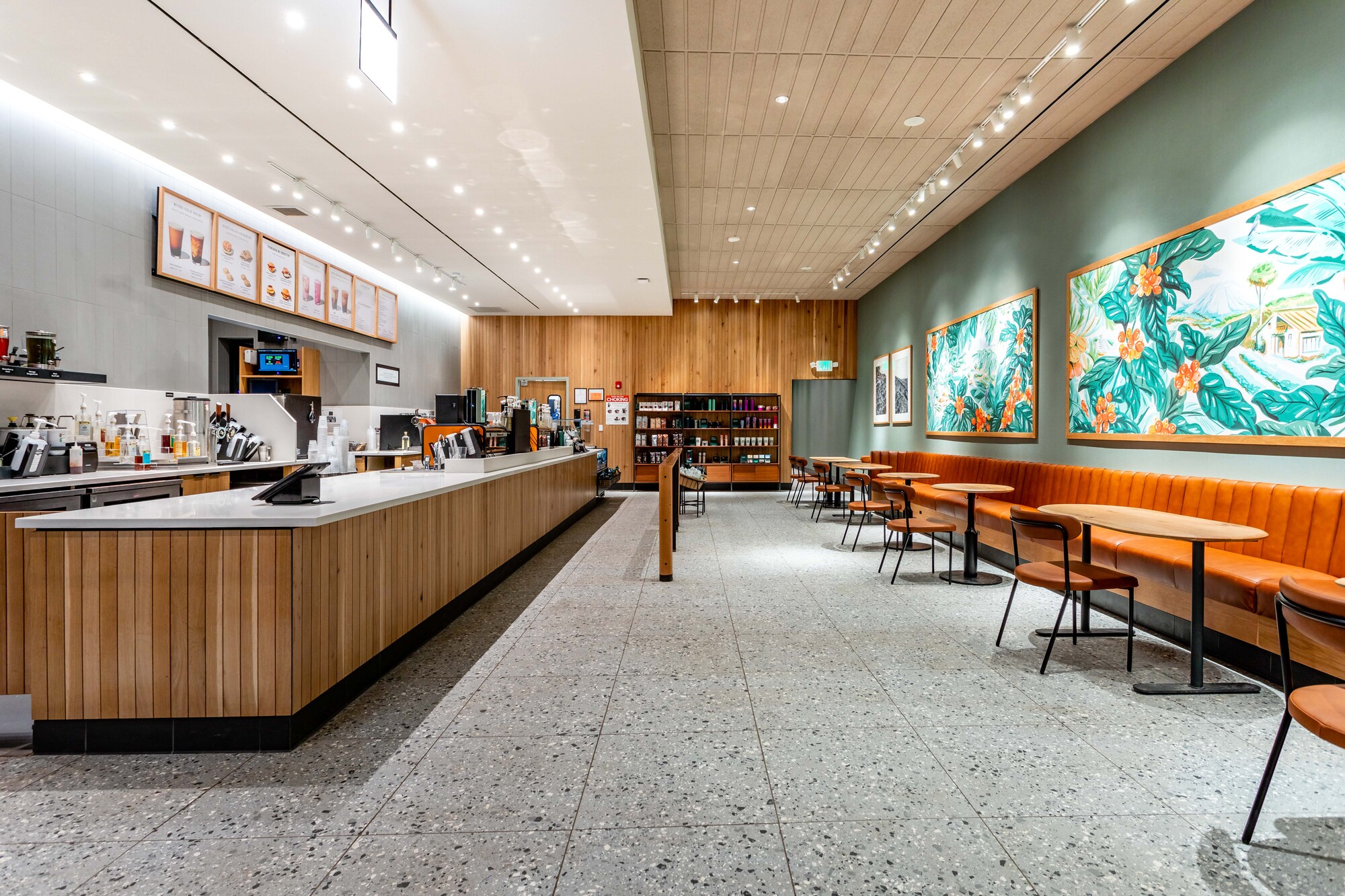
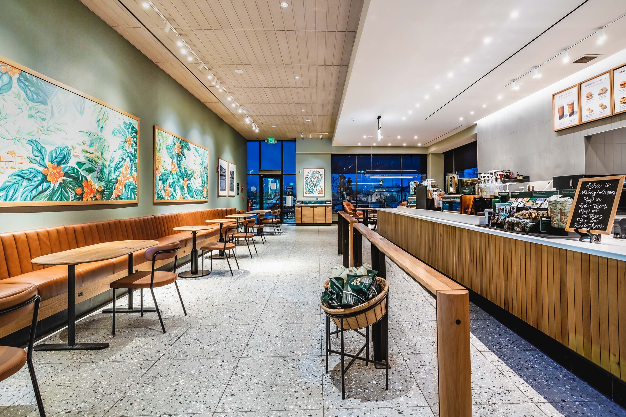
Your interiors are nice, one-point perspectives that are good establishing shots and make the space look vibrant and large. How about adding a couple tighter vignettes to include in your deliverables? It's clear you've already shot the space so that may not be helpful.
The one comment that I hope is helpful is the interiors seem over-lit. It's a bad pun but they kind of seem "over-caffeinated." Your highlights are on the verge of burning out — especially on the paintings and ceilings. Because of that I find my eye going to unimportant parts of the image.
I've not been in this space so I would just ask… "do your images truly represent the feeling of being there… does it feel inviting?" I suspect the lighting feels warmer with a little less intensity when you're there? I could be wrong,
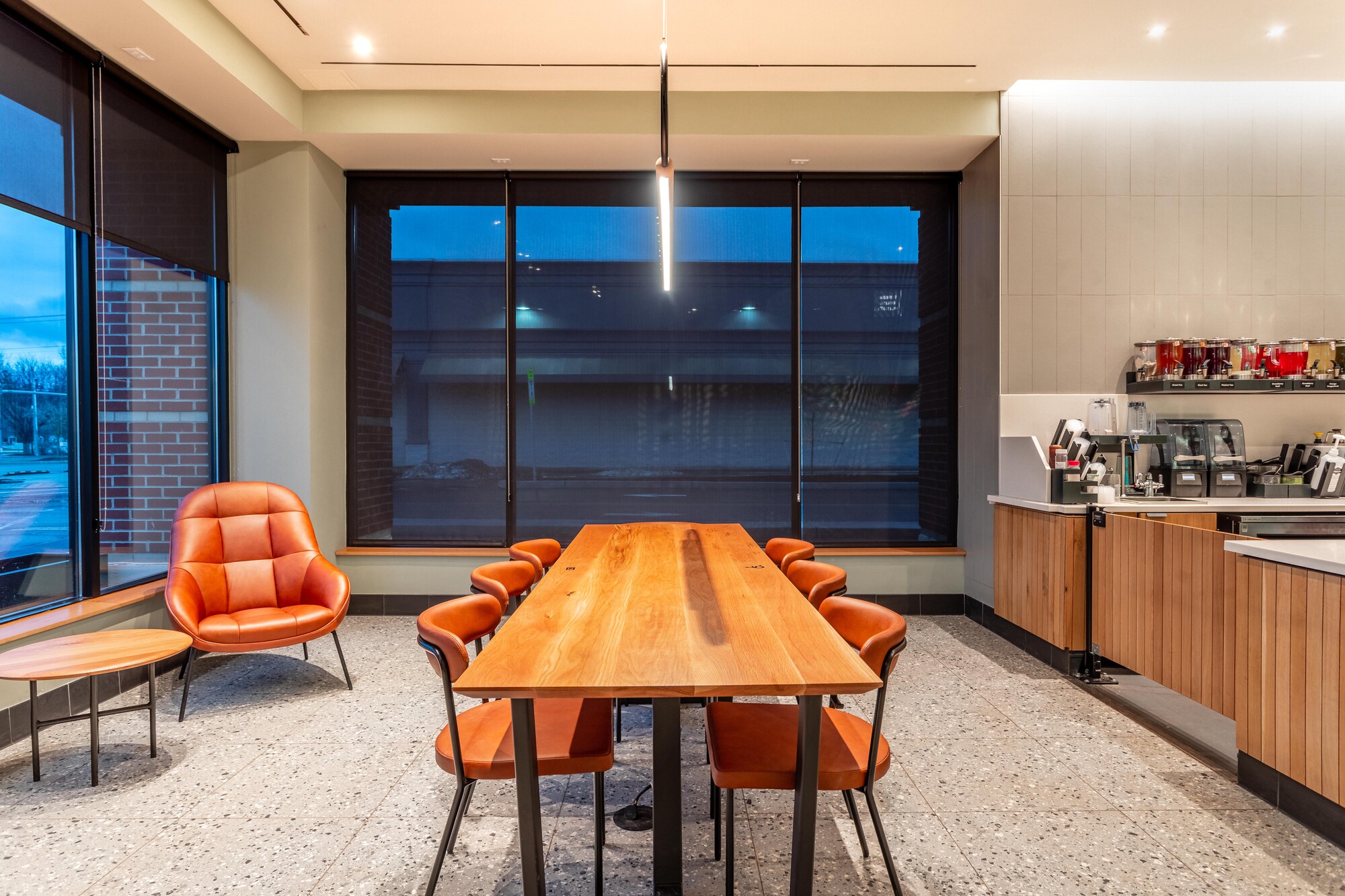
If you shot brackets then you have a great opportunity to do a comparison process. Maybe knock the intensity down a little and try some selective dodging and burning to invite the viewer into the scene? Notice how the table shot has a warmer color temperature and feels more intimate. The wider shots might benefit from not completely correcting the whites to 5,000K.
One last thought…… After many years of not including people in architectural shots we are back to showing how humans use a space. I love it! You could have added some staff and a couple customers (with blurry heads/bodies of course)
You don't mention who the client is but I'm sure they will be happy with the images as they are. As always this is just one person's thoughts.
Thank you for the impute. It was a local Starbucks and the lighting was very difficult. the menus and art all had very bright track lights on them and the ambient light was very dim. Shadows were everywhere and highlights were so far out of the range that I had a very hard time correcting for them. thankfully this job came with and editor so the final product wont be on me, but I want to make sure that if need be I can rock a job like this front to back when the time comes. I have some other shots from various perspectives and will be editing those eventually but I found that these were my favorite shots from the job.
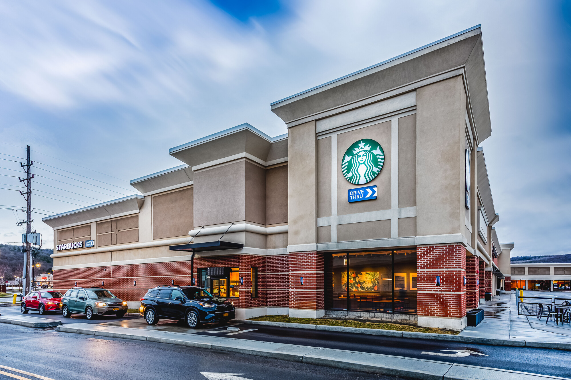
(also, if you check out the exterior there is movement in the windows.)
@Daniel. Cool and valid.
I agree with Daniel regarding toning, color and view variety.
Be sure to do exposure brackets that cover full shadow to highlight for HDR merges, then your bright areas will be easily controllable.
Also I assume the floor grids are square with the walls, but in your images they're not. The wide shot with the basket of coffee bags also shows a bit of keystone. Be sure to visit the Transform panel if you're in LR or ACR.
I'm not feeling the table shot. I appreciate minimalism, but there's not much appeal to the scene, especially out the window.
Overall a good attempt that isn't far from being spot on. Keep up the good work!
Who was the client; architect, designer, lighting, etc?
I agree with Daniel, plus relax on the clarity wheel.