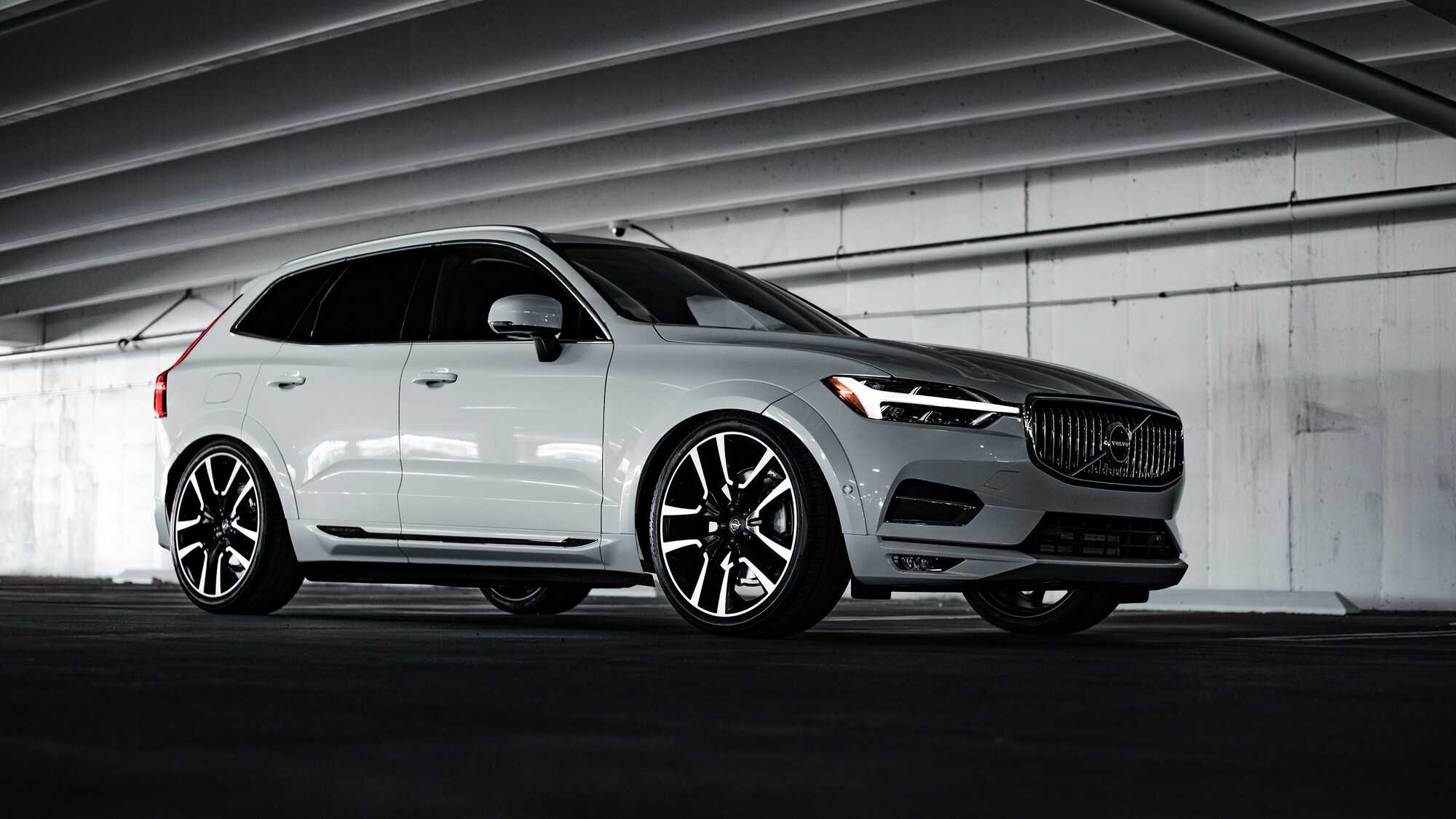
2020 Volvo XC60 (EDITED)
The Original intention was to do some light painting until I arrived and opened up my bag and realized I forgot my light at home.
Shots for my dealership
Critiques and comments welcome, the front is probably a little too dark for most people but I don't mind it actually.
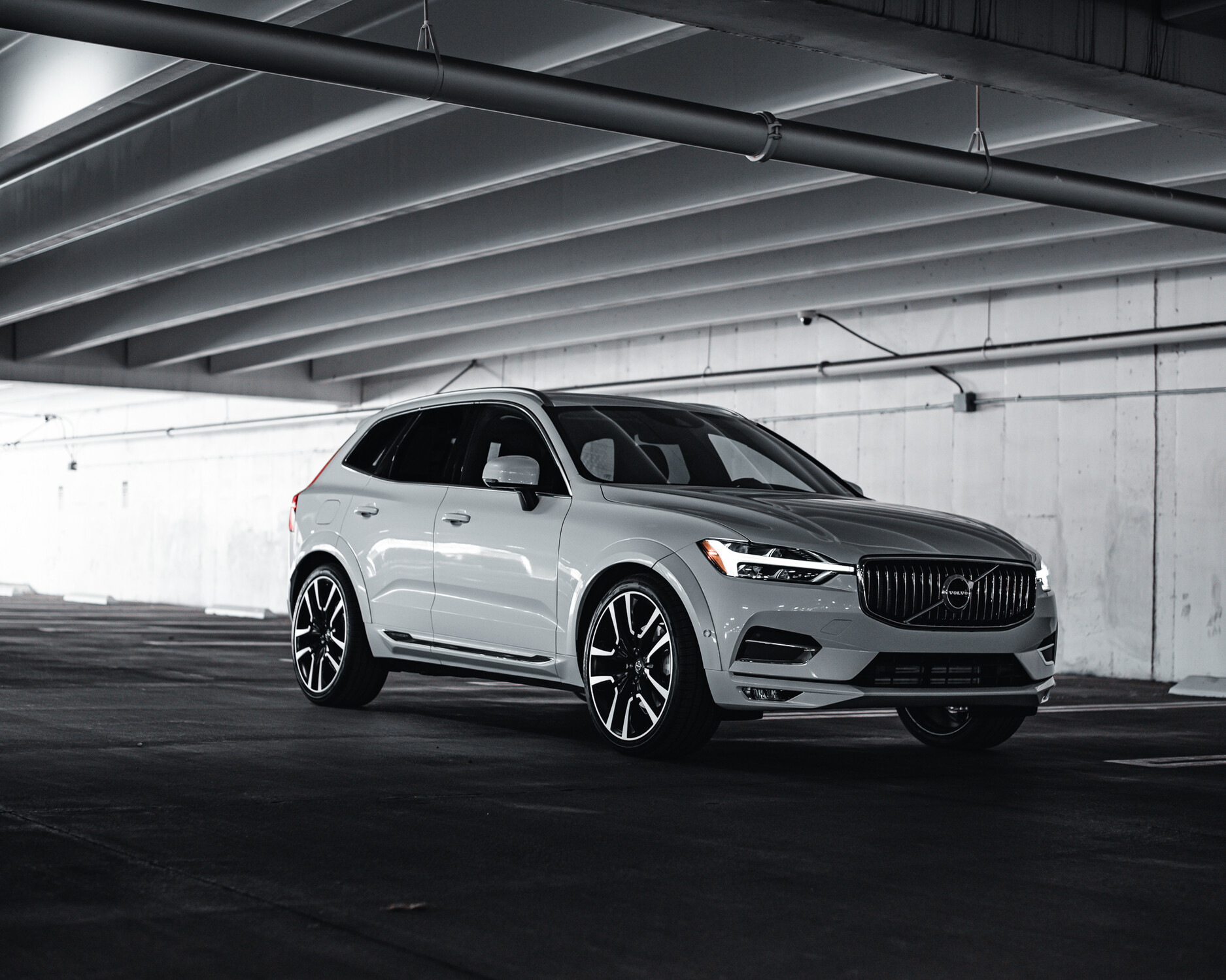
Edited photo posted, without spending too much time on it.


13 Comments
My 2c
1. To much light On the lefthand side so focus is pulled away from the logo and the vehicle itself
2. The second photo - but bring down /soften the exposure on the left and and bring up the exposure around the logo/grill on the front
3. Strip out the camera and conduit as well as the big water pipe in the front and let the lines on the roof/wall do the talking
4. Photo 1’s low cam angle with photo 2’s perspective
Thanks for the input Marius, I'll work on an edit and post here. Good input, I appreciate it.
ps: not that obvious on the quick edit but i tried to give the grill a bada$$ smile
I can see what you did in the grill, nice touch. I've posted the edited photo here. It still needs work but it's heading in the right direction I think. Needs some dodging and burning and clutter removal
Really nice shots in my opinion! maybe can be better using a cpl for getting rid of the reflections on the side doors 😉
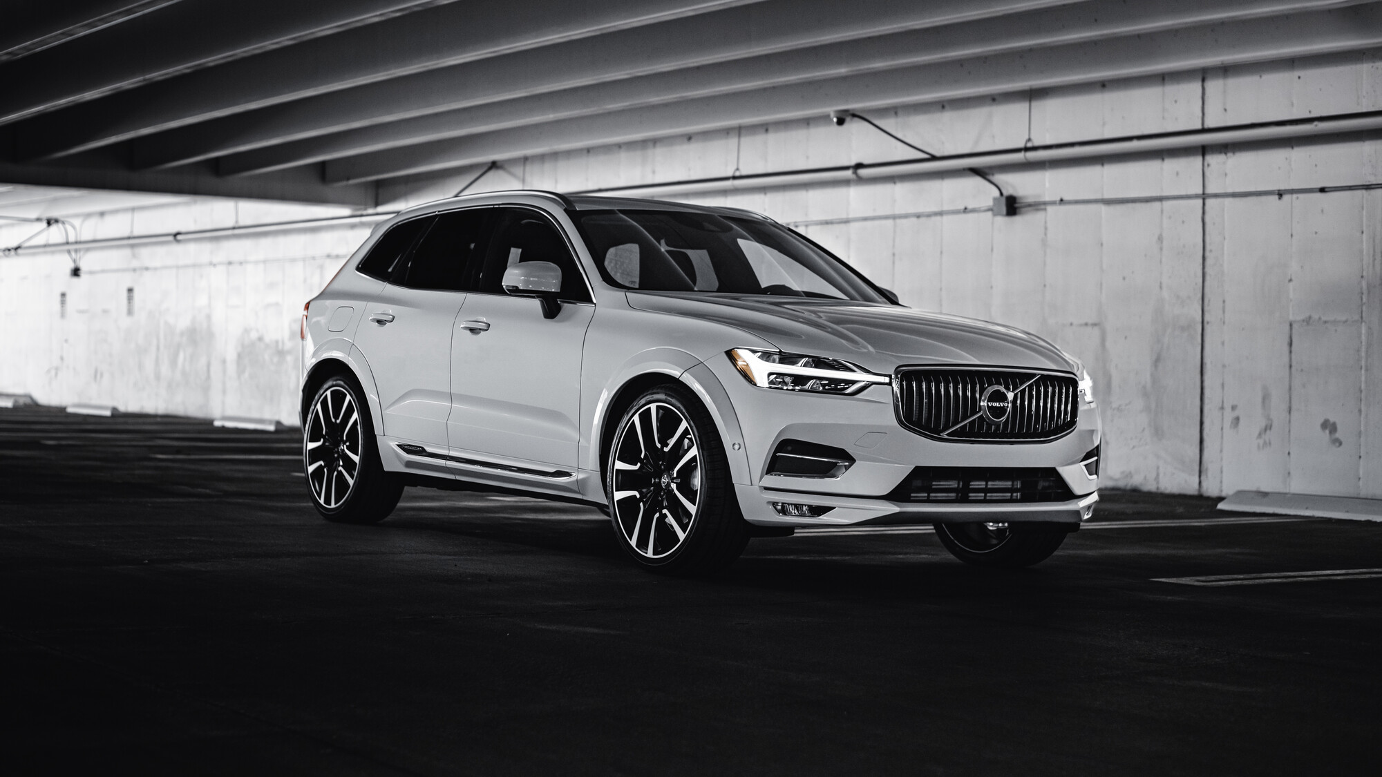
I had a CPL shot, it worked kind of. Either way there was still a reflection. I've posted an edited version of the car. Didn't do any dodging or burning on the body. Not spending too much time editing this one. Using it as a learning process.
I think the last one looks way better
I don't know, this is tough one. It's running downhill, the front is kind of dark, the angle or focal length IMO makes the shape look a bit weird.
Have you tried to clean up the reflected highlight in the door, or doing some light painting in photoshop to bring up the character lines in the hood and side? Just my opinion
The car itself has some interesting proportions that can throw your eyes off a bit. It's on a completely level surface. I used the Vertical seams between the concrete slabs as my level.
The redo looks a lot better, the A and B lines look good.I might do some curve adjustments to jazz up the paint a little. I think the big wheels add to the odd look, what lense did you use? Sometimes I'll add some weight in the back so it's not riding so high, but it is an suv so maybe not...
I will say I would prefer the rear sat a bit lower as well, this car is on full ride factory air suspension but it still doesn't quite sit where I would prefer it, a little photoshop magic could get it lower.
I was using my 50 f1.8. I'm going to pick up an 85 prime eventually, I think anything wider than those starts to distort the body, though I know a lot of people really like that style.
I'll expand on that edit a bit more when I have time and accentuate the body lines
Yeah the look these days it a wider lens maybe because how the cars like this have a tendency to look stumpy unless shot from the narrow angle where it looks the best. I think most of the cars I shoot these days are 35mm-50mm because the client likes to see some environment and car can look longer with a wider lens. But then a lot of cars look good with a longer lens, from the right angle...it all changes when you move the camera 8 inches up or to the left.
If it’s just a regular inventory photo I’ll stick to 35mm for exterior and 24mm or wider for the interiors. I need to practice with different elevations, I have a tendency to squat and want to get low but I know there are other really attractive angles to work with.