A Partial Review of Luminar 4, Pond Edition
Recently I have seen a lot on Fstoppers about Luminar 4. This inspired me to test it out to see what it could do to some of my own images. I tried to use a variety of genres, to fully test the capabilities of Luminar. Over the next few weeks, I'll be putting out some of my results to get community feedback. I also recognize that I am only beginning in photography, so I probably missed some detail or overcompensated in some way. I would much appreciate comments on my work so that I could improve.
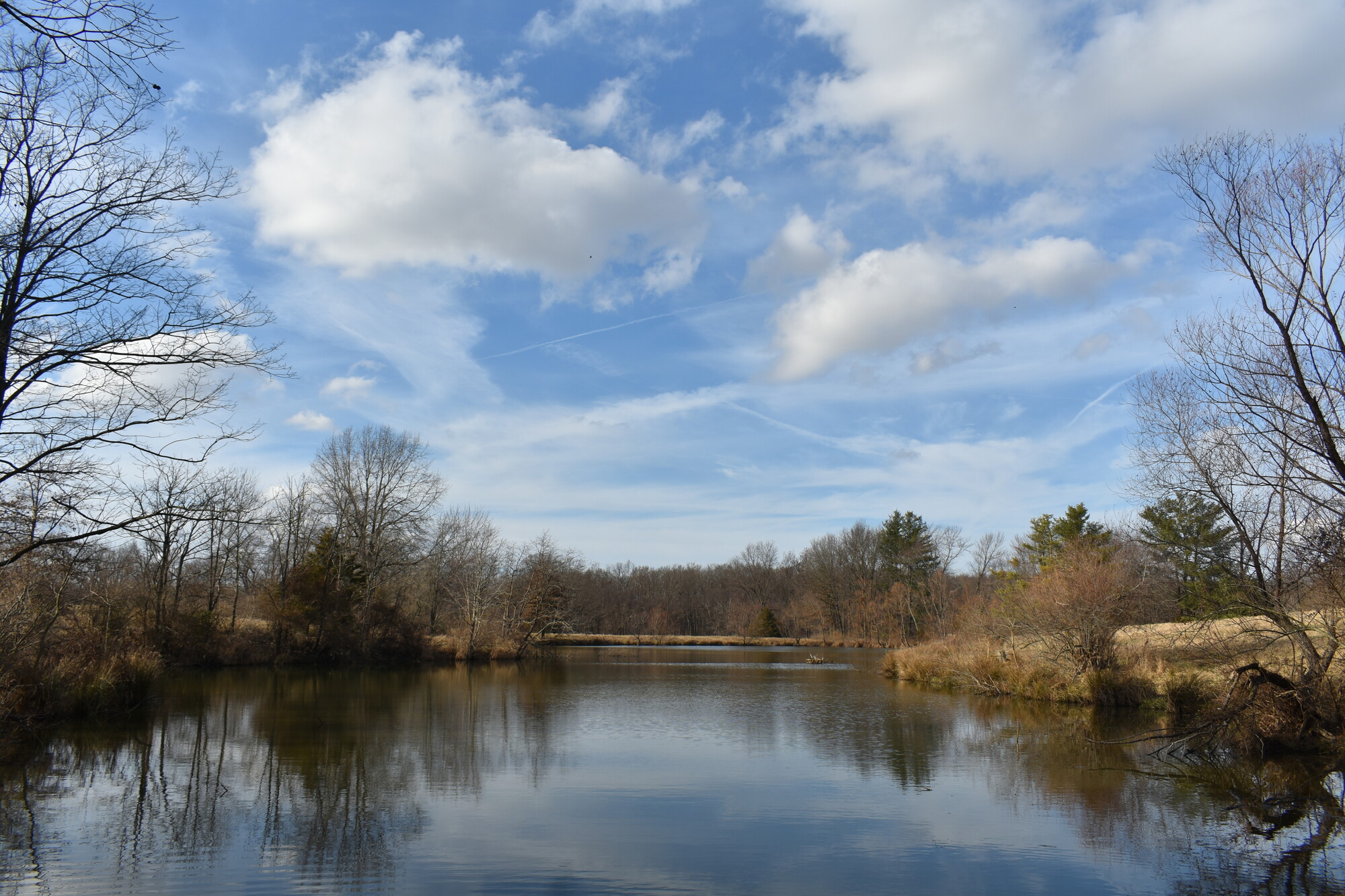
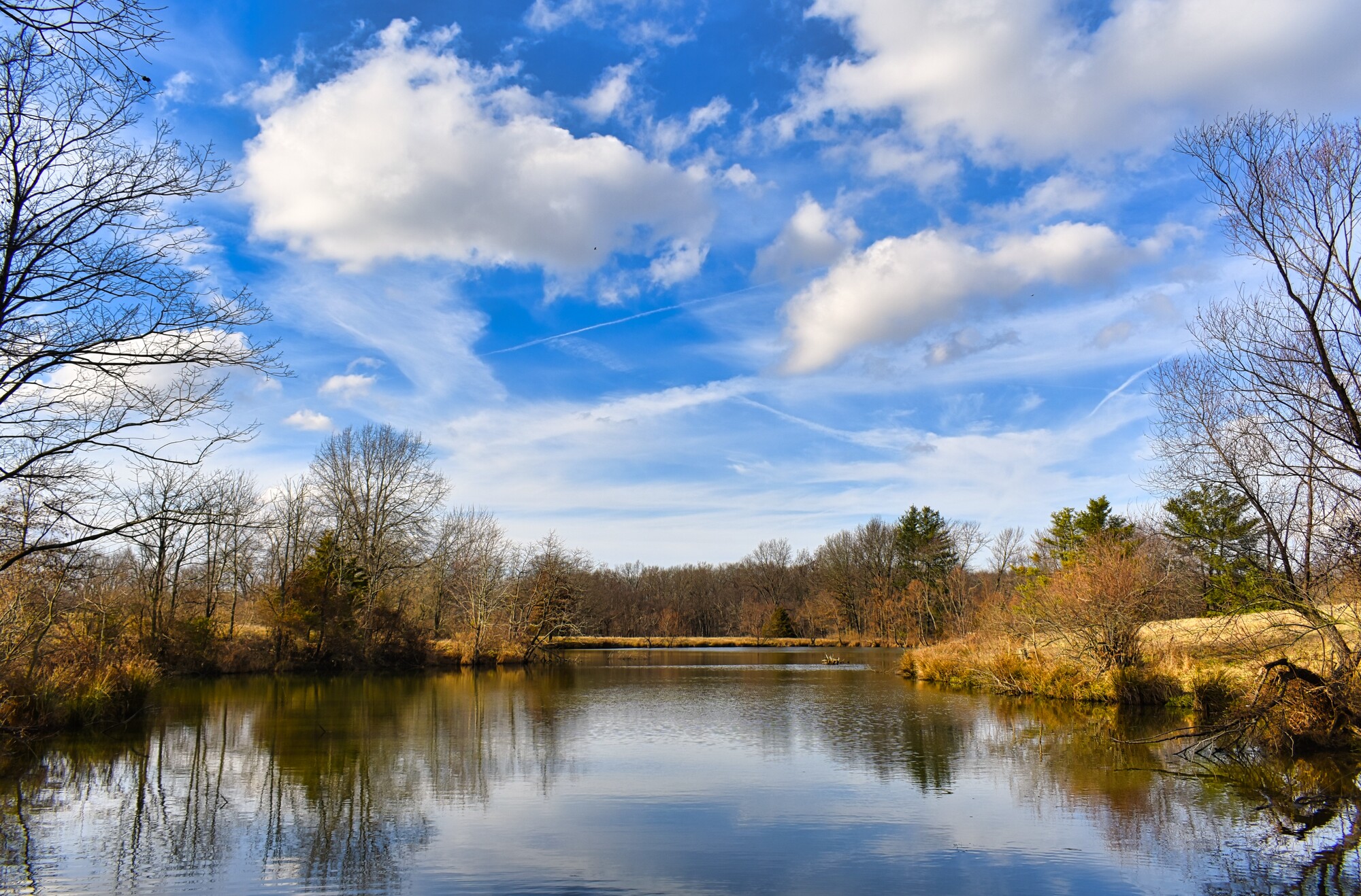
Without further ado, here is one of my landscapes that I put through Luminar. When I first took this picture, in December 2019, I was struck by the amazing sky, but I really didn't like the colors in the image. In my opinion they were too flat. Additionally, the horizon was tilted. After editing, I was very impressed with the results. The colors really stand out, but they don't look unnatural. Perhaps the sky is a little brighter than it was on that day, but once again, it isn't too unnatural.
I'd much appreciate community feedback here. If you have had experience with Luminar, I'd especially love to hear how you think it has done. I look forward to hearing what you have to say.
Thank you in advance,
Matthew Lacy


8 Comments
I've been using Luminar for roughly six weeks now and have incorporated it into my work flow; but in conjunction (as a filter) with Photoshop, and not as a stand-a-lone piece of software.
This way I can make Luminar-edits to a single layer and can then blend that into other layers. Example, I will make a new work layer of all current layers in Photoshop (alt+ctrl+shift+e) then bring the new layer into Luminar (filter)... I will then use a "look" into one of the various black and white styles, and export... back in PS I then set the blend mode of that new b/w layer to a luminosity.. Then make another new work layer (combining all past layers).... ect..
Why? Luminar can get bogged down if you try to do too much all at once.. Example: using the erase.. new sky.. new style, touch all the sliders on the right, make another layer blending another slider... ect.. it has not crashed on me (yet) but it dose bog down on my older computer. All that said, I'm enjoying the software.
Okay onto landscapes.. I've been taking and processing similar shots to yours as of late at a local marshland; so a lot of the same colors.
In Luminar check out "Autumn Colors" Look/preset.. Then play with the saturation slider on the right under Color to taste. Then I like doing one "1" point into Glow to make the color contrast pop just a pinch.
Below I did two edits just to show what Im talking about.. First is just with the B/W layer used as a luminosity mask. Second is using the Autumn Colors and 1 Tick in Glow. I also removed the black dot that was once a bird in the center of the image.
But the CC on your Edit, I like it.. The sky is a bit too much blue for my tastes. I'd use the sky from the unedited version and the ground of the edited.
All of this is just my taste and opinion of course... Nothing more. :)
I also noticed that it tended to get bogged down, but like you, I am using older hardware. I like what you did with the image, and am curious. You said that you used the sky from the original, but the ground was edited. Was this achievable through Luminar, or did you have to do this with photoshop?
Either way... Ohh I said using the two images you posted I'd use the sky from the original.. and mix the two.. I didn't do it myself.. But I gotcha..
To do it in luminar.. (Maybe?) Use the image you fulled edited.. Then in luminar do a sky replacement but use a second copy of your image, the unedited version. This will swap out the edited for the original unedited sky.
Sky replacement is under the "painters palette" icon all the way on the right-center, first tool at the top of the collection. It comes with a list of skys to use, but at the bottom of the list you can load your own file. Pretty sure this will work, I haven't tried it myself. I have used the sky replacement feature quite a bit but not with two identical files. Worth a shot though.
The easier way might be to go into the Color tools (HLS area) and adjust just the blues to bring them back a bit to look more like the original.
Again just my tastes.
Thank you for the help. I appreciate it. I'll have to try the sky replacement with the identical image. I already tried it out on a different image, which I'll be putting out a different post on, but I hadn't thought to use the original image. By the way, I checked out your portfolio, and you have some great pictures. I especially like the marsh path.
Always happy to help where I can and share my eye. We all have different visions, which is one of the aspects that makes this field so interesting... ...and thank you, it's very much appreciated. The Marsh Trail shot is one of my favorites as well.
I can only see that blue and yellow is charged, other colours are as weak as they were.
Can you tell us what exactly steps did you do? Just increased saturation?
I was really happy with this picture right away, which tends to make me a lazy editor. Besides increased saturation, which I specifically, used on the blues and yellows, I increased the sharpness slightly to bring out more detail in the trees. The other effects are slighter and more subtle, but I increased the exposure by .25% and did a slight uptick in the greens. After this I was satisfied with the image, as all of the initial "problems" I found with it were fixed.
Out of curiosity, which colors are "weak"? They all seemed good to my eye, but I am very new at this. If you could point that out, I can keep a closer eye on it in the future.
Take my remarks as totally subjective, as all are.
Sometimes I see the sky on reality very similar to yours, in unedited image, but I usually do the opposite, though the colour is quite dramatic, I desaturate it a little, to look more realistic, which is opposite to your decision.
Lightroom usually boosts yellows and oranges on many pics, so in that case I move it back, to have punchy balance.
If I see well, there is some weak reddish that can be barely seen, and green seems to be too weak to me. If you like more yellow, general boost in saturation might give you all colours.