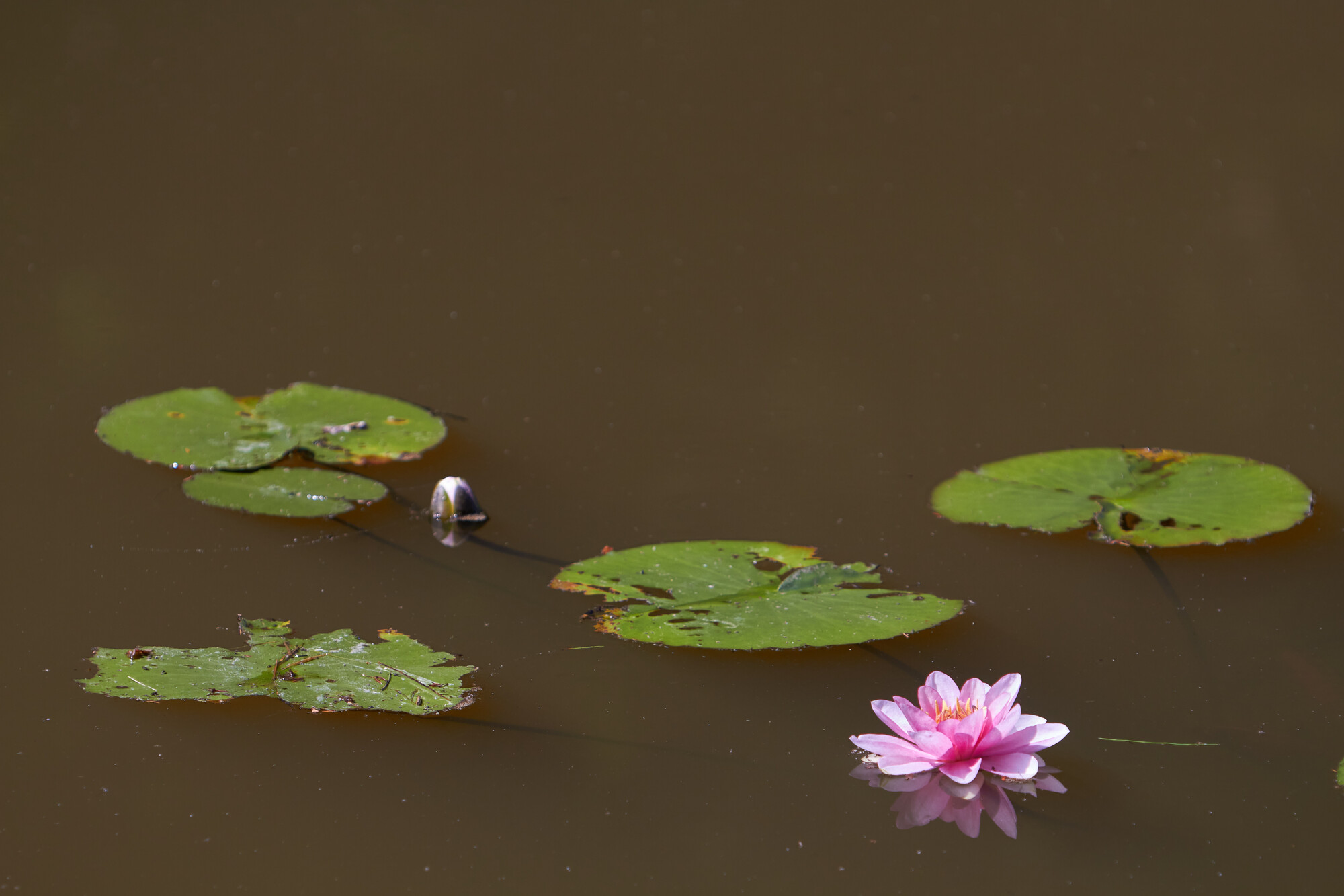
Not submissible to Nature photo contests
I captured these water lilies, and although I generally liked the scene, I disliked all the "dirt" in the water, and the water came out with a really ugly color.
This was processed on an un-calibrated monitor, hope it looks all right. Will get my calibration device next week.


10 Comments
That's a vast improvement. Good job.
Thanks
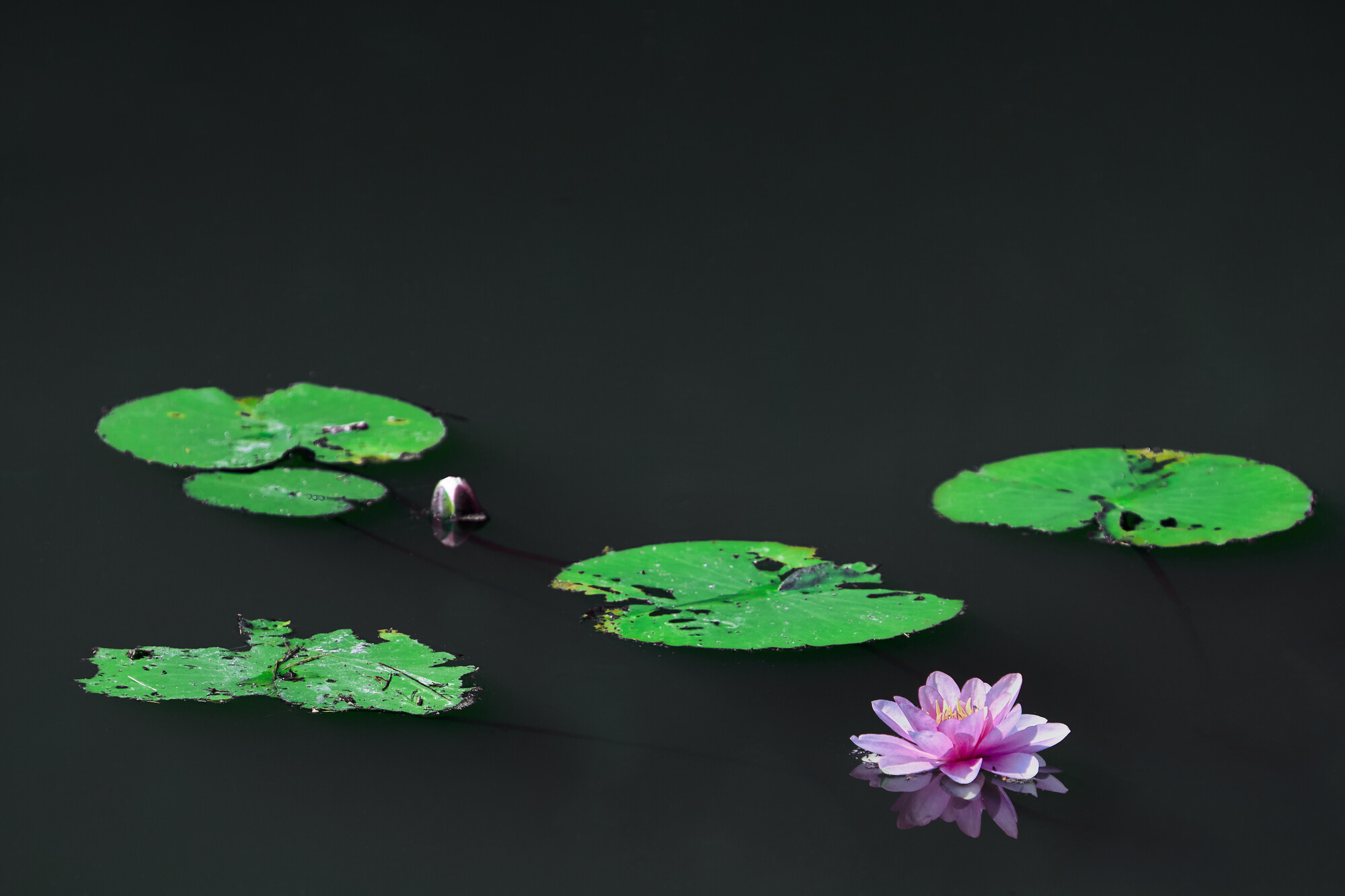
Btw, all processing done in Affinity Photo.(Raw conversion in Capture One)
I'm wondering why you didn't use the RAW converter from Capture One itself? Just curiosity.
I haven't seen your question until now, and it's been a while now. But I seem to remember I started doing the retouching in C1, but cleaning up the water was too much a hassle there. That was way easier in Affinity.
Check, I got it!
I think the cleaned up water looks way better. I like the greens in the original better, for me they are to neonish in the post processed version, but maybe that was something you were going for.
I agree that the lilies look too green in the processed version.
I definitely like the direction the edit is going. I think you can still keep a pleasant monochromatic color scheme, while also toning the green down a hair on the lily pads. This might create less contrast, but I think it will create a bit more of a cohesive feel. Currently, they green pads makes me think of the Toxic Avenger, which I love... but maybe not for lily pads.
Thanks to all for your comments, particularly suggesting that the lily pads have an unnatural toxic looking color, I totally get that.
It's been a while, so I think that they got that color to create a good contrast to the water. Maybe I'll revisit that file later. Hope I didn't flatten it yet.