Music Video Shoot
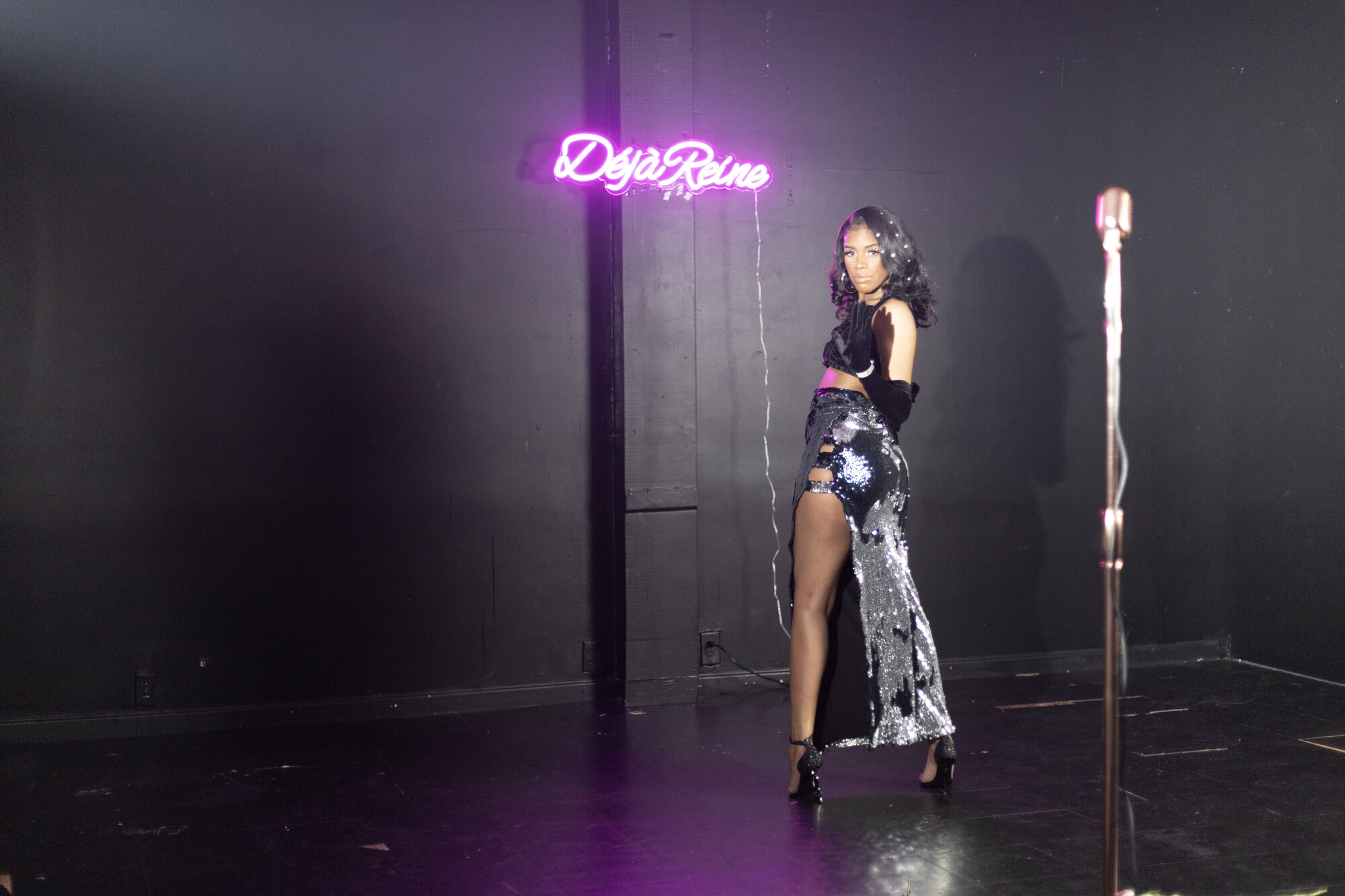
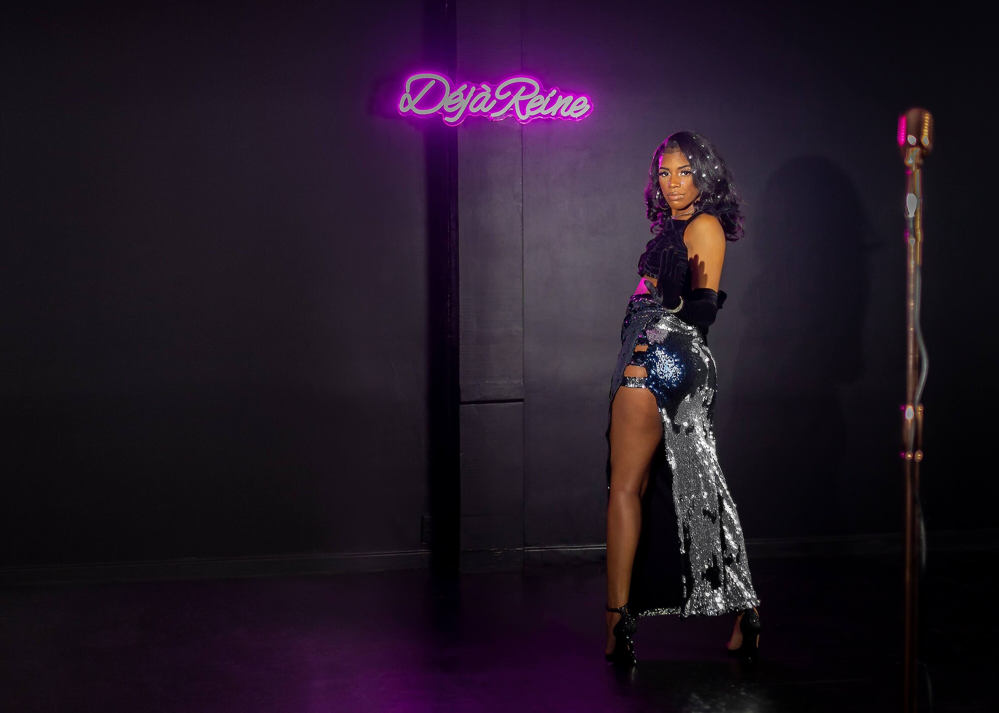
I was asked by a local singer to take photos during a video shoot to promote her new single. Being this was not my set, I had no control over lighting, set, etc and I had to work around the director to stay out of his way.
I took hundreds of photos over three hours to give her a broad choice of poses, expressions and areas on the set and this was the image she chose. As you can see the stage is in horrible shape and the cross lighting created two shadows on the wall.
One of the things I try to do as a photographer is to keep the environment as close to original as possible, especially when the scenery in the image is the same in the video. Matching matters to me. So when another photographer suggested simply doing a background replacement I balked because that wouldn't be true to the image or the video. That meant keeping the column, but cleaning it up of course.
Editing this image took me into areas I hadn't ventured into before. Yes, there are a few flaws but overall the client was happy with what I was able to accomplish. Space on left is deliberately blank to allow for client copy and cropping.
Would love input on this whether kind or critical.
Thanks.


4 Comments
Hey Bruce, WOW - nice job...from the original photo to the edited photo you really cleaned it up pretty nice. My recommendation (and I am not a pro or consider myself a expert or anything) BUT, a couple things I think you should look at is around your singers shoes, maybe lighting up the black to allow a little of the purple show just a tiny bit...also, maybe you could have tried to center the photo just a little bit leaving both ends open for cropping...other than that, I like it!
I appreciate your comments. This was a lot of work for me as I'm not the most proficient in PS but I'm learning. Yes, I probably could have brought up the shadows around the shoes a bit. However the left was deliberately included for cropping - I like to leave lead room on the side the person is facing. I'd have done the same if she was facing right. That's a carryover from being in TV studios back in the day. I do wish I had more space to the right of the microphone though.
Thanks again for your input!
Hey Bruce, while I appreciate your philosophy as a photographer, your role here was to present the singer in a way that would be as flattering to her as possible. I think you did some of that with the post, but at the same time your primary focus (no pun intended)
isn't to preserve the environment unless the job was to showcase the studio.
All that being said, a background replacement would look cheap and contrived with the poor lighting you had to use. I would simply recommend cropping in to focus on the singer and also brighten the neon sign as it shouldn't be that dark. The other elements (mic stand, negative space) you preserved add nothing to the scene in my opinion and would be cropped anyway by an editor. As a result, crop with a photographer's eye to produce the best possible product for the client.
I appreciate your opinion, Robert. Now that you mention it the sign could be brighter.
I think part of the reason she chose this shot is because the microphone had such a prominent role in the video and wanted to link them together for the single's promotion.
Thanks again for your opinions. I'll keep them in mind for future shoots.