
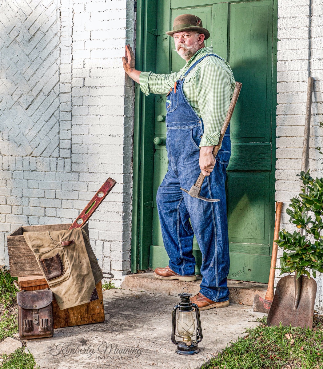
Quitting Time
There’s two things that could have been done better in this image- imo. But I won’t point them out because I’m sure you all see them too. However, comparing this image with what I was capturing a year ago I am more than pleased with the outcome. I am SOOO close to successfully creating the images that I dream about daily. Model is my hubby. Captured at golden hour with one speedlight on a Canon 5D ‘Mark III 24-70 2.8 (my favorite lens!)


11 Comments
Portraiture is not really my thing Kimberly, so perhaps I'm not the best qualified to comment, but I think this is a great shot. I think the only thing I's have changed is to move the lamp on the ground to provide separation between the foot, but I'm splitting hairs.
Yep- that was one of the two things I noticed. And I think the speedlight was a little too hot on the wall right by his hand. I should have flagged it. But overall I’m happy with it. Thanks for your input!
I love the story this tells. I missed the lamp. One of the things I have to remind myself about is the details.
There also seems to be a double shadow - one from the speedlight and the other from the sun.
Yes- details details. It’s always something little that could have been just a little better. But every day I get a little closer. I’m sure the shadow is a technical no no but it didn’t really bother me here. I’m more bothered by the lamp breaking the plane of the boot and the highlight on the wall.
The composition is busy. The odd angle of the spirit level is distracting. Maybe less of the herring bone brick and make the shot from sixty degrees more to the left. Not all of the box imagery needs to be in the frame. The greenery to his left can stand alone and not hide the shovel handle. Have the lantern in his left hand and splay out the handled tools from the box. Shovel is maybe the odd object here - leave out. Too much white wall. Too much foreground. Camera is at about knee height. Maybe mid-chest is better. Get a little tighter on that magnificent guy and you've got yourself a winner.
Thanks for the tips. That would be a good image as well. I feel like most of your suggestions is more stylistic from your viewpoint. I agree all that would make a great image. I really like what I did here too.
Yes, I was approaching it from a two-dimensional art point of view. Have had some classes in design, drawing, sketching, color theory, and painting. Also am still a certified journeyman carpenter so I paid special attention to those tools.
When you have a great subject like that at hand, keep on photographing and try different things. Some artists have done similar things hundreds of times. As you might suspect, they get better and better.
He is somewhat of a captive, being your husband, so make him earn his keep.
What strikes me is 1) the oddness of the tool set selected, and 2) that it does not look like it was shot at the Golden Hour. Why would he have an axe, a mattock, a shovel and a level? And any tradesman using these tools would normally be drenched in sweat. And why is there an oil lamp during daylight? And frankly, I've never seen a tradesman use both an apron and bib overalls. I agree that it looks hot in terms of the flash used, but the flash seems to negate the beauty of the Golden Hour.
Using the lighting did take away from the warm beauty of golden hour. (Probably my third time to use ocf so I’m learning. From this session I learned to bring the lighting WAAY down and to use golden hour to my advantage instead of fighting it) My husband is a craftsman and he in fact does wear his apron with his overalls depending on what he is working on. The set was his doing- he wanted to create a “going home at the end of a long day” look and I struggled with telling that story. But again, I am learning and I learned A LOT from this session. I’m not disappointed with the final image. And I know what to do differently next time to make an even better one.
Hi Kimberly.....the only thing that stands out for me is that the image looks almost like to much hdr has been applied ??...of course it's a matter of personal taste....other than that I like it 😁😁
It’s a Joel grimes filter. But yeah it pushes the boundaries I think.