Hi! :)
Please give me a tip on how to improve my work. Thanks :D

Please give me a tip on how to improve my work. Thanks :D
Another visit to our garden using a vintage lens (Canon FD 50mm f/1.4) on my Canon R5. NOTE: With this lens the minimum focusing distance is 18" at which point you have 1/4" depth of field.

Was down in Austin for a bit on a work trip. I've always heard how beautiful the skyline is from the river.
Was a little let down by the clouds, but what can I do!
My two favourite images from my recent night time adventure in Tenerife. Foregrounds and skies were shot separately and blended in PS.
Hi all, I was looking for such a group but see that although there are many members there hasn’t been a single post. Is there interest out there in getting this group going?
I thought I would try out my 50 year old lenses: Canon FD 50mm f/1.5 SSC and Canon FD 28mm f/2.8 on my Canon R5 with the use of the appropriate adapter.


9 Comments
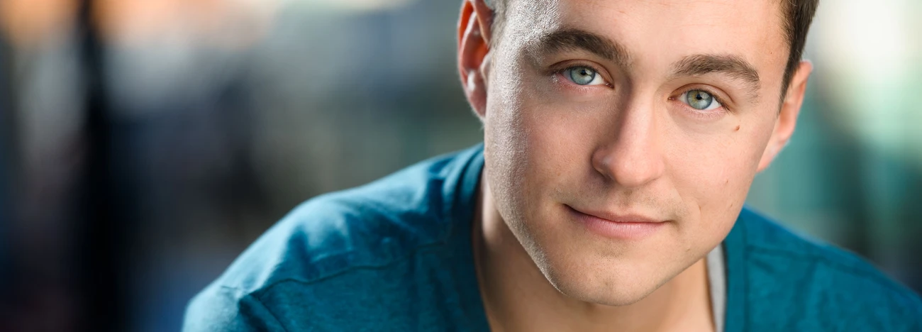
Hi Andrei,
i really like the light, the background and the whole picture itself (:
My personally opinion would be to crop down the image a little to cut a bit of his head (it looks better if his eyes are in the middle of the upper third of the picture - for me) and sit him further on the right side - he is really centered right now.
Greetings from Germany!
Thank you, Niko! I really apreciate it. I am only an amateru who wants to learn more.
With these images normally and in this case you are right to put the subject bang on the vanishing point, which is often but not always best in the centre of your frame. Usually when going for a central position it is best ensure it is perfectly central laterally. Your pic looks slightly off centre to me. Not a big no no but I would shift it to be totally symerical or 1/3 and 2/3 or something like that. the rule of thirds is a good rule and it should be broken regularly when something else looks better.
Overall I like the shot but would have prefered less light on the left of the subject's face as the light in the space appears to come from the windows to his right, camera left if you prefer.
I think it is slightly too pale, and I suspect you have over lit him rather than used available as the key light. The warm cast on his neck and left face don't look like another window has done the fill-in lighting and even if it had done I would have stopped it, as the scene in the frame and the subject are slightly at odds with each other becasuse of this lighting. The strange fold of cloth on the right shoulder is distracting.
Good composition but more attention to detail needed, imo.
You are right. Thank you so much for your advice :) It really helps me. I will take your advice into account for the next portrait.
I still think my above critique is correct but as an additional point If you hade warmed up all of his face, without lightening it, relative to the background, then you would also have had a great image with a more sylised look, less natural, but also very impactful.
I really like this shot. Love the model centered with the vanishing point implied behind him. It would be really great if it where shot slightly to your left. This way you could crop to center your model within the image and still utilize the vanishing point.
Great work!
Thanks....Craig
"Life and Living Captured as Art"
Great Shot ! Nice blurred background and lighting is very nice !
Did you have some light bounced back on his left side from under may be at a waist level ?
This shot is from a parking lot.It's all natural light. There were windows everywhere: in the left, the right and behind me. But the closest windows are the left ones (my left). But the windows were big enough: they are starting from his elbow level and going above his head. Please excuse my bad english.
Awesome ! Best of Luck my friend to you in, whatever you wish to do !