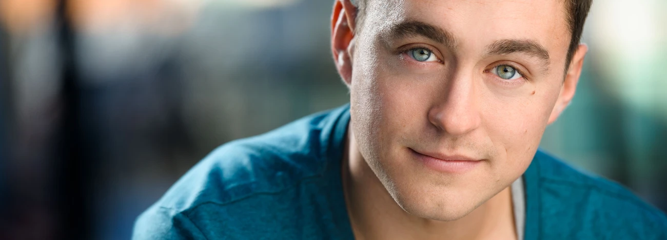
Outdoor Portrait
Please let me know what and how it can be improved !


Please let me know what and how it can be improved !
Another visit to our garden using a vintage lens (Canon FD 50mm f/1.4) on my Canon R5. NOTE: With this lens the minimum focusing distance is 18" at which point you have 1/4" depth of field.

Was down in Austin for a bit on a work trip. I've always heard how beautiful the skyline is from the river.
Was a little let down by the clouds, but what can I do!
My two favourite images from my recent night time adventure in Tenerife. Foregrounds and skies were shot separately and blended in PS.
Hi all, I was looking for such a group but see that although there are many members there hasn’t been a single post. Is there interest out there in getting this group going?
I thought I would try out my 50 year old lenses: Canon FD 50mm f/1.5 SSC and Canon FD 28mm f/2.8 on my Canon R5 with the use of the appropriate adapter.


1 Comment
Picture one, the light is to dull and too frontal. This flattens the image. The lack of contrast in the man and the cool colour just kill it. The background is too dark against such a pale reproduction of the subject. It is about sensitive selection of tones, colours and lighting plus the ususal human interaction, of course.
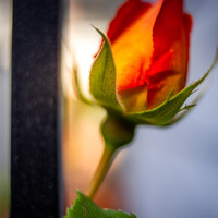
Picture 2, the colour is better the background is nicely out of focus but still illchosen, it is distracting. Stong geometric shapes, however out of focus are generally going to pull the eye away from you subject. Ditto bright red stuff.