More Posts in: Landscape and Nature Photography
First time this young lady posed and worked in studio. Just finished her Masters degree and is now pursuing her PhD.
Just a few interesting details walking around a couple of towns in Germany. In the second one, I was just captured by the setting sunlight in an alley.
Spotted close to walking trail in Ebor NSW. Intense body colour indicates recent skin shedding.
We just came back from NE Oregon location scouting Zumwalt Prairie and Enterprise/Joseph area as well.
At least that is what it seems...


10 Comments
Both are acceptable.
Edited:
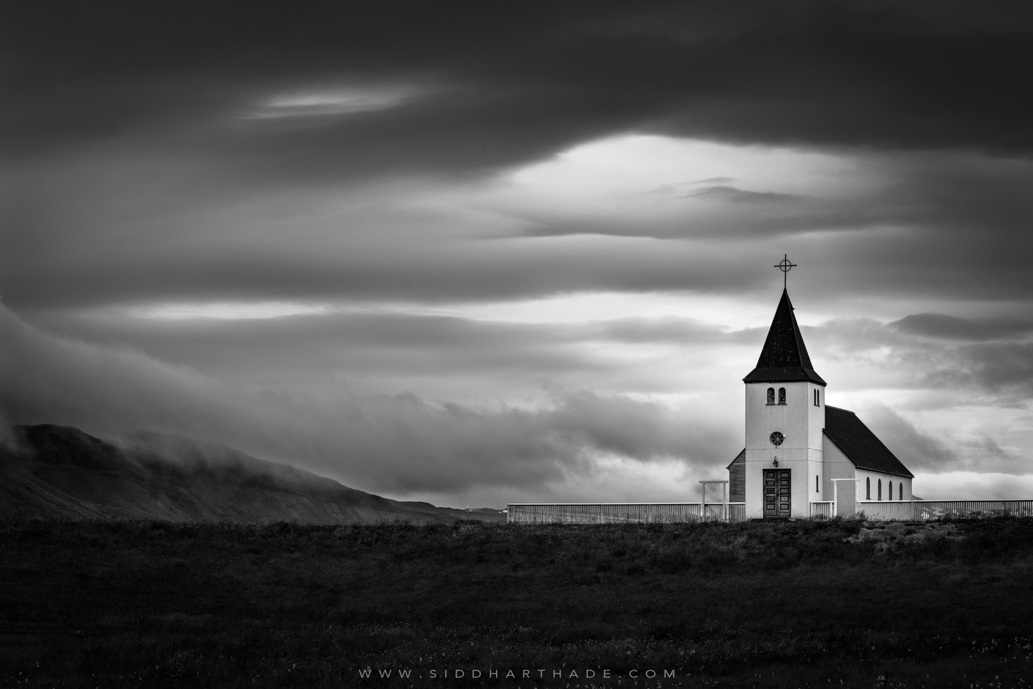
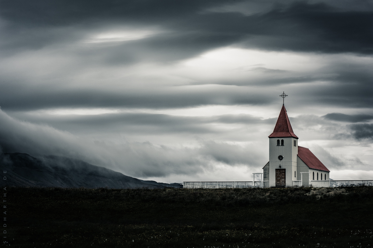
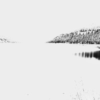
Let me elaborate a bit more.. The color image simply stands out more and draws the eye to the red of the church roof. But the black & white images is also composted very well simply because you've used the color image and simply converted the color to black and white. Now the objective would be to actually take this image again, but in black & white mode.. Otherwise you're left with a "untrue" black & white photography which can be spotted a mile away even if you didn't post the color image below. Always, Always take more shots in a verity of color situations using you camera and avoid using editing software.
Hi Amp Lighter,
Thanks for your comments. Since this was taken in RAW, it doesn't really matter if I shoot in colour or B/W mode on my camera. The RAW file will be the same. The LCD screen on the camera merely shows you a JPEG rendition in B/W. You'll still have to post-process the picture afterwards.
When you say 'untrue' B/W, it is essentially the same for all digital colour sensors. The only way to have a 'true' B/W then would be to use a modified sensor with a single colour channel. So yes, with my camera, I would have to take the RAW file that has all the colour data, then convert it to B/W in post-processing. I would like to add that the B/W image is not simply a version of the colour image with the B/W mode toggled. My post-processing workflow was completely different for the two pictures.
Sid
You'll have to forgive my ignorance as I've never shot anything using the RAW format. Thus the next new camera (matter of weeks) will have this capability and I look forward to seeing these results.
No worries, Amp Lighter. I hope you enjoy shooting with your new camera.
The color version is okay, the B&W outstanding. Ask yourself what does the color add to the image. For me, nothing. It reduces the drama of the B&W version. I think the compositions is excellent. I'm reserving any comments on the PP as I'm having to view it on a crappy, small laptop screen.
Thanks, Paul. Those were my instincts too. I took this picture in 2015, and looking at the RAW file I knew right away that B/W would be more dramatic. I only processed the colour version yesterday for the first time in response to a particular request, and thought I'd post it here for feedback.
Another vote for the BW version.
Thanks, Jack.
I prefer the black and white for a stark, dramatic scene like this. Have you tried a slightly tighter crop?
I'm leaning towards the B&W, which I normally don't care for. Something about the sky I think makes it more interesting to me. I shot an old church last night. Never considered B&W, but I don't think mine would look as good that way.
Great composition, it's a beautiful place. Thanks for sharing.