
Contrast means so much more than the separation of light and dark. Understanding the different types of contrast can train our photographic eyes and improve our Images.
We usually think of contrast as the difference between the darkest and brightest parts of the photo, in other words, the separation of tones. The more pixels there are pushed away from one another and towards the extremes of white and black, the more contrast the image has.
Open an image in your favorite processing software and push the contrast slider to both extremes and observe the histogram. Watch as the pixels represented in the graph move further apart as contrast increases, and then move closer together as it is reduced.
On a practical level, knowing about tonal contrast is useful in photography. In black and white photography, for example, we can only distinguish between subjects if there is tonal contrast. A lot of successful monochrome images have strong shadows and highlights, although this is not always the case. Low contrast black and white photography can sometimes work too.
However, difference in tonal values is just one aspect of contrast that we should consider in our photography. Although important, contrast can mean much more than just that. Johannes Itten (1888-1967) promoted a broader definition. He was a Swiss expressionist artist and teacher of the preliminary course at the Bauhaus School. He proposed seven basic color contrasts, and awareness of these in photography can also help us improve our work.
Itten’s Seven Color Contrasts
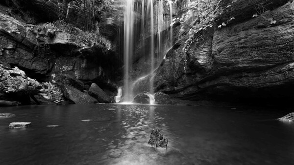
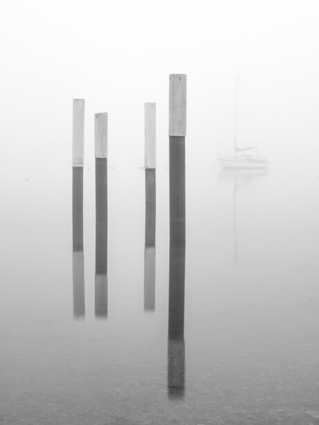
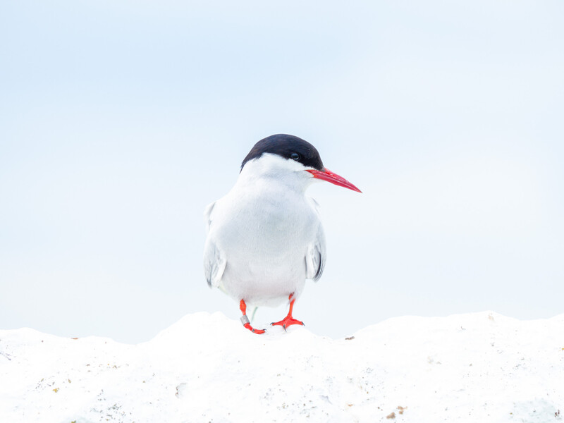
1. Light and Dark
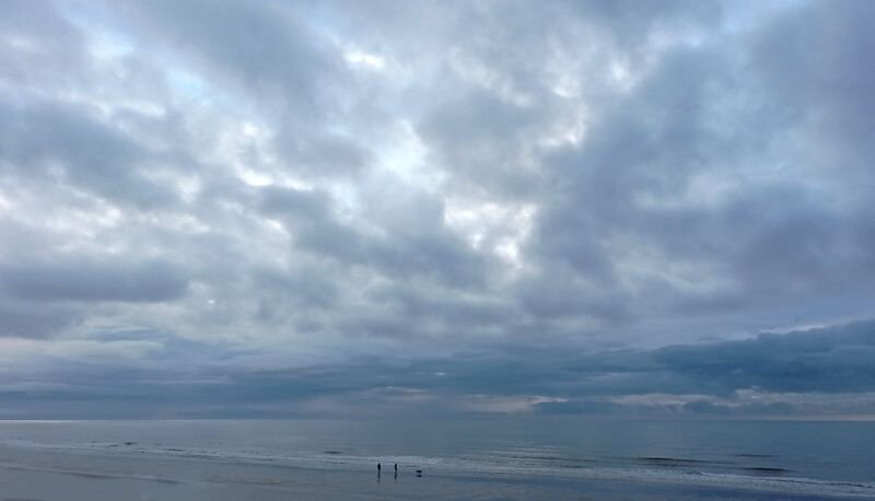
This is the tonal contrast described above, and the first of Itten’s seven contrasts. A low contrast image may have no blacks and/or whites and all the tones are bunched together, such as the image shot in the fog above.
Meanwhile, a low-key, chiaroscuro image will have strong contrast with heavy blacks and shadows and areas of, bright light. In painting, the artist Caravaggio created high contrast chiaroscuro work in an extreme style known as Tenebrism, where dark dominates, there are few mid-tones, and the smaller areas of highlights draw one's eye. This approach can be employed in photography.
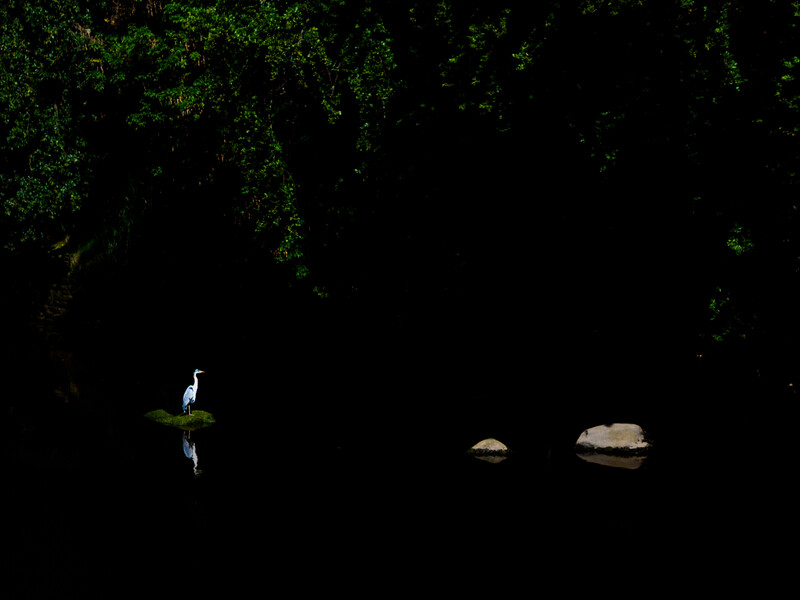
Similarly, high-key images also show light and dark contrasts, but with the highlights dominating the frame.
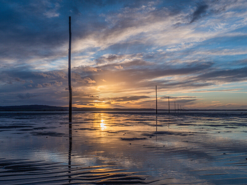
2. Cold and Warm
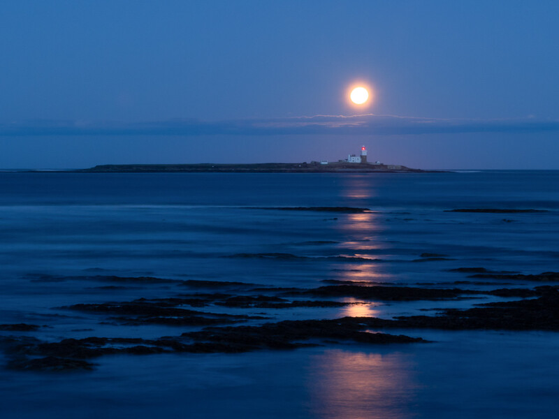
This is the contrast between warm oranges, reds, and yellows, and cooler blues. It should be noted that warm and cool here refer to the psychological meanings of the colors. In physics, blue light has far more energy and is thus hotter than the red end of the electromagnetic spectrum. The most common cold and warm contrast we see in photography is orange against blue: the sunset against the sea, autumn leaves against the sky.
Warm foregrounds and cooler backgrounds increase perspective in an image, while the reverse reduces perspective. You may see in the following image that the orange of the sunset seems closer than the blue horizons to either side.
3. Hue
This contrast is formed by the juxtaposing of different hues. A greater distance between hues on a color wheel produces a greater contrast. So, red and orange have low contrast, whereas red and green have the highest color contrast.
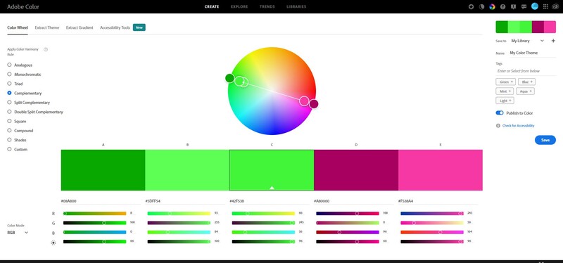
4. Complementary
Related to the contrast by hue, and sometimes grouped together with it in Itten's color contrast, complementary colors are those on the opposite sides of the color wheel.
In very simple terms, if we take the two primary colors and mix them together, we get a secondary color: red and blue make purple, blue and yellow make green, and yellow and red make orange. The complementary color of the secondary color is the primary not included in its composition. So, green does not include red in its composition, so red and green are complementary colors. Orange does not include blue, so they are complementary to each other, and likewise purple is complementary to yellow. True complementary colors are opposite each other on a color wheel.
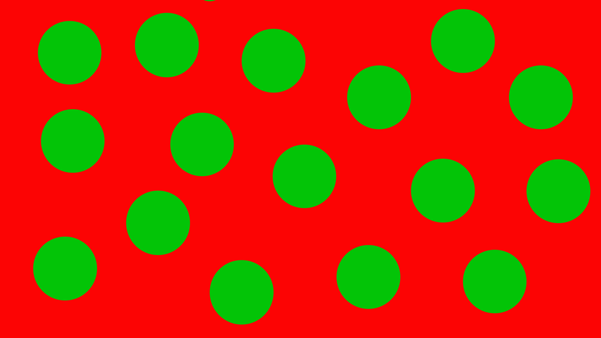
5. Simultaneous Contrast
Have you ever looked at a strong red against a strong green and the colors seem to vibrate against each other? This is simultaneous contrast. It’s the way in which one color can affect the way we perceive another.
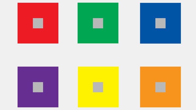
Additionally, simultaneous contrast also refers to the effect a color has on its surroundings. For example, if you place yellow objects on a gray background, the background seems to take on a purple hue. If we do the same with red on a gray background, the background appears slightly greenish. In the following diagram, all the small gray boxes are the same gray tone, yet they can appear to take on the complementary color of their surroundings.
6. Quality (Saturation)
These are contrasts in saturation, pale muted colors against strong, saturated ones.
7. Quantity
A typical example of contrast by quantity would be a little splash of color against a backdrop of another hue.
Physical Contrasts
Itten set his students tasks to explore other possibilities of contrasts. Although he was concentrating on art and design, applying the same principles in photography make our images more compelling. These contrasts were physical opposites, such as points and lines, horizontal and vertical, thick and thin, small and large, tall and short, many and one, etc.
Being aware of contrasts can improve our photography. Instead of just lifting the camera to our eye and shooting, we can use them to help tell the story to the viewer about what it is we were trying to portray. In other words, it shows the intelligence behind the photograph.
Of course, not all photographs have to contain such contrasts. A soft, repeating pattern of ripples on the water, or a field of golden wheat which is similar textures, shapes, colors, and tones can still make compelling shots.
What is Micro-Contrast?
There is a lot of hogwash written about micro-contrast at the moment. It's a trendy topic in internet forums.
Look through a cheap piece of greenhouse glass and, although you can discern what you are looking at, the edges of fine lines will blur into one another. In comparison, good quality window glass can appear almost invisible; you can see the fine edges. The same applies to lenses. High-quality lenses produce much sharper images because they can show tiny differences in tone much more effectively than most consumer-end lenses. Micro contrast is the ability of a lens to transmit those small differences between tones. In other words, a lens with high micro-contrast is sharper.
Modern technology allows most consumer-end lenses to have excellent micro-contrast, far better than many pro-lenses produced thirty years ago. However, “better” in this case is subjective. There are plenty of people who enjoy photography using old film lenses.
Personal Challenge
If you want to explore contrast, make a list of opposites. Then, using the genre of photography that appeals to you, take a series of images that demonstrate those opposites. You can either shoot single photos that contain the two extremes, or alternatively pairs of photos that depict opposites of each other. Do upload them to your online gallery and please post a link in the comments, as it would be great to see them.
All images © Ivor Rackham 2005-2021


Join the Fstoppers community for free
-
Post comments and join in the discussions
-
Browse the site ad-free
-
Share your work and get featured in the community
-
Compete in the photo contests for fun and prizes
4 Comments
Good article. Contrast is indeed about opposites and not just a contrast slider or curves. Looking for contrast as we take photographs is quite a useful discipline. It could be contrasting colours, contrasting objects/subjects, contrasting shapes. With street photography I sometimes like to create a contrast using both indoor and outdoor spaces in the same photograph, like using doorways or entrances to buildings or windows.
Thank you for the kind comment, Sam. That's a great point about using doors and windows for creating contrast.
Thank you!
Hi Sébastien, thank you too! Glad you enjoyed the article.