
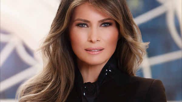
It’s been posted nearly everywhere by now. The official White House portrait of the first lady, Melania Trump is being criticized all over the web for its 1980’s-esque vibe and overall lack of quality. The image has photographers everywhere claiming that they could have produced better, however, given that it’s highly unlikely that you’ll receive an opportunity to photograph the First Lady in a studio environment, I’m interested in how the community thinks the portrait should look.
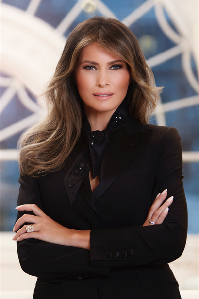
Considering the amount of media attention the US President and his family already receive, does anyone actually care about one more photograph of the First Lady? The White House does, and they updated their website to include a new portrait, the official portrait, of the First Lady. Mrs. Trump can be seen standing in a strong, forward-facing pose with her arms crossed, wearing a black scarf and business coat. Personally, I’m okay with that. What I can’t seem to get over is the apparent lack of quality present in the image. Either I need some corrective glasses, or whoever processed this image seemingly hates clarity and sharpness and chose to lean on the left-hand side of their clarity and sharpness sliders.
No doubt, one of the many competent photographers here among the Fstoppers community could have taken a much better portrait. With the obvious aside, let’s have a little fun with this. I’m interested in seeing if any of you Photoshop experts out there can make a few, corrections. Ready, set, go! Post your edits in the comments. Oh, and be nice!
Photo courtesy of WhiteHouse.gov
Join the Fstoppers community for free
-
Post comments and join in the discussions
-
Browse the site ad-free
-
Share your work and get featured in the community
-
Compete in the photo contests for fun and prizes
64 Comments
With all due respect to the First Lady, I would start over.
The shot itself is unsharp...which in itself doesn't bother me too much. However, the retouching is way overdone. She is an attractive lady with exceptional bold features. The PP/Photographer didn't need to go that far with the after-work.
As for the pose itself...I like it. Strong, confident woman...
I agree.
Thought I would give it a go - man it's hard to introduce detail to an image with so little!
Nice!
Thanks :)
My guess is it's over-processed using Portrait Professional software. Not a knock on the software, but the person using it. In my opinion it's too heavy handed. So the debate is, is it a two light set-up or three?
Here ya go
Thanks for helping me procrastinate today. Here's my version.
Too much black.
All good tries...but trying to make silk from a Sow's ear....not so much.
Horribly retouched image. It's the retouching that utterly destroys it. I guess with all the money going to the military and building The Wall they couldn't afford a real retoucher...
Dude, get a grip, and stick to the photo.
Here, educate yourself: http://tinyurl.com/jk2t6z9
Yeah I know what it was, and my response is the same. Get a grip.
If you knew what it was, then we all know who really needs to "get a grip"...
You do not equal "we."
I don't have to.
for me as a rank amature photographer let alone post editor the pose is completely wrong. It's supposed to be a formal portrait of the first lady not a portfolio shot for a soap actress. smile or close your mouth, that "sparrow face" crap belong on instagram.
I'm also of the opinion that the image in question is more appropriate for corporate branding rather than a formal presentation of the FLOTUS. but even then, I would not bother to re-edit this image, there are too many details missed that to me this screams "rushed job". I would have tried for a 3/4 portrait, angled the subject a bit. I would also prefer to have more ambient daylight and perhaps feature a nice piece of furniture to accent the image and give it a bit of depth.
The photographer is Regine Mahaux. She has some great images and an A list of clientele. Not sure where she went wrong with this one
I used a special Dark Crystal filter to bring out her eyes a bit. I then took the slider to 100 on the second one. A or B?
Don't understand why anyone would vote you down here.
Wouldn't expect anything less from you, Peter.
What I have seen here so far is mostly just cropping. I thought the crop was ok. And, yes, maybe it's more MY style, but I added a vingnette. I also smoothed out her skin tones, darkened her cheek color a bit, sharpened her eyes, eyebrows and hair, upped the vibrance a tad and brightened the contrast. Hope you like it...
"I added vignette" - ironically I'm guessing
Nope, never mind, just looked at your work.
Take the time and understand what vignette is and when and when not to use. (hint: rarely ever). IMHO
Constructive criticism is more constructive when you're less of a dick...IMHO.
Everyone here is just sharpening the image...I would have thought the background was the first thing to be shopped out!
Basically correcting the only real problem that existed...the shot was out of focus and the photographer tried to hide it with a smoothing edit.
Unless you have the unretouched original, there's nothing that can be done to this shot. It's just horribly retouched.
Ain't nobody got time for that! Including the original photographer.
The background was the 1st thing that screamed at me too. There is more detail in the out of focus window (or whatever that is behind her) than the subject. Plus its nice and bright while she is wearing black with little in the way of highlights. Kind of the opposite way I would approach a portrait
Agree the background is distracting
The pose is fine but the expression on her face is not the most flattering. She has looked much better elsewhere. The background is also lousy. Finally, and more importanly, the editing of the image is awful. It looks like a typical case of excessive noise reduction being applied, not to mention some kind of softening or blurrring added. It has that typical plastic CGI look of so many photos of today, minus the sharpness. Unfortunately you see a lot of that in photos posted to this site. I would trash those photos and start again.
"She has looked much better elsewhere."
I agree: http://tinyurl.com/mlwko8g
Good to see she is not a prude.
What is that backdrop?
More age to her.
It's not as though this most recent image is the first portrait using creative brushwork resulting in something less than a 100% accurate rendering.
The image has certainly made me wonder about the "brief" (simple, safe, formal), and compare this image to earlier portraits like Michelle Obama (where she is smaller in frame to place her in context of the surroundings) or the very informal Grace Coolidge portrait
I think it is a strong, formal image worthy of a corporate report, perhaps the intended message is that this is a person who will take an active role in the business of government. Maybe this style is why the image has missed in the eyes of many people, it focussed on the individual and lacks any acknowledgement or recognition of the gravity associated with the position which for a short term elected official is borrowed. For some that might seem a little disrespectful or insulting.
Back to the question, for the image itself my criticism would be that it is photography "sans art".
There's more texture in that painting of Hillary than there is in Melania's skin. lol
Don't blame the photographer just yet. We know how the current Whitehouse administration just loves photographers, so:
1 What was the brief?
2 Did the Whitehouse pick the location or the photographer?
3 How long, and how many shots did the photographer get before they were told they were finished?
4 Did the photographer supply a very good and excellently retouched image that was then re-retouched by the Whitehouse?
5 Or did the intern do the retouching?
My money is on number 4!
The White House.
I chose number 5.
Nothing like starting the day procrastinating.
The photo of MT is better than this of BB. MT is squinting and looking fierce. BB is not.
https://en.wikipedia.org/wiki/Barbara_Bush#/media/File:Barbara_Bush_por…
I wasn't aware you were allowed to retouch official white house portraits. As-in, these are official portraits of the leader and his wife. From a historical and reference perspective, any distortion or enhancement should be disallowed in my opinion (if it isn't already). Same as photographs used in journalism.
Interesting point. You'd think they'd pull down the orange saturation on more of the presidents photos while they're at it. Guess they're keeping that particular feature historically accurate.
Like this. I'm a professional headshot photographer, and this photo is an abomination. Looks like she's selling real estate, life coaching or debt counseling. She's a very attractive woman, but not in this picture.
Has anyone else found it curious that FLOTUS is the ONLY image you can click on to enlarge on the official page? POS-POTUS, Pence & wife are all smaller images that can't be enlarged.
I like the image pose, but would have done a lighter portraiture/skin softening. I do like the other images on Regine Mahaux's page of the first family though!
While we all agree the shot seems to have poor retouching (esp. the skin), I suggest we see if the photographer can tell us the story. The reason is that I downloaded the shot and opened the info panel and found the attached. If you go to http://mahaux.com/en/ and start looking, you find lots of images that seem competently shot and retouched (not saying I love everything, but no one loves all my stuff either). I'm wondering if, for some reason, the images had to leave Mahaux's control between the capture and the retouch.
Oh, yes, I accidentally cut off the bottom, but it says the image was created in Photoshop CC 2014 -- so it's apparently been on the shelf for awhile too?