
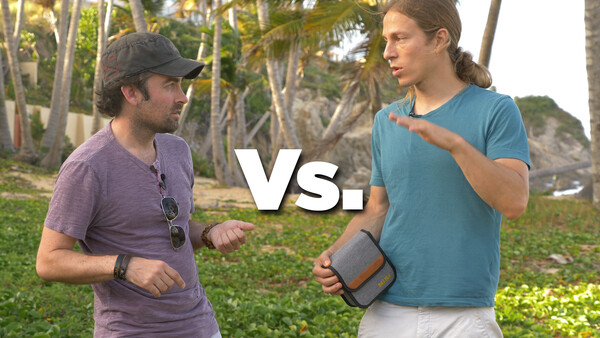
This week, we have a new photo challenge that pits two photographers against each other as they battle to see who can create the best image in a limited amount of time. Click the full post to cast your vote, and tomorrow, we will reveal the winner to the two challengers!
If you've been following our YouTube Channel, you have probably seen our first two photography challenges in Puerto Rico. The first challenge was between Lee Morris and me, as we were faced with capturing a series of waterfalls in the western part of the island. After easily destroying Lee, a new challenger by the name of Josh Rossi attempted to take the top honors as we explored two massive caves hidden in the jungles of Puerto Rico.
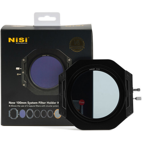
This time, we are mixing it up a bit and pitting two photographers against each other, but instead of traveling to an uninhabited land, the shoot will be taking place on the coast of Palmas Del Mar. This episode is also sponsored by the filter company NiSi, and each photographer will have the option of using a 3-stop graduated neutral density filter, a 6-stop ND filter, or a 10-stop ND filter (or a combination of any 3 filters).
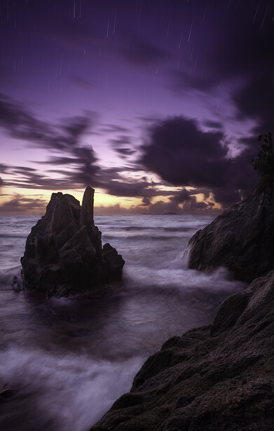
Below are the two images submitted by each photographer. All voting must be made before 4pm on Friday, May 10th (eastern time), and the final behind the scenes video of the competition will be released next week.
Image 1
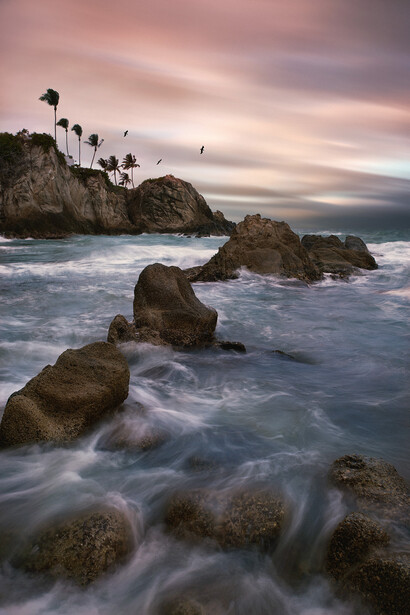
Image 2
Feel free to leave your comments about the images below, and some of them might even make the final video when we reveal the winner to both photographers. Also, if you want to check out the other amazing Puerto Rican locations featured in these competition videos, make sure you head over to our YouTube channel and subscribe to the Puerto Rican Photo Challenges playlist.


Join the Fstoppers community for free
-
Post comments and join in the discussions
-
Browse the site ad-free
-
Share your work and get featured in the community
-
Compete in the photo contests for fun and prizes
20 Comments
Both too cheesy and over the top.
1) HDR-ish look in the water and the composited motion blurred sky doesn't make any sense at all. (especially with the birds)
2) The sky is cheaply composited. The transitions havn't been done very well. The yellow colour from the sky doesn't show up in the water either. The colour grading doesn't follow any natural harmony. Those star trails are ridiculous. Sorry.
The first has a better composition. Still, both shots are 2* and need work. Sorry, guys.
This is one contest where my vote will be withheld...........
None of the above. Was #2 from Peter Lik?
I preferred number 1 because it has a clear subject which works with the rest of the image - the lines all draw you to the bird and trees (for the most part). The star image is interesting on first glance because there's a lot of eye-catching stuff going on, but my eye wanders around a lot as the different elements don't really interact - the core elements of the image don't seem to work together in harmony. Also, I feel like there was a missed opportunity in the rules here - the filters used can be stacked and I feel like using three image composites misses one of the key benefits of filter systems like this - that you can catch images in one shot that would be otherwise impossible. Mind you, neither of these images would be possible in one shot no matter the filters used, but if you're compositing multiple images, you could likely recreate many parts of these images without filters at all (with the exception of the ultra-long exposures).
Reminds me of those cooking competition shows where the chef only has a limited time and has to cook with certain ingredients. I was always more interested in what they could do if they were allowed to do things the right way.
Anyway, I'd say that with image 2 the mood and subject are in better harmony.
Love these challenges, keep 'em coming--a fun way to explore places in Puerto Rico with you guys!
There are things that work and don't work for me with both images, but I think #1 takes the cake overall. That being said, the shutter speed on the sky and birds is clearly out of step. The sky also looks to be a much longer shutter speed than the water, though I'm not sure non-photographers would notice that as much.
Fstoppers, yes. Showstoppers.................no!
Personally I prefer image-1 in terms of overall composition, color and the way it presents, only one thing truly bother me - those 3 sharp birds are too fake to be there....
Why do these challenges seem to be only about landscapes? How about a challenge where the genre is something relatively foreign to both shooters? For example, how about asking the audience for a basic creative brief and drawing one at random. Here's an example of what I envision:
"Create an ad-worthy image of [product name] in a lifestyle shot that speaks to the brand"
or...
"Shoot a fashion model that speaks to [some aspect] of [some attribute]"
That's much more of a challenge than "Both of you go shoot the same general landscape".
If it's a "challenge", let's make it truly challenging.
I hope to incorporate more shoots like this but you gotta remember, it's much more difficult arranging shoots like that in PR and especially in a rural community like we are in. I might have something for you in the next shootout though!
Cool. Thanks
If I ignore the birds in the first image, then I’d say it’s the stronger image. But if I crop out the top of the sky on the second image, it’s also stronger... so I guess it’s a wash.
I may not be a pro, but I feel the need to remind y’all that sometimes less is more.
Either way, looks like you’re having fun, so don’t let our Negative Nellie attitudes ruin that.
Hmm I'd like to vote 2 because on number 1 it feels like it's Patrick with his bad habit of cloning birds in photos. On both images the water could be better. The exposure is too long, you lose the definition and movement in the water, a slightly shorter exposure would be better. Wave photography is very hard though, it takes dozens of shots and sometimes hours to capture the perfect one. On the other hand on 2, the stars are just too much, so is the long exposure on the clouds. They're not necessary. So in the end I didn't vote, to me both are at the same level. I'd like to see you try a challenge where you don't composite anything in. Just pure composition, but with the rights to revisit a location again and again for say a week. It probably wasn't possible for this video, but maybe next time. From the other comments, I feel like it's what people don't like either : the star trails, the cloned birds etc...
I'm kind of disappointed that both images appear to be composites.
The first one is for sure. There's too much motion in the majority of the scene for the birds to be so static.
Both are nice but #2 really captures my imagination. The star trails are unusual and remind me of a meteor shower. The colors are really lovely.
Image 1:
Why the birds? They look good there, give us a sensation of incoming storm, also the tree leafs are static but is a bit confusing to my eyes.
A well performed composite but, there is a grunge HDRish type of editing on there that make me uncomfortable.
Image 2:
Contrasty, and with an 80's look that could be used as a cover for a Miami Vice poster. Hell, I can even listen to Jan Hammer - Crockett's Theme while looking at it. The rocks look hazed, like the contrast was gone on the texture and by the cloud movement, the exposure don't seem longer than 20 seconds, in no way one could produce 20 minute like star trails.
Anyhow, I'll vote for number 1.
Haha you win just for mentioning Jan Hammer! There and Back by Jeff Beck!
Send me the raw files and I'll make them a solid 3* image.
I find this the hardest to pick because I actually don't like either imagine very much! I like the colours in 2, but I think overall 1 is a slightly, and I mean SLIGHTLY better image. This time around has been more like which one I dislike the least, rather than the one I like the most!