As a beginner photographer, your natural instinct often tries to capture everything that catches your eye. If you’re standing in front of the most beautiful view you’ve ever seen, of course you’ll want to show the whole scene in your image, but you’ll often create the most compelling images by showing less.
The Art of Showing Less in Photography
Although I’m a street photographer, I have a keen interest in other genres, including landscape, travel, documentary, and plenty more. I love seeing expansive views of stunning landscapes as much as anyone, but the images that often have the biggest impact on me are the ones that show the fewest elements.
I constantly see videos published by landscape photographers advising viewers to try telephoto lenses, instead of always going for the wide angle. For example, this video from James Popsys shows him only using the Sony 135mm f/1.8 GM prime in Iceland.
Again, I’m no landscape photographer, but my favorite street photographers excel at eliminating elements from the frame. If you take a look at the work of Saul Leiter or Joshua K. Jackson, both evoke mystery, mood, and impact by obscuring parts or all of the scene/subject.
This doesn’t take anything away from the photographers who excel at capturing expansive vistas or squeezing multiple subjects into the frame. In fact, I have huge respect for those photographers because I know how difficult it is to create impactful images with those approaches.
All I can say is that, for me, the photographers who master the art of showing less are the ones whose work speaks to me the most.
How to Add Impact By Showing Less in Your Images
Sadly, I haven’t mastered the art of impactful photography, but this is the one thing I’ve spent the most time working on over the past couple of years. I’ve still got a way to go, but I have made enough progress to share some tips and examples of them in action.
Fill the Frame
The easiest way to add impact by showing less in photography is to fill the frame. Get in close or use a longer lens to remove contextual surroundings, placing all focus on your subject(s) and a few carefully selected elements.

A landscape photographer might fill the frame by using a telephoto lens to capture the slope of a mountain and some overlapping clouds, instead of trying to show the whole scene. Meanwhile, an architectural photographer could get in close with their wide angle lens and fill the frame with dynamic lines, using the barrel distortion of the lens to enhance the shapes.
Use a Longer Focal Length
There's no reason you can't use a wider lens to show less in your images, but it's definitely easier to remove elements from the frame when you're using a longer focal length. All of the images I'm including in this article were shot using either a 50mm, 85mm, or 135mm prime (full frame equivalents).
Aside from making it easier to remove elements from the frame, the compression you'll get from 85mm or longer focal lengths allows you to flatten layers within the frame.

Don't take my photography as a good example of this, though. I mentioned Saul Leiter earlier, and he was a true master of this, so make sure you check out his work if you're interested in this approach to photography.
Show Less of the Subject
Once you get into the habit of filling the frame, you'll naturally find you're showing less of your subjects. Instead of showing the whole mountain or building, you're getting in close to show only a part of it. For me, this means not showing the whole of a person and, in some cases, not even enough context for the viewer to instantly know what they're looking at.

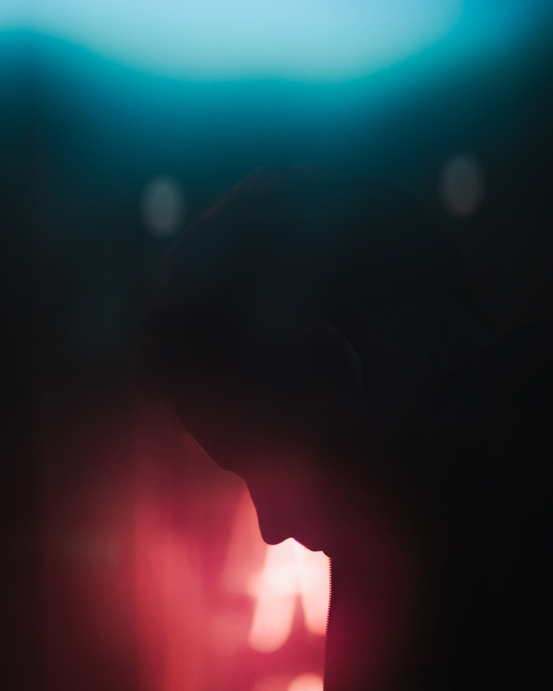
More recently, I'm experimenting to see how little of a subject I can clearly show and make the image still work. As long as there's some kind of anchor element (a nose, lips, eyelashes, etc.), it's amazing how much you can remove from the frame while painting just enough subject definition for the viewer to know what they're looking at, even if it takes a moment.
Hone in on Details
Another natural progression of showing less of your subjects is to hone in on details. This is also a good mental exercise for quickly identifying what it is about a subject or a scene that really matters to you. If you can strip away everything unnecessary and still convey the mood or story you want to portray, the impact of the final image can only increase.

Honing in on the details can also help you understand more about what it is that you want to show in your images. It might be moments of intimacy, dramatic weather changes, dynamic action, or any manner of other things. By getting in close and removing everything you don't want from the frame, you'll develop a clearer picture of what you do want in there.
Obscure Your Subject
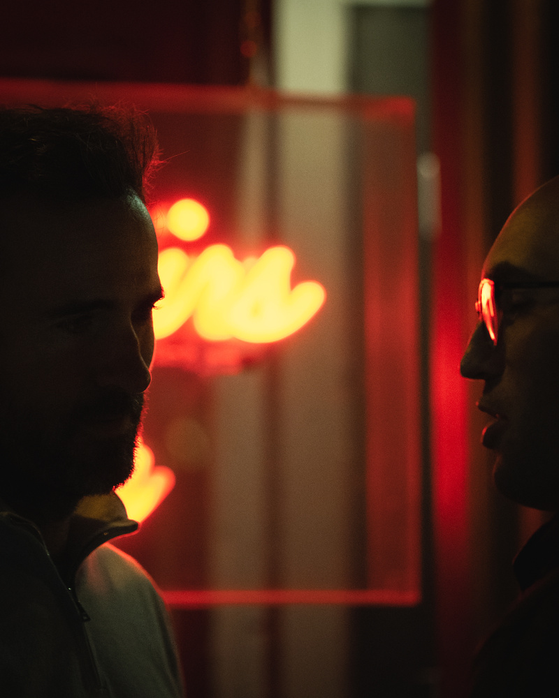
One of my favorite ways to show less in my images is to obscure the subject or even the whole scene. There are so many different ways you can do this that I'll never be able to cover them all here. Personally, I like to shoot through windows and use reflections, lights, and silhouettes to obscure the subject and their surroundings.

I also like to shoot through condensation on windows, raindrops on glass, or light and shadow to obscure the scene. I often use slow shutter speeds, intentional camera movement, out-of-focus rendering, and other techniques to play around with subject definition.
None of this is limited to street photography, either. Landscape photographers use light, shadow, mist, clouds, and all kinds of other elements and techniques to control the clarity of subjects and scenes.
Show a Hint of the Wider Story
We constantly hear about storytelling in photography and, yes, it's one of the most powerful ways to create impactful images. That being said, there's something even more powerful than telling a story in your images and that's showing a hint of the wider story to the viewer and allowing their mind to fill in the gaps.
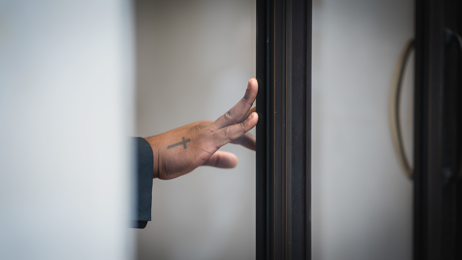
Sometimes, you don't even need to show them the main protagonist of the story. You could simply show the trailing hand of a secondary character and a moment that gives the viewer everything they need to create a narrative for themselves.

For the record, you don't have to tell a story to create impactful photographs. There are plenty of other ways to create impactful images without telling stories or capturing decisive moments. There's no hint of storytelling or decisive moment in the image above showing the silhouette of a nose, but the photograph still works.
Have You Tried Showing Less in Your Images?
The approaches in this article may be a little extreme for some photographers, especially if your passion is wide angle shots, complex scenes, or squeezing multiple subjects into the frame. However, every photographer will benefit from practicing these techniques, even if you don't push them to the same extent. And, if you're still a relatively new photographer, I'm confident you'll progress faster by honing in on what you really want to show in your images and building from there.


Great photos and a skill worth practicing.
One of the best examples I’ve seen of this is a recent cover of The Golfer’s Journal. Tight shot of a golfer’s hand tossing a few blades of grass into the air to check the breeze. But what really makes the image special is that, even with no additional context, anyone remotely familiar with the game will know that it’s the aging hand of Tiger Woods, himself a proverbial blade of grass in the winds of time. But we probably wouldn’t recognize just anyone’s hand - the obvious tell is the color of his skin, which forces us to confront some uncomfortable truths about the sport. All from a simple photo of a hand.
https://www.golfersjournal.com/product/tgj-no-23/
Racism was institutional among many gatekeepers of the sport for decades, or more. Clubs did not allow black people to play or become members, but all the caddies were black. Black professionals had to deal with moving goalposts that prevented them from qualifying for elite tournaments like the Masters. Tiger stands on the shoulders of other less dominant figures like Lee Elder, but he changed the game forever in too many ways to count.
So the photo is cool because you go “oh wow I know whose hand that is without any other context,” but when you ask yourself why that is it’s a little uncomfortable to acknowledge that, at the professional, magazine cover level there are only a tiny number of black players whose hand it could be. The photo isn’t technically special, blessed by perfect light or some grand idea executed flawlessly. It’s just a hand, but if it were a white player’s hand it would probably look like little more than stock photography.
Not odd...pragmatic. We should acknowledge our history and as with virtually every country, there's bad things. The golf example is over and done with. It's been acknowledged and it does not exist except in pages in history books. Has everyone moved on? No and that's part of the problem. It's like an old wound that is picked at until it starts bleeding again. The heeling process began some time ago. Heeling takes time, but without admitting it was bad AND moving on, it won't go away. It will remain a thorn.
While some might enjoy the minimalistic impact that a photo brings, I do not. As both a photographer and a viewer, I'd rather have more context than less. That way I can attempt to decipher the meaning or situation in the photo without wondering what the heck is happening. Even with the photos used in this article, none display any real meaning except photo #2 where the two men are talking.
In general, that's a good idea. Less is more. However, the images above are not the best examples of how this can be done. You still need some kind of subject of the image. Otherwise, what is the story in the image?