
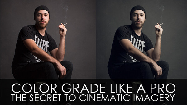
Getting it right in camera is one of the most important steps to achieving a great photograph, but color grading is what can really take your work to entirely new level. It has taken me nearly 2 years to find the right process and perfect combination to obtain the right look. And, over the course of my time writing for Fstoppers, I've been asked dozens of times about the coloring and process behind my imagery. Well, I've finally broken it all down in one quick tutorial.
This grading technique uses a combination of adjustment layers; Hue/Saturation, Curves, Levels and Solid Color Fill. Depending on the look you want to achieve, this process can be altered and switched to fit to your vision.
For a cold, dramatic image...
- Create a Hue/Saturation Adjustment Layer. Drag the Saturation slide far left to around -40, nearly halfway to black and white. The de-saturation will add drama to the image.
- Create a Curves Adjustment Layer. With this adjustment, it's all about the subtle color. Pull down the midtones in the Red, Green and Blue channels to achieve a moody blue/green tinted image.
- Create a Levels Adjustment Layer. Drop down to the blue channel and drag the bottom black slider to the right to bring blue into the shadows. Then, drag the white slider just slightly left to bring back warmth in the highlights.

For a natural earthy, warm image...
- Create a Hue/Saturation Adjustment Layer. Drag the Saturation slider left to around -15, for some slight drama.
- Create a Curves Adjustment Layer. Pull up the highlights on the Red channel. Then, drop down to the Green channel, pull up the highlights and pull down the shadows to create contrast. Drop down to the Blue channel, again create a small "S-Curve," pull up the highlights and pull down the shadows.
- Create a Levels Adjustment Layer. Drop down to the blue channel and drag the bottom black slider to the right to bring blue into the shadows. Then, drag the white slider left quite a bit to bring back a lot of warmth in the highlights.
- Create a Solid Color Fill. From the color picker select a strong gold/brown, but not too dark. Change the blending mode to Hard Light, then bring down the Opacity to around 8%. This will give an additional milky warmth to the image.

This isn't the only way to color an image and there is certainty no right or wrong way to do it. I can't guarantee it will work for your photography, but I can guarantee this technique will supplement workflow and enhance any imagery. So, give it a shot and let me know how it works for you.


Join the Fstoppers community for free
-
Post comments and join in the discussions
-
Browse the site ad-free
-
Share your work and get featured in the community
-
Compete in the photo contests for fun and prizes
33 Comments
Great tutorial. Did you have to train your eye to "see" the color grading or what looks good? Every time I've tried color grading it just looks like a bad color correction job. It just doesn't look....right. It looks like a mistake.
I find my problem with grading is that I typically go overboard. After 30min of tweaking colours and adding adjustment layers it's easy to think you finally got it. I find it's good to step away from the computer for a little while and come back with a fresh perspective. Most of the time I end up lowering the opacity on most of those adjustments.
I really think the important part to a good grading job is to keep natural skin tones. I guess you can think of it like film, the most coveted film get the skin tones right. Everything else can be all over the place and add character, slightly tinted shadows, emphasizing certain colour over others (the hue/saturation and colour balance adjustment layers can also be good).
I suffer from that too. I'll just keep tweaking a little more and a little more until I think I have it. Then I'll come back to it after I rest my eyes and think "Oh dear god that looks disgusting."
I never used to have that before though when I first started. I guess, as you work more and more with images and graphics, your eyes become sensitive to both subtle and substantial changes.
So true!
Thank you David! It's all about being subtle and maintaining some realism with skin. As my friend said below, step away from the image for a few hours and come back to it. You'll see something completely different. It's definitely an eyeball game.
When I grade, I want just the slightest touch. All technique aside, as I think Clay is definitely a capable photographer, my taste is that the examples of the smoking guy and the girl on the stump go further than I'd feel good about. This is about as extreme as I get. To each their own though, even though this is the internet. Isn't someone supposed to call someone an idiot here?
Great work Graham! It's all about personal taste!
Thanks man! I really like what you bring to the site, content and attitude-wise. Keep it up!
I've noticed my style improves more and more the more I just do it. I recently completed a 365-day photo-a-day challenge and I can see that I've grown in my style simply by forcing myself to do it everyday. I also think subtlety is key.
Awesome! Subtleties are everything!
It's interesting how this usually plays out. For example, in the above two examples with Before-and-After, I prefer both Befores over the Afters. But for the examples with only the Afters, I like them all.
I think a lot of this has to do with one's capacity to "let go" of fidelity to the baseline.
You make a good point. I went back and looked at the first set. I prefer the style of the graded version, but it is very much so just that: a style. The original is arguably 'more' timeless.
I guess that's why many photographers are just average. Color grading is also one of the things I want to master in the future. I'm slowly getting the hang of it. The best way to learn this is color theory. The earthy warm picture with the blond is the best example. Light greens and blues and warm yellow tones go well with blond. If it was. Brunette you could use more blues, even purples, but also greens (mint green etc). Color grading shouldn't take more than 5 minutes. If you spend 30 mins on your picture you're going overboard.
I really like this--now--but I'm curious as to whether or not this is just a fad...It'd be interesting to see how colors have changed through the years.
Thanks Mitch, I just like treating an image to the colors I like to see, fad or not.
Nothing beats mastering the Curves Adjustment tool for color grading, but the most underutilized tool I've noticed is the Channel Mixer. It's my go to for adding saturation (google Ben Secret BenColour), as well as compressing tones when Channel Mixer is set to monochrome.
Nice and easy tutorial with beautiful results :) color grading is my favorite part of my editing workflow. I do it pretty much like you while also working with the wonderful tool selective color!
Thank you so much Valdemar!
AWESOME tips! Thanks! Will try them out as soon as I get a chance.
Thanks for reading!
Simple but effective, nice one Clay. Great shots, too :)
Thank you Bob!
Every time I see a title that catches my attention… it turns out it was written by Clay Cook. ;)
You are awesome Dani! Thank you for that.
Can you pull of this look with Lightroom?
I don't really work much in Lightroom, but I had a friend try it out. He got close, but didn't like the way the blues looked in the shadows and blacks. It's achievable, but not quite as precise as the process in Photoshop! Give it a shot! Thanks!
I managed to get it going in LR. You might need a little more fine tuning though.
This actually works well on a number of things but you have to tweak it to taste. I ended up trying to do this in Lightroom with some positive results.
Awesome Jaleel! Glad it worked out for ya!
Simple but effective technique, I think as long as you don't over do it, the enhanced version can look better. Here is my color grading test
I've had success using a mixture of Curves, Hue/Saturation and Color Lookup layers.
thanks for this color grading tutorial