
Cold and moody processing is quite trendy lately. As I’ve been watching a lot of movies and cinematography tutorials, I began mimicking that cinematic feel in spite of myself. While lighting and makeup both play a big part in the final look, the post processing is critical as well. Here’s how to achieve it using Capture One!
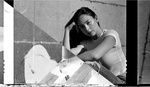
The tutorial will concentrate on portraiture, however, if you are a street, landscape, or still life photographer, most principles can apply. Let’s start with Capture One Pro 10 opened with your latest beautifully shot and lit portrait. Here’s mine:

Let’s head to the color tab and adjust the white balance to obtain a neutral result. If you shoot a gray card, be sure to use it, if not, press the A at the top of the white balance tool and then adjust manually until you feel like your image is neutral. White balance may not seem like a big deal, but it will significantly affect the rest of the workflow. If you adjust it afterward, you may need to readjust everything we are going to do.
Using the default Capture One Pro 10 workspace, you should find the color balance tool right below the white balance. We are going to skip the master tab, and head straight to the 3-Way – if it’s not precise enough for you, use the three following tabs which act the same. The cinematic look is usually cold with blue or cyan in the shadows and yellow or orange in the highlights. Because the color balance is designed to adjust the shadows, mid-tones, and highlights individually, it’s the perfect tool for the look we are going for! Let’s add a bit of blue in the shadows, cyan in the mid-tones, and orange/yellow in the highlights like so:


Note that the slider left to each color wheel adjusts the saturation and the one to the right the luminosity. For now, leave the luminosity slider alone, and only use the color wheel and saturation sliders. Be sure to keep the adjustment very subtle, the color balance tool is fantastic, but it’s easy to go overboard with it!
Then we are heading down to the color editor, which should be right below your color balance tool. To get a cinematic look, I want to mainly keep blue, cyan, orange, and yellow in my shot, but remove or desaturate the other colors. The color editor will let us edit each color channel individually. So we are going to tone down the magenta, purple, and red while leaving the other channels to their default settings. Feel free to play around with each slider, because depending on the colors you have on your shot, you may need to add saturation to the blue and yellow channels, perhaps even shift the hue of the purple to more blue or the red to more orange. When shooting in studio with little-saturated clothing, the settings I used below should work just fine!


Enough with the colors for now. Let’s move on to the exposition tab where we are going to adjust our image exposure. When shooting for this kind of look, I keep the highlights on the face at around 200-220 in the red channel. If you shoot tethered be sure to keep an eye for that. If not, check the histogram on the back of your camera, it should help. The reason for keeping the highlights on the t-zone around those values is that we are going to tweak our exposure and brightness sliders to get a moodier look while making an even more shiny and glowy skin.
The exposure slider adjusts the whole exposure of the shot, just as if we were to change the ISO on our camera. Meaning the full histogram is going to move left or right with the slider. On the other hand, the brightness slider will adjust mainly the mid-tones, leaving both extremities of our histogram alone. What this means is if we push our exposure slider to the right, we are going to bring everything to the right: brighter highlights, brighter mid-tones, brighter shadows.


As you can see, we lost quite a bit of contrast by moving our sliders just by a +0.6 value. To bring back our contrast, we are not going to use the contrast slider but the brightness instead. While we are at it, let’s bring the saturation down a tad as well because the cinematic look isn’t a very saturated one.

The result is quite dark for now, but don’t worry, we are going to use the levels and curves to tone our image like we want! For now, all we want is a slightly desaturated but contrasty image with a t-zone at around 200-220 in the red channel – that shouldn’t have moved by much if you adjusted your exposure and brightness correctly, you should have roughly the same values as before the exposure adjustment.
If you look at movies, usually you can see details across the whole image, rarely will you see pitch black areas. We could use levels and curves to bring the dark tones back up, but Capture One Pro offers an even better alternative: the shadow slider found in the High Dynamic Range tool. It doesn’t affect the mid-tones or highlights, but only the shadows. Bring it up until you have just enough detail in the dark.

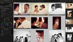
Onto the most interesting part now: the levels and curves. Before we adjust them, open up Capture One preferences and click the Exposure tab. Make sure the channel mode under Levels Tool is set to Red, Green, and Blue Channels.

Then get back to the levels tool and press the little A at the top of the tool. It should move the sliders in every channel but the RGB. While not perfect, the automatic adjustment gives us a good point to start. Sometimes, no further refinement is actually needed! So it’s worth a try. As you can see below, in my case, it gives me a very warm image. So everything but what I want!


On this image I seem to have mostly too much red. As the cinematic look is meant to have quite a bit of cyan, I’m going to back off the reds in the highlights.

But now, I feel like I have too much green. So let’s correct that.


Your image may require different adjustments than mine here, so be sure to play around with the sliders! In this case, I won’t adjust the blue slider as the skin tone is yellow enough to contrast with the blue/cyan background. But sometimes, the blue channel must be tweaked as well.
We are not doing too bad! The result isn’t far off.

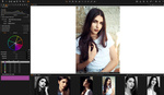
We are just missing the final touch with the curves. Let’s start with the Luma channel here. I want my highlights to shine even more while keeping the remaining of the image as is. Before adjusting the highlights, we must fix our mid-tones and shadows with new points, just so that we don’t move them. Just click on the curve, once in the shadows, once in the mid-tones and Capture One will create new points and keep the curve in place in those areas. Then take your white point and move it slightly to the left until the orange vertical line touches the beginning of your histogram. This should really make the skin glow a lot more giving your model’s face a three-dimensional look.

With the contrast adjusted, we can move on to the blue channel where we want to add blue in the shadows and remove some of the highlights. It translates into to a very slight S-shaped curve. As you can notice below, I’m not going crazy with the blue, because we are going to play with the red/cyan curve just after. So you want to be careful not adding too much blue right now, but rather keep it minimal and come back to it if needed.

Just like the blue curve, we are going to create a slight s in the red one, but we don’t want to push the red too much. Keep it minimal, just make it, so the dark tones of the skin look red enough that they seem human. If you model has a very red skin tone, you may want to skip the dark point and only pull the mid tones down instead of creating an s-curve. Note that in the red curve, I decided to pull the white point down to add more cyan and give a colder look to my image. This is optional, but it makes the high points of the face stand out, again, making your model feel more real.

Finally, the green curve. We are going to make a similar adjustment to what we created with the luma curve, meaning we are only moving the white point. It will add some green in the highlights to make the t-zone stand out and look glowy while retaining the color and luminosity we created in the shadows and mid tones.

For those of you whose workflow isn’t limited to digital support, be careful when moving the white point of your curves. It works quite well when the final use is only digital, but if you are printing, it may not be the best idea depending on the final support. If you must keep your white point white, create a point between the white point and the mid-tones and move it instead of what’s shown above.
The last touch I’d tweak is a tiny push in clarity. I tend to like how the clarity slider in Capture One adds a more realistic feel to my images. No need to go crazy, a simple 5-10 value is more than enough.
Because I know having a preset is always much easier, I created one with the settings shown above just for you. However, keep in mind that a preset doesn’t mean that it does all the work for you! It will give you approximate settings that should work but will probably need a bit of refinement. I designed the preset linked below for the way I shoot, but perhaps, depending on your lighting, it may not suit your images.
Download the cinematic preset here
Also, for those of you who like their images to be a bit warmer, I created a second preset which is almost the same as the one above but with more red in the shadows making richer and more human-looking skin tones. So be sure to try it as well and see which one works best for you!
Download the warm cinematic preset here
For those of you who don't own Capture One but this tutorial makes you want to try it, you can download a free 30-day trial version on Phase One's website. If you then decide to go ahead and buy a license, be sure to use the code AMBQUENTIN for a special price.
Did you create any custom preset in Capture One Pro for your portrait, beauty, or fashion work? Be sure to share them with the rest of us in the beauty, portrait, and editorial Fstoppers Group. If you download my presets above, I’d love to see the result you get out of them, so head over to the group as well and show us your fantastic work!


When using the preset it bumps the distortions to 100%, might be better to leave that off when saving it
I've added lens correction in all of my presets. The distortion set at 100% in Capture One corrects any possible distortion caused by the lens, it doesn't add distortion ;) But feel free to resave it without lens correction if it bothers you.
great article. a step by step approach that is easy to follow! well done!
It should be noted that the cinema look you speak of, in regards to color, has it's origin in the use of tungsten film during the film only era. It was also not used for and noticed in every scene, so the blue/cyan look you speak of was not always seen, and not enough to be characterized as "usual." In daytime outdoor scenes, for example, you wouldn't normally see the use of such film. In indoor scenes you more often than not never noticed the effect of the blue/cyan balance of the film.
In regards to your comment where you say "if you look at movies, usually you can see details across the whole image, rarely will you see pitch black areas," if you are talking about movies created today, there is certainly some truth to that. When it comes to movies form the film only era, unless contrasty scenes were artificially well lit and exposed for properly, you most certainly had plenty of shadows going to black, and/or the reverse of highlights going to white, since there was simply no easy way back then to take advantage of what film recorded. There was no such a thing as bumping up the shadows and recovering highlights in software, so the results more closely resembled the crushed blacks and blown out highlights that a person would get from an analog print from back then than what you can achieve today.
It has taken digital to get the best out of film. Interestingly enough though, and thankfully, software is not often used to recover those shadows and highlights of older film movies when transfered to disc, DVD or Blu-Ray. The films wouldn't be the same, and as remembered, if that were the case.
Your final result is also not something I would liken to what I saw/see from movies during the film only era. As I touched on before, the use of tungsten film in such an indoor situation was used to counteract the yellow/orange effect of tungsten lighting, to create a proper, or more proper, color balance, not to show the effect of the blue/cyan bias of the film. Back then the blue/cyan effect was simply a side-effect, a consequence, of the film that was used, not something that was strived for, whereas today that look is being applied all throughout movies and photos in the way Instagram filters are.
Your final result is also too green, if you are striving for the blue/cyan bias of tungsten film.
I searched this page for word film and it only shows in your comment. Where did he say anything about simulating movies shot on film? Color grading is a technique used to create specific mood in the scene or entire movie. This is the cinematic look Quentin is helping us to recreate.
Read more carefully what I wrote. Cinema started with film, and the general look in question originated from film. Even for young people, such as yourself, the look of film has an influence on you, and it continues to have an influence on the industry of your avocation or profession.
Let's talk about religion because it has influence on most people and cultures who shoot film...
Cinema started with black and white movies. We shouldn't use any colors...
Bad analogy. The influence I speak of is directly related to what we are seeing in the article.
The article has nothing to do with black and white.
Not so directly, since you are talking about influence of film even though it wasn't mentioned in the article at all.
You interpreted the article your own way and started poking holes in it.
That is where that look comes from. It was/is the result of the use of tungsten film. The article didn't have to mention the word film for that to be true.
Poking holes? I'm simply sharing my views and opinions. That's what forums are for.
I'd just use photoshop
Imagine you have more images from session, it's much easier to copy settings from one photo to another, but it's of course also doable in Photoshop :)
Excellent article. I truly enjoyed the step by step approach and the explanation as to why each change is made. I am learning more and more about colour grading and articles such as this are a huge help. Finally, adding the styles for free download at the end was a brilliant touch! I have downloaded both and will definitively try them
Thanks man. I'll try the presets out, and it's always nice to see how people work in C1.
When I try to add the presets into capture one it gives me and error saying some of the file was not applied.. Anyone know what the issue could be? The style sheet is coming into my Mac as a .txt file
As the file is already named .costyle.txt you just need to delete .txt then add the new .costyle file to (Mac) [username]/Library/Application Support/Capture One/Styles; (Win) C:\Users\[username]\AppData\Local\CaptureOne\Styles50