
Color banding is a problem we encounter when retouching many of our images or making them ready for print, but in many of the cases we just ignore it hoping no one will notice. In this long and detailed video, photographer / illustrator Lee Varis explains why banding appears in our photos, how we can recognize it, and shows the best methods we can use to fix it. (to save time, skip to minute 3:30).
Banding is when the transition between colors is not smooth, what can create patterns of vertical lines. This can be very visible when shooting clear blue sky or sunsets, as well as when shooting on a color backdrop in the studio. Color Banding won't be very visible in areas where you have a lot of details/objects (such as faces, trees, or any complex subject).
In just few minutes you can easily fix color banding on your images (of course, depends on the situation). There are two main methods that can be used to fix that issue: Adding noise, or using the 'Spatter' tool. As shown in the video, the second option gives better results. Here is a quick example I created using one of my old photos to show the difference this method can make:
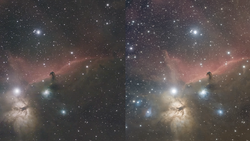
1: Original photo, color banding is visible without using any tools (hint: look at the sky)

2: Original photo with a solar curve to get a better view of the banding.

3: The photo after using the 'Spatter' method (shown in video) with a solar curve to get a better view of the banding.

4: The final result. Color banding is gone.

As you can see, the color transition in the sky is much smoother in examples #3 and #4. It took me less than a minute to fix the color banding issues on my photo, and the difference is huge.
[via iso1200]
If you'd like to take your photo editing to a new level, make sure to check out the variety of Photoshop tutorials and plugins that will speed up your workflow and help you create stunning, professional work. Save 15% by using "ARTICLE" at checkout.


Join the Fstoppers community for free
-
Post comments and join in the discussions
-
Browse the site ad-free
-
Share your work and get featured in the community
-
Compete in the photo contests for fun and prizes
16 Comments
He's shooting in medium quality JPEG and is doing an anti-banding tutorial. Most of the problems are much less prominent when you shoot in RAW and work with the original 12bit files.
That's true, but I dont think we should focus on this specific image - instead we should focus on the method presented. Because color banding is something we all experience at one point or another.... so good to know how to fix it.
That's what Tobias is saying though. That we shouldn't just focus on this image seeing as this technique probably wouldn't work on many other types of image.
What makes you think it won't work on another image? He had an uncompressed tiff example from a raw file that he applied the same technique to. It's an interesting option that you now know of to use when you come up with this dilemma the next time that you do.
It is a great tip and I glad I found it. On the rare occasion noise does not fully resolve the issue, this technique, as I discovered 10 minutes ago, can!
I did have to isolate the problematic background from the subject before applying the spatter tool. As it was a 3D project that wasn't an issue.
Very true, I've encountered banding working with CMYK files when a client insists on keeping the workflow in CMYK. I've seen it even in alpha channels!
Typically using a noise overlay takes care of most things, as well as jumping to 16-bit. I disagree with his comment about 16-bit, I've solve many banding problems in 16 and even 32 bit space when creating gradients in CMYK space. Modern Photoshop dithers down from 32/16 to 8-bit, introducing a form of noise diffusion that works well.
That said, his solution is certainly simple enough and you can even stay in 8-bit space. Certainly a great tidbit of information to have in your troubleshooting arsenal.
You can't always decide how you're going to get your images. The vast majority of images I've worked on professionally are 8-bit tiffs whose RAW processing origins are completely unknown tome. I've also had to work in environments where I have to immediately convert said tiff file to CMYK and do all the retouching in that space.
I wouldn't dismiss this process. Yes, it is situational, but now you know another way around a potential problem.
wow! nice sharing!
old...
...to an old salt perhaps. There's lots of young ones' on this site you know, you old fart...
Wow...this video did NOT need to be half an hour. He doesn't get to the point until after 11min. And honestly, i find adding a little bit of grain does the trick just as easily.
I think it is that long just because it's a recording of a workshop/class. Otherwise this can be covered in 5 minutes or less... But still, some cool ideas and tips.
A 1 pt or even a .5 pt noise will do the same thing.
What is the relationship that he describes here between 8-bit image processing and the monitor's *ability* to display detail? I seem to be having trouble differentiating here between what I presume to be working colour-space—8- or 16-bit in the cases he describes in Photoshop—and what I "know" to be monitor colour-gamut (eg, officially "32 Bit"). Are these homologous, or is each mention in-reference to some other aspect of light/colour bit-depth? And what impact would/should this have on a technical-quality-centric workflow?
Great share, I did have some weird banding issues in 16Bit mode working on RAW and couldn't fix it, this tip helped me greatly. Thank you for share! :)
I really want to give this a try! The splatter tool in Photoshop?