
Much to my dismay, I've recently discovered that many photographers are unaware of the power of selective coloring. With its versatility, I'm convinced it's one of the most powerful tools for photographers today. It sounds insane, but I've used selective coloring for the majority of my photos over the last few years, and have left largely everyone impressed with my techniques. And no, I'm not trolling you.
Before you scoff this post off, let me explain. I'm not talking about making flowers red while the remainder of the photo is in black and white. I'm not talking about making that babies blue eyes pop in an otherwise dull grey background. I'm talking about the powerful tool found in Adobe Photoshop that allows you to work within a color histogram, in a non complex manner.
Despite it sharing the name with one of the worst photography techniques to come along since angel wing cladded models on railroad tracks, Selective Color is a tool found in Photoshop to help tone and cross process your images properly. Still not convinced? What if I was to tell you that this is the main tool used by some of the top photographers in the world today? Okay, I've won over your skepticism.
What Is Selective Coloring?
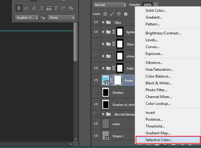
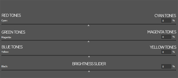
Selective Coloring is a tool used in Photoshop that allows you to cross blend your individual color channels using sliders within Photoshop. This allows you to add blue hues to your shadows, gold/yellow tones to your highlights, and everything in between to help make your photo look great. The dialog for Selective Color can be found in your Adjustment panels within Photoshop, and I've found is best used when put onto a layers mask. The panel itself is broken into 9 different color channels (Reds, Yellows, Greens, Cyans, Blues, Magentas, Whites, Neutrals & Blacks), each with their own color channel adjustments (Cyan, Magenta, Yellow & Black). Sounds complicated, but it's not.

The color channels (Reds, Yellows, Greens, Cyans, Blues, Magentas, Whites, Neutrals & Blacks) will be where you select the colors within your image. For example, if you have a blue sky that you want to tone down a bit, you're able to make adjustments to the color within the Cyan and Blue color channels. When you've selected your color channel, you're then able to make adjustments to it by adding and subtracting the various Cyan, Magenta, Yellow and Blacks.
Working With Opposites
The general breakdown of the color channel adjustments are as follows -
Absolute or Relative
The difference between these two settings within the panel is pretty simple. Relative is going to be a much more subtle technique for the tool. What Relative does is it takes the value of the color tone in the image, and then changes it by a percentage of the total. So if your image is 50% red tones, adding 10% to the red slider is actually going to add 50% of the 10%....bringing the total to 55%.
Absolute is going to work in absolute values, meaning the 10% adjustment is going to adjust that color by 10%. For the sake of simplicity, just think of relative being a much more subtle option to use, and absolute being far more dramatic in it's adjustments. For me personally, I use relative, cause I prefer the fine tuning you can get from it.
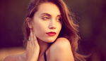
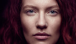
Using Selective Color to Adjust Skin Tones
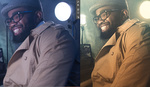
Getting skin tones to look correct can sometimes be complicated. Using the Selective Color tool allows you to make global adjustments to skin tones easily and on a layer mask, which then allows you to go through and correct where needed. The three color channels you'll use for this are the Reds, Yellows and occasionally Green (for olive skin tones only). Using this, you're able to push back pink tones in skins, and give a much more muted, beautiful tone.
Using Selective Color for General Toning
This is where the true power of Selective Coloring comes into play. Using the Whites, Neutrals and Blacks, you're able to cross process your images easily, by working on a basic histogram to adjust your images. The idea is pretty simple - Whites will control the color cast of your highlights, Neutrals are your mid tones, and Blacks are your shadows. Using this technique, you can make your shadows stark, faded, or even with a blue cast with ease.
How I Use Selective Coloring
Like mentioned above, the bulk of my uses comes in toning the image itself. While I use other techniques for correcting skin tone issues, there is nothing that can really compare to the versatility found in the toning tools for the selective coloring dialog. I, more often than not, go into the dialog, and start on the midtones, as that should be adjusting the majority of the image as a whole. I then take my sliders one at a time, and slide them all the way to the left, and then to the right. This is my way of "clearing my palate" so to speak. From there, I center the slider once again, and then make my subtle adjustments to tone the image as needed. I then will often go into my Blacks color and adjust that if needed. Personally, I like a strong black point and white point in my images, so the adjustments on this color selection is usually pretty minimal. However, if you're looking to get the muted film tones found commonly in today's photography, you're able to make adjustments in to Blacks to mute your shadows, giving a vintage feel to your images. I then will make any adjustment I may need to correct and colors within the image.
For me, each image is different, so I don't have set presets or styles that I'm able to use in my images. But by having the visibility of the layer on during my adjustments, I'm able to see the changes in real time.
Conclusion
There is no right or wrong way to use this technique to tone your images. Whether your technique is using subtly or breaching the extreme side of editing, I'm convinced that the Selective Coloring tool is one of the best default tools within Photoshop, and that every photographer should be experimenting with it.

Thats because a lot of people when hearing the words selective colour, think spot colour. I spend so much time defending my use of selective colour to those who don't understand what I mean.
p.s Taking the blacks out of the whites channel to around -30 will make any image pop. ;)
Yup. It's an incredibly powerful tool...with an incredibly unfortunate name.
Thanks for reading, Dani :-)
Funny, I always thought the name was very straightforward..
And when you say spot color, I think offset printing, so now we're all confused.
haha, we need some new names...
I wonder how this method compares to the Hue, Saturation, Luminance (HSL) sliders and split toning tools in Lightroom. I always process raw images in LR first and have used these for a long time. With the target you can simply click on the skin and drag on either H,S or L and it targets/adjusts the appropriate colors automatically, even if it is a blend of multiple colors. You can also select between Red, Orange, Yellow, Green, Aqua, Blue, Purple, Magenta. Highlight and shadows are controlled in split toning box and overall WB with the white balance control sliders. I find this way to be very intuitive and provide a high level of control over the final image.
I agree. I could do this in a few seconds in LR. There are many ways to do the same thing, but I always find LR to be super easy when it comes to global adjustments.
I was about to say "How's this different than Split-toning in Lr?".
I guess more control is given to the retoucher in Ps but by how much?
One difference is putting it on a layer mask allows you to be really selective on what gets toned and what doesn't. And you can adjust the color properties as well as the opacity independently.
If you don't want to affect your luminosity levels simply convert the adjustment layer to color. This will deprive you of some of the processes, but if needed...
It's perfect for color crossovers or color casts, especially if you're dealing with archival film footage.
Absolute is the way to go as far as I'm concerned.
This is great! Any hint on how to efficiently incorporate this into a workflow? Say you have 10 images shot in the same light...how would I "copy and paste" this newly made selective color layer to all images?
Like most of Photoshop's tools, you're able to build Presets that you can use to speed up your workflow process. I'd recommend that if you're looking to match edit multiple photos with the same lighting conditions.
thanks zach
This is how I do it:
-Edit one image to your liking, including the color grading. Don't close the document
-Edit another image to your liking, up to the part where you get to the color grading part
-Go back to the first image, and select the layer(s) you would like to 'copy and paste'
-Hold Option/Alt and drag them to the create new layer icon at the bottom of the layers panel
-A dialogue will appear that would let you copy those layers into a different document. Select the second image you were working on
-Repeat
-?????
-Profit.
the man...thank you
Great post. Thanks for the info
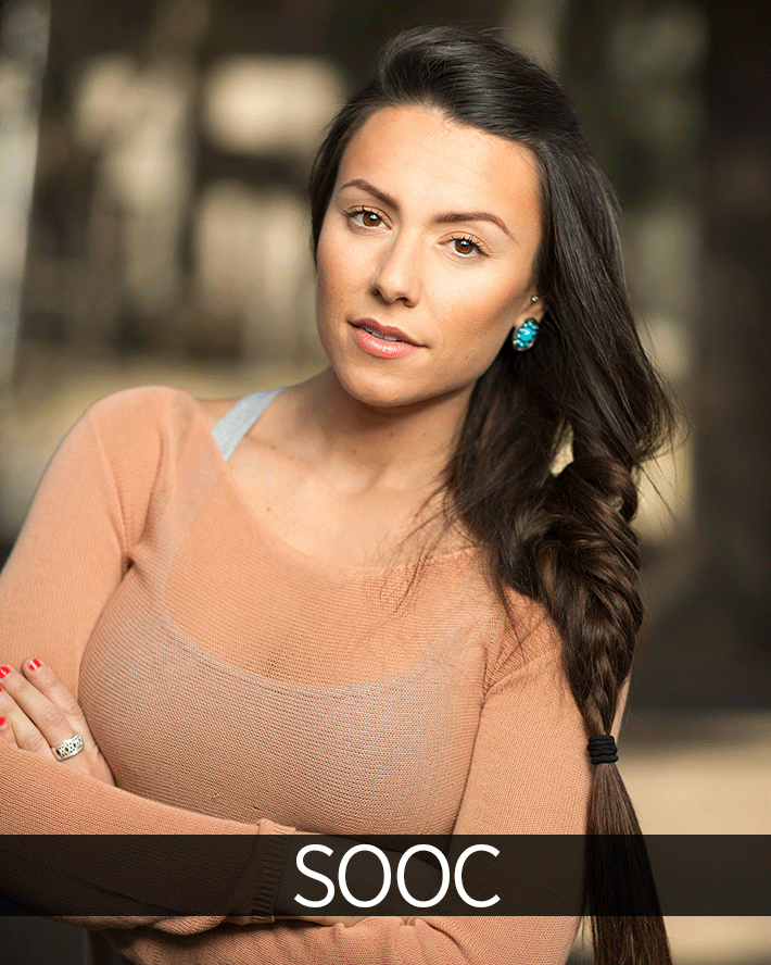
Just in case anyone is as confused as I was... SOOC means "straight out of camera"
I believe selective coloring is built into the (now open-source) Lightzone as part of its workflow. And a damn good thing that is too!
need to change the name, we made selective colour in wedding d baby shots illegal in the UK years ago :-)
nice...
Like the look of this technique despite the unfortunate name. Will give that a try thanks for sharing!
One of the nice things about this adjustment that I particularly like is the ability to make very specific, targeted adjustments to certain colors without the need for masks. So long as there is good color contrast in the image (i.e. yellow/tan skin tones against a blue/cyan sky), these sorts of maneuvers are a huge time saver.
All good but I agree with scot LR 800 when he speaks of excellence that is in my opinion the most versatile tool I have found
regards
this is the one of the primary tools I always use when I work in a photograph ;) nice topic!
A video of editing an example would have been very handy. Sometimes it's hard to visualise suvh stuff by words alone.
hehe not just handy for photographers but digital artist to. I use this to correct color balance in an digital pianted image from time to to time
How useful! thanks a lot!!! Is there a way to increase the range of color you can edit? (we only have 9 range of colors to choose) I want to be able to edit not just kind of red or yellow colors for example... I would like to edit kind of orange colors for example. This color range is not in the tool color list to edit.. any idea? =)