
As a Photographer you will often find yourself in a situation where your color palette is less than ideal. For example, you show up on location for a Portrait shoot and your subject is wearing dull, dark clothing on a dark background. What do you do? If you happen to find yourself in this kind of situation, here’s what you can do to add a little life to your images and broaden your color palette.
Colored gels have been used by Photographers and Videographers for years to create or enhance a mood and to add complementary colors to a scene. Colored gels also work exceptionally well with Speed Lights on location to add a little atmosphere to a life less background.
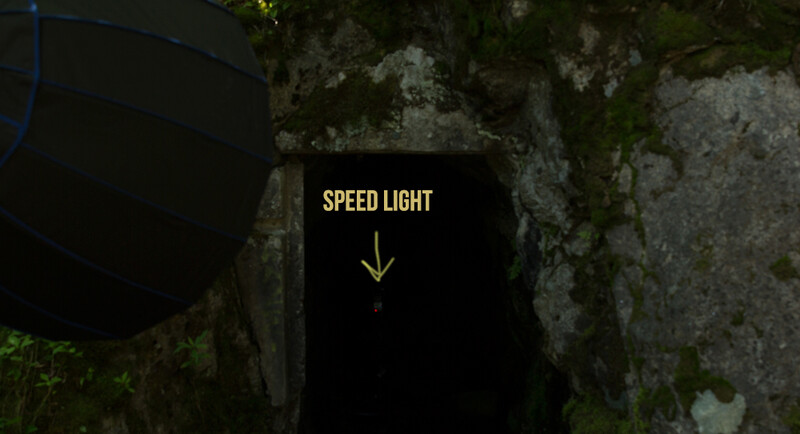
As you can see from the behind the scenes image below, there is a lack of depth and color in this background and you can’t see any dimension in the cave. In fact, there is so little light on the background that you can barely tell there is a cave in this photo at all. If you look closely you'll see a bare Speed Light in the cave.
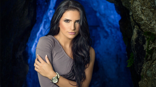
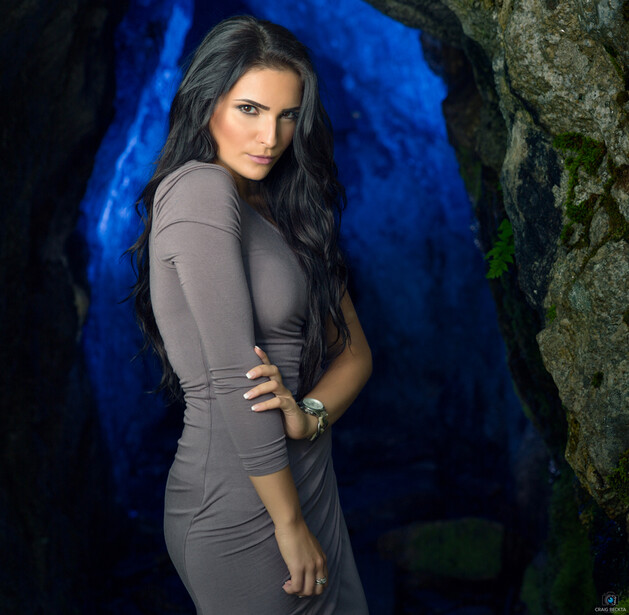
If you find yourself in a similar situation colored gels can be a life saver and they will help you to add an extra pop of color to your images, that will give you some extra impact. In the image below I used a Roscoe blue gel attached to a Canon 600 EX RT in the cave to give the image a little extra depth. The Blue Roscoe Gel from the Roscoe Speed Light Gel pack adds a complementary color to the background to enhance the Model’s skin tone.
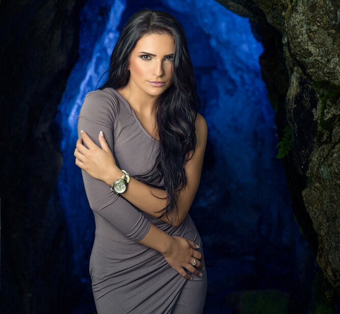
The reason why the color Blue works so well as a background color is because it is roughly opposite of skin tones on a color wheel which are predominantly orange. See the image of the color wheel below to give you a better understanding of complementary colors and how they work together…

Next time you go on a photo shoot make sure you bring along some colored gels and try to be conscious of the color wheel and how it will effect your overall shot. Try experimenting using complementary colors in your scene and don’t forget to have a little fun with it while you are at it.
You can find out more about me on my Blog.

Join the Fstoppers community for free
-
Post comments and join in the discussions
-
Browse the site ad-free
-
Share your work and get featured in the community
-
Compete in the photo contests for fun and prizes
6 Comments
Think I'm going to pick up a magmod kit or two to make the whole gel/speedlight process a little more efficient
Oh that was you Craig ?
This photo has been stored permanently in my memory.
Guess this is what you call a successful photo.
I've seen it on 500px if I recall correctly like a year ago or so.
Great job and a "creativity of the mind" opener article.
Thanks Bill,
Yep that was me...
Craig
Craig do you do anything in post to get the blue to pop? When I've tried this my background color always seems dull.
Hi Douglas,
No, not for the images in this article. The shots are pretty much how they looked, right out of the camera. If you check out the first part of the video, I show the raw images in Lightroom unedited.
I suggest replacing the subtractive color wheel for paint with the additive color wheel that applies for light. RGB primary and CYM for secondary. Because THAT is what photographers need to know, not the RBY that is pretty much inaccurate. In fact to pass the CPP exam from the PPA one MUST know the RGB color wheel and how the colors mix.
Example, you can't use a red, blue and yellow gels, one on a flash each and pop them for white color and colored shadows. But you can with RGB or CYM.