
My background was in design and web development before I was a photographer. So in my eyes, it's easy to see a connection between design and photography, and how that should translate to a photography website, however I am still surprised at how many photographers’ websites are very much behind the times. Mostly because most photographers are not designers or programmers. I see them using flash, or splash (intro) pages, saying “click here to enter website.” I want to talk about some basic practice that is absolutely essential in today’s world of websites.
Mobile Devices
These days, depending of course on the demographic that you are going for, a very high percentage of your users will very likely be visiting from mobile devices, in many cases, an even higher percentage than from a computer. Of course using Google Analytics is critical to knowing exactly what your customers are using, that way you can tailor the experience to suit the majority of your visitors. A very common thing that used to be normal for a photographer's website was to use flash, it was a way to be "hip" or to have some cool animation or user experience that in the early days was considered cool and had a certain wow factor. Times have tremendously changed, it is now considered annoying for a website to be in Flash, as well as deprecated since the platform is not supported across all devices, especially iOS devices, which account for a massive amount of most websites’ visitors, especially in the senior portrait market.
If some sort of cool animation is on your checklist of things you would like to have, JavaScript and CSS together can provide some very compelling user experiences, and is much more standards-compliant to work on a variety of devices.
Flash isn't the only thing that needs to be considered when optimizing for mobile devices, your content should also scale and fit and be readable on any device size. For example, a photo that you have put words on to describe certain things scaled-down small, very often will make those words illegible. Consider using an alternate image for mobile devices or displaying the information in a different way, such as in text that can be styled with CSS to display correctly on different screen sizes.
Computers Have Changed
It used to be common practice for most people to have 17-22” monitors or even smaller, and would develop their website to look good on that screen. An image that does scale to fill up as much of the screen as possible and is uploaded at that size looked good on the old monitor, but now it is common for 28” monitors and ultra-high-definition monitors, such as the new iMac to be found in many households. When that old 1280px image is scaled (now up) to fit a new iMac, it’s very blurry and looks bad, which is a problem, obviously under normal circumstances, but especially bad for a photographer since the images are actually what you're selling or showing off as your “brand” or work quality. Never would a customer ever see that and think “Oh, they just developed this for a smaller screen and that is why it is blurry” - it's just simply going to represent your work in a bad way, or make you look unprofessional.
So make sure that you look at your Google Analytics and see what size screens your visitors are using and make sure that you support that range. As an example, if you had 400 visitors per month on your website and one or two use one of the extra large high definition screens, you may not feel that is enough volume to warrant the website catering to that screen size, but if 15% of your users are using that size, it all of a sudden is a much bigger deal, so just make sure to know your customer base and what the trend is and realize that it does change over time.
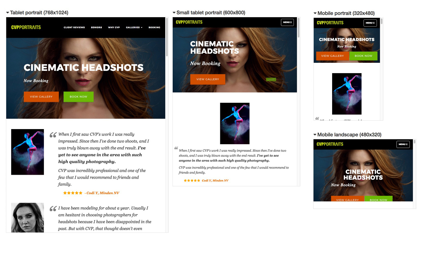
Here’s some examples of my photography website at various device sizes, the responsive layout keeps the “image and branding” the same throughout.

Splash Screens
It used to be very common for a photographer's website to do this; it was seen as a digital “front door” to your place of business, much like a door on a brick and mortar store would be. However, it doesn't translate digitally, all you are doing is forcing the user to make another click to get into your website once they have already attempted to get there, whether they typed in the website address or clicked a link, the last thing you really want to do is to have them click again just to get to your basic content. Statistics show that having a splash page like this can reduce the amount of people who go on into your website by 15% or more in some cases, think of it this way each additional click the user has to do to get to where you ultimately want them to be (probably booking you), is one more hurdle they have to jump over to get there, good website practice is to make it as easy as possible for the user to get to where you ultimately want them to be. It also has very negative effects on search engine optimization, more on this below.
Difficult Navigation
Another comment trait of photographers’ websites is to use some kind of abnormal navigation. By abnormal, I mean things like the menu not being found in the ”typical” places people are used to finding them (top or side), but rather a horizontal scroll that you have to look for a very tiny scroll bar at the bottom of the screen to scroll sideways, or perhaps a large image that takes up the whole screen, and any relevant content such as how to contact you or how to navigate your website are found “below the fold” - (a term used to describe any content that has to be scroll down out of the initial view to see). Well, some kind of fancy trickery like this might be cool to you, and “set you apart” as I often hear people are interested in, but it is difficult and even frustrating for a customer who doesn't know how it works to navigate it, it absolutely can and will cost you business. Not a good trade-off for you, losing business to have some "different and cool" navigation concept.
I have developed websites for photographers whose average “time on page” for customers on their old website was less than 20 seconds (we know this from the analytics), meaning people come to the site, and almost instantly leave. Likely because of being too frustrated to deal with how to navigate around, they’ll go somewhere easier. After modernizing the site, the average time on page jumped to over four minutes in most cases, meaning the customers are sticking around and seeing what you have to offer, which gives you the most opportunity to close the sale. These things do matter.
Background Music
Having some song that you have carefully chosen to match the style of your work automatically play when the user visits your website used to be a common practice. Please, don't do this, more than 90% of people that visit websites feel very strongly about how much they hate background music on any website, just think perhaps someone is viewing your website at work on their break and they visit the website, and all of a sudden bunch of music starts playing and they didn't realize how loud their speakers were on, and everybody turns and stares at them… you didn't win any new fans.
Please, just don’t do it, it’s incredibly annoying.
An exception would be if you had a video to play, it is certainly fine there because when people press play on a video they expect there to be some form of sound. But, while we are on the subject of a video, generally it is better to not auto-play videos, because that has the same effect we just discussed about an unexpected sound starting. There are exceptions to this but as a general rule, try not to surprise your visitors like this, let them click play themselves if they wish to watch your video.
SEO - Helping Your Website Be Found
This is a subject deserving of its own entire article, however I will touch on a few key things.
One of the big ones, is back to the splash screen or “Enter Website” page, this is one of the worst things you can do, besides being annoying to users, typically those pages have minimal content. I see them often where there is just a photo with the photographers logo on it and text that says “Enter Website” - When we understand how search engines read a website and display content to their users for searches, we quickly see why this is a bad thing. Search engines read text; images (especially with no alt tag) which is an accessibility feature within website code, are seen as nothing, and the only text on the page is “Enter Website” - so to Google, this is a blank web page about “entering a website,” nothing to do with photography in your town, or what you specialize in.
What Should You Do?
First and foremost, text on the page that search engines can read is obviously essential, this includes title tags that say what you do, text that has your location and phone number obviously help. I use phrases like "Reno Photographer" and "Reno Modeling Photos" - as Reno is the primary location that my business services.
Images can (and should) have “alt” tags, so that even though search engines don’t see what the image “says visually,” they can read the alt text, shown here:
So you can have the look you want for your visitors, without compromising the ability for search engines to find you. Here’s a few examples of a users view and the search engine’s view.


The very first thing you should do, is view your own website on as many devices as you can, different phones, tablets, small laptops, big desktop computers… browse through the site and see if anything is not “as expected.” Even better is to have someone else go through your site, while you watch… see where they hesitate, have issues, etc. - This is a great way to test your navigation, if people can’t quickly and easily find it, changes should be made.
This obviously is not a complete and total list of everything, but a great place to start with your website checkup and make sure you are on the right track.
Some Things To Look For:
- Mobile friendly responsive design
- No Flash
- No Splash/Intro pages
- Easy way for people to contact you
- Quick page load times (not only does this affect users’ experience, but Google considers page load speed in your page rankings!) Make sure those images are optimized properly.
- Text on your page, with titles, and relevant keywords related to your business
If you would like suggestions on your photography website, feel free to leave me a link and I'll do my best to review for you.
Edit: Example Review
Here's a quick review I did for this website, with his permission, I am posting it here as an example of what I meant by splash pages, and navigation.


I don't want to sound like I'm arguing (I'm not). And the "best practices" approach is most certainly to design your site for the highest end hardware (if only for future proofing), part if you make it flexible enough to deal with mobile and the varying screen sizes there. Good website design is good website design and you've laid out an excellent set of guiding principles for doing this responsibly--seriously, it's 2017, nobody should still be using Flash for anything ever.
Still, there's nothing common about 28" monitors in the households of non-creative industry types. The large majority of people with computers are still viewing our websites on screens that are 1080p and below.
The best data for monitor usage statistics is probably from the Steam Hardware Survey. And even then that's likely skewed toward better screens than the normal population simply because of the nature of the gaming community. Steam statistics (as of March 2017) say that 1920x1080 is still the most common size (45.26%). And second place is still 1366x768 (!!!).
That's nuts. But it's also the best information we have for a getting a semblance of the current state of people's hardware.
http://store.steampowered.com/hwsurvey
Michael, thanks for your thoughts.
Yep being 2017, nobody should be using flash, but I see it a lot, nobody should be using splash pages either, yet I keep seeing them, hence why I wrote about it, trying to get the last of the "old school" to see :)
As far as the stats go, I still like getting actual stats from each person's visitors, rather than a generalization of all market types... Because as you said gamers for example as a whole are gonna have different specs that Moms of high school seniors for example.
But I do also agree to lean toward the higher end. but sometimes that can hurt, in specific cases... if none of the visitors are taking advantage of it, particularly in the performance dept.
But I think we're still generally on the same page :)
Hi, I don't want to sound like I'm arguing (I'm not), but... Flash does still have a place in the digital landscape from presentation to advanced state manipulation and in many other ways when combined with Java and/or C programming. http://2advanced.com/#/home still offers an experience that even the latest HTML5 with any favorite scripting library combo can't really touch. If the point was just about splash pages, then yeah, never ever ever....
I also don't think Steam's survey is necessarily the best hardware statistics. I believe normalized data from actual and respective users that [actually] visited a site would be more useful.
Again, not arguing- just my .02 cents worth.
Ahh 2advanced, if you had any idea how much time I spent in the past trying to be like them, LOL they've always had the coolest looking sites. Although, terribly unpractical for a photographer trying to book clients. But man, their site has always been cool, I remember each generation of it.
**...trying to decide whether I'm being mocked...**
My problem with flash is twofold and neither are about design
(1) Flash isn't secure for your site's visitors.
(2) Your potential clients who use Apple phones or tablets won't be able to enjoy your site at all, regardless of how beautiful it is.
But yes. 2advanced has always been awesome.
no shade intended.
Bill: I'm game. mkyphotography.com
I'll send some thoughts shortly.
Thanks, Bill
I'm up for it....www.caseyjmcgeorgephotography.com
will do.
Good article bill, if you have time check my site out.
www.wilbursmithimagery.com
will do, I do have thoughts.
Thanks man
sent you pm
Amen...
Just putting it out there, I have a splash page. www.gabehavelphoto.com
Great article Bill - if you get a chance I'd love a critique of my website
www.mikeglatzerphotos.com
Thanks!
Bill, thanks for this great article. Your words are prodding me to do what I've (thankfully) been too busy to do for a couple of years. Update my sight. I'd love to get your thoughts if you have a moment.
www.julianrayphotography.com
Wow! Nice article! A review?...why yes, yes I would! www.michaelsheaphoto.com
Website looks clean and easy to use IMO Michael as a fellow wedding photo+video company!
it does look easy to use, which is definitely a good thing.
www.balihaiphoto.com Give it a check if possible? This is a great article for various reasons even though its not specific to each category of our users/clients. Something huge to note is the most recent update to google's algorithms as of last month impacting organic search results as some of you may have seen in terms of website traffic! I strongly believe an article like that in combination to clean website design geared towards your target customer or client picking up the phone or clicking send to get in contact with you. I got lost a few website design passes before of what I wanted vs what my clients want and what they need to see to book. This is still a work in progress but I can say that in combination with SEO/SEM for better user experience its helped massively in terms of business. That said this last update hurt my organic results and many other professionals! Any SEO dudes out there that can get us a photography breakdown on last months (still unannounced from google) update and how we can do better? EDIT! There are some great tools you can link up to your website for free to see whats going on, like how much/how long people are on your page, where they click, and where they stop reading on average. Check out www.sumome.com Im using the paid service but it will hopefully get some ideas rolling for you guys out there if your in a saturated market and on ways to make a site better!
Looks good, the navigation is present and easy for a customer to find, there's plenty of text present with appropriate words for the search engine, seems like it should work well.
www.softshadowsphoto.com
I'm fairly new to all this. So, any advise you can give will be appreciated.
You have text on your page, which is good for google to be able to crawl the site. Navigation is in a prominent spot, I don't see an issue there. I'd consider not using that font for everything, and spacing sentences out differently, which would help user-readability. That font is pretty "dated" but that's more aesthetic than functional, this article is more about functionality, so I'd say your search-ability is ok!
Love your website. What platform is it built on (e.g., Wordpress, Squarespace, etc.)?
Hi, thanks much, my site is a custom that I built, it's not any of those platforms.
I'd be interested in a website review - www.creativedogmedia.com. Thanks!
I would love it if you could review my site. www.roelfotografie.nl
I could really use your input about what to improve on my site: www.lasselundbergandreasen.com
This article came at an ideal time! I'm in the middle of doing a fresh push for my site, and would love to hear your crit if you've got any time life from the current stack of review requests:
http://derekdix.com
www.jimwestphoto.com. Thanks for any comments you can give.
Great time for me as well... learned a few things and will be making some changes. new website (a few weeks "live" now) so any thoughts would be greatly appreciated.
www.rmballgalleries.com
... I do have a splash page and your thoughts make sense, so I'll be working on that! again, thank you so much for any thoughts you might have, however brief or involved! Much appreciated!
Feedback on my page would be greatly appreciated www.hofverbergphotography.se
Thanks for the article Bill. I am game : www.purple-monkey.com